The (bad) stuff of legend

What is a legend? Merriam–Webster says:

  1. A story from the past that is believed by many people but cannot be proved to be true.
  2. An explanatory list of the symbols on a map or chart.

I think we can combine these:

An explanatory list from the past that is believed by many to be useful but which cannot be proved to be.

Maybe that goes too far, sometimes you need a legend. But often, very often, you don't. At the very least, you should always try hard to make the legend irrelevant. Why, and how, can you do this? 
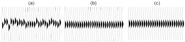
A case study

On the right is a non-scientific caricature of a figure from a paper I just finished reviewing for Geophysics. I won't give any more details because I don't want to pick on it unduly — lots of authors make the same mistakes.

Here are some of the things I think are confusing about this figure, detracting from the science in the paper. 

  • Making the reader cross-reference the line decoration with the legend makes it harder to make the comparison you're asking them to make. Just label the lines directly. 
  • Using unhelpful, generic names like 1, 2, and 3 for the models leads the reader into cross-reference Inception. The models were shown and explained on the previous page. 
  • Inception again: the models 1, 2, and 3 were shown in the previous figure parts (a), (b), and (c) respectively. So I had to cross-reference deeper still to really find out about them. 
  • The paper used colour elsewhere, so the use of black and white line decoration here seems unnecessary. There are other ways to ensure clarity if the paper is photocopied.
  • Everything on the same visual plane, so to speak, so the chart cannot take any more detail, such as gridlines. 

Getting better

I have tried to fix some of this in the version of the figure shown here. It's the same size as the original. The legend, such as it is, is now a visual key to the models. Careful juxtaposition of figures could obviate the need even for this extra key. The idea would be to use the colours and names of the models in every figure, to link them more intuitively.

The principles at work:

  • Reduce the fatigue of reading by labeling things directly.
  • Avoid using 'a' and 'b' or other generic names. Call the parts before and after, or 8 ms gate and 16 ms gate
  • Put things you want people to compare next to each other: models with data, output with input, etc. 
  • Use less ink for decoration, more ink for data. Gently direct the reader's attention. 

I'm sure there are other improvements we could make. Do you have any tips to share for making better figures? Leave them in the comments. 


Update, 30 Jan 2015

Some great comments came in today, and the point about black and white is well taken. Indeed, our 52 Things books are all black and white, and I end up transforming most images and figures to (I hope) make them clearer without colour. Here's how I'd do this figure in black and white.

Test driven development geoscience

Sometimes I wonder how much of what we do in applied geoscience is really science. Is it really about objective enquiry? Do we form hypotheses, then test them? The scientific method is largely a caricature — science is more accidental and more fun than a step-by-step recipe — but I think our field sometimes falls short of even basic rigour. Go and sit through a conference session on seismic attribute analysis some time and you'll see what I mean. Let's just say there's a lot of arm-waving and shape-ology. 

Learning from geeks

We've written before about the virtues of the software engineering community. Innovation has been so rapid recently, that I think it's a great place to find interpretation hacks like pair picking. Learning about and experiencing the amazing productivity of programmers is one of the reasons I think all scientists should learn to program (but not learn to be a programmer). You'll find out about concepts like version control, user-centered design, and test-driven development. Programmers embrace these ideas to a greater or lesser degree, depending on their goals and those of the project they're working on. But all programmers know them.

I'm especially into test-driven development at the moment. The idea is that before implementing a new module or feature, you write a test — a short program that gives the new thing some input, inspects the output, and compares it to a known answer. The first version of the code will likely fail the test. The idea is to refactor the code until it passes the test. Then you add that test to a suite that runs every time you build anything in the same project, so you know your new thing doesn't get broken by something else later. And you aren't tempted to implement features that weren't part of the test.

Fail — Refactor — Pass

Imagine test-driven development geology (or any other kind of geoscience). What would that look like?

  • When planning wells, we often do write tests — they're called prognoses. But the comparison with the result is rarely formalized or quantified, especially outside the target zone. Once the well is drilled, it becomes data and we move on. No-one likes to dwell on the poorly understood or error-prone, but naturally that's where the greatest room for improvement is.  
  • When designing a new seismic attribute, or embarking on a seismic processing project, we often have a vague idea of success in our heads, and that's about it. What if we explicitly defined an input test dataset, some wells or bits of wells, and set 'passing' performance criteria on those? "I won't interpret the reprocessed seismic until it improves those synthetic correlation coefficients by 40%."
  • When designing a seismic survey, we could establish acceptable criteria for trace density, minimum offset, azimuth distribution, and recording time, then use these as a cost function to find the best possible survey for our dollars. Wait, perhaps we actually do this one. Is seismic acquisition unusually scientific? Or is it an inherently more linear problem?

What do you think? Can you see ways to define 'success' before you begin, then somewhat quantitatively compare your results with that? Ideas wanted!

Seismic survey layout: from theory to practice

Up to this point, we've modeled the subsurface moveout and the range of useful offsets, we've build an array of sources and receivers, and we've examined the offset and azimuth statistics in the bins. And we've done it all using open source Python libraries and only about 100 lines of source code. What we have now is a theoretical seismic program. Now it's time to put that survey on the ground. 

The theoretical survey

Ours is a theoretical plot because it idealizes the locations of sources and receivers, as if there were no surface constraints. But it's unlikely that we'll be able to put sources and receivers in perfectly straight lines and at perfectly regular intervals. Topography, ground conditions, buildings, pipelines, and other surface factors have an impact on where stations can't be placed. One of the jobs of the survey designer is to indicate how far sources and receivers can be skidded, or moved away from their theoretical locations before rejecting them entirely.

From theory to practice

In order to see through the noise, we need to collect lots of traces with plenty of redundancy. The effect of station gaps or relocations won't be as immediately obvious as dead pixels on a digital camera, but they can cause some bins to have fewer traces than the idealized layout, which could be detrimental to the quality of imaging in that region. We can examine the impact of moving and removing stations on the data quality, by recomputing the bin statistics based on the new geometries, and comparing them to the results we were designing for. 

When one station needs to be adjusted, it may make sense to adjust several neighbouring points to compensate, or to add more somewhere nearby. But how can we tell what makes sense? The points should resemble the idealized fold and minimum offset statistics bin by bin. For example, let's assume that we can't put sources or receivers in river valleys and channels. Say they are too steep, or water would destroy the instrumentation, or are otherwise off limits. So we remove the invalid points from our series, giving our survey a more realistic surface layout based on the ground conditions. 

Unlike the theoretical layout, we now have bins that aren't served by any traces at all so we've made them invisible (no data). On the right, bins that have a minimum offset greater than 800 m are highlighted in grey. Beneath these grey bins is where the onset of imaging would be the deepest, which would not be a good thing if we have interests in the shallow part of the subsurface. (Because seismic energy spreads out more or less spherically from the source, we will eventually undershoot all but the largest gaps.)

This ends the mini-series on seismic acquisition. I'll end with the final state of the IPython Notebook we've been developing, complete with the suggested edits of reader Jake Wasserman in the last post — this single change resulted in a speed-up of the midpoint-gathering step from about 30 minutes to under 30 seconds!

We want to know... How do you plan seismic acquisitions? Do you have a favourite back-of-the-envelope calculation, a big giant spreadsheet, or a piece of software you like? Let us know in the comments.

It goes in the bin

The cells of a digital image sensor. CC-BY-SA Natural Philo.

The cells of a digital image sensor. CC-BY-SA Natural Philo.

Inlines and crosslines of a 3D seismic volume are like the rows and columns of the cells in your digital camera's image sensor. Seismic bins are directly analogous to pixels — tile-like containers for digital information. The smaller the tiles, the higher the maximum realisable spatial resolution. A square survey with 4 million bins (or 4 megapixels) gives us 2000 inlines and 2000 crosslines to interpret, after processing the data of course. Small bins can mean high resolution, but just as with cameras, bin size is only one aspect of image quality.

Unlike your digital camera however, seismic surveys don't come with a preset number of megapixels. There aren't any bins until you form them. They are an abstraction.

Making bins

This post picks up where Laying out a seismic survey left off. Follow the link to refresh your memory; I'll wait here. 

At the end of that post, we had a network of sources and receivers, and the Notebook showed how I computed the midpoints of the source–receiver pairs. At the end, we had a plot of the midpoints. Next we'd like to collect those midpoints into bins. We'll use the so-called natural bins of this orthogonal survey — squares with sides half the source and receiver spacing.

Just as we represented the midpoints as a GeoSeries of Point objects, we will represent  the bins with a GeoSeries of Polygons. GeoPandas provides the GeoSeries; Shapely provides the geometries; take a look at the IPython Notebook for the code. This green mesh is the result, and will hold the stacked traces after processing.

bins_physical.png

Fetching the traces within each bin

To create a CMP gather like the one we modelled at the start, we need to grab all the traces that have midpoints within a particular bin. And we'll want to create gathers for every bin, so it is a huge number of comparisons to make, even for a small example such as this: 128 receivers and 120 sources make 15 320 midpoints. In a purely GIS environment, we could perform a spatial join operation between the midpoint and bin GeoDataFrames, but instead we can use Shapely's contains method inside nested loops. Because of the loops, this code block takes a long time to run.

# Make a copy because I'm going to drop points as I
# assign them to polys, to speed up subsequent search.
midpts = midpoints.copy()

offsets, azimuths = [], [] # To hold complete list.

# Loop over bin polygons with index i.
for i, bin_i in bins.iterrows():
    
    o, a = [], [] # To hold list for this bin only.
    
    # Now loop over all midpoints with index j.
    for j, midpt_j in midpts.iterrows():
        if bin_i.geometry.contains(midpt_j.geometry):
            # Then it's a hit! Add it to the lists,
            # and drop it so we have less hunting.
            o.append(midpt_j.offset)
            a.append(midpt_j.azimuth)
            midpts = midpts.drop([j])
            
    # Add the bin_i lists to the master list
    # and go around the outer loop again.
    offsets.append(o)
    azimuths.append(a)
    
# Add everything to the dataframe.    
bins['offsets'] = gpd.GeoSeries(offsets)
bins['azimuths'] = gpd.GeoSeries(azimuths)

After we've assigned traces to their respective bins, we can make displays of the bin statistics. Three common views we can look at are:

  1. A spider plot to illustrate the offset and azimuth distribution.
  2. A heat map of the number of traces contributing to each bin, usually called fold.
  3. A heat map of the minimum offset that is servicing each bin. 

The spider plot is easily achieved with Matplotlib's quiver plot:

spider_bubble_zoom.png

And the arrays representing our data are also quite easy to display as heatmaps of fold (left) and minimum offset (right): 

fold_and_xmin_physical.png

In the next and final post of this seismic survey mini-series, we'll analyze the impact of data quality when there are gaps and shifts in the source and receiver stations from these idealized locations.

Last thought: if the bins of a seismic survey are like a digital camera's image sensor, then what is the apparatus that acts like a lens? 

Geocomputing: Call for papers

52 Things .+? Geocomputing is in the works.

For previous books, we've reached out to people we know and trust. This felt like the right way to start our micropublishing project, because we had zero credibility as publishers, and were asking a lot from people to believe anything would come of it.

Now we know we can do it, but personal invitation means writing to a lot of people. We only hear back from about 50% of everyone we write to, and only about 50% of those ever submit anything. So each book takes about 160 invitations.

This time, I'd like to try something different, and see if we can truly crowdsource these books. If you would like to write a short contribution for this book on geoscience and computing, please have a look at the author guidelines. In a nutshell, we need about 600 words before the end of March. A figure or two is OK, and code is very much encouraged. Publication date: fall 2015.

We would also like to find some reviewers. If you would be available to read at least 5 essays, and provide feedback to us and the authors, please let me know

In keeping with past practice, we will be donating money from sales of the book to scientific Python community projects via the non-profit NumFOCUS Foundation.

What the cover might look like. If you'd like to write for us, please read the author guidelines.

What the cover might look like. If you'd like to write for us, please read the author guidelines.

Laying out a seismic survey

Cutlines for a dense 3D survey at Surmont field, Alberta, Canada. Image: Google Maps.

Cutlines for a dense 3D survey at Surmont field, Alberta, Canada. Image: Google Maps.

Cutlines for a dense 3D survey at Surmont field, Alberta, Canada. Image: Google Maps.There are a number of ways to lay out sources and receivers for a 3D seismic survey. In forested areas, a designer may choose a pattern that minimizes the number of trees that need to be felled. Where land access is easier, designers may opt for a pattern that is efficient for the recording crew to deploy and pick up receivers. However, no matter what survey pattern used, most geometries consist of receivers strung together along receiver lines and source points placed along source lines. The pairing of source points with live receiver stations comprises the collection of traces that go into making a seismic volume.

An orthogonal surface pattern, with receiver lines laid out perpendicular to the source lines, is the simplest surface geometry to think about. This pattern can be specified over an area of interest by merely choosing the spacing interval between lines well as the station intervals along the lines. For instance:

xmi = 575000        # Easting of bottom-left corner of grid (m)
ymi = 4710000       # Northing of bottom-left corner (m)
SL = 600            # Source line interval (m)
RL = 600            # Receiver line interval (m)
si = 100            # Source point interval (m)
ri = 100            # Receiver point interval (m)
x = 3000            # x extent of survey (m)
y = 1800            # y extent of survey (m)

We can calculate the number of receiver lines and source lines, as well as the number of receivers and sources for each.

# Calculate the number of receiver and source lines.
rlines = int(y/RL) + 1
slines = int(x/SL) + 1

# Calculate the number of points per line (add 2 to straddle the edges). 
rperline = int(x/ri) + 2 
sperline = int(y/si) + 2

# Offset the receiver points.
shiftx = -si/2.
shifty = -ri/2.

Computing coordinates

We create a list of x and y coordinates with a nested list comprehension — essentially a compact way to write 'for' loops in Python — that iterates over all the stations along the line, and all the lines in the survey.

# Find x and y coordinates of receivers and sources.
rcvrx = [xmi+rcvr*ri+shifty for line in range(rlines) for rcvr in range(rperline)]
rcvry = [ymi+line*RL+shiftx for line in range(rlines) for rcvr in range(rperline)]

srcx = [xmi+line*SL for line in range(slines) for src in range(sperline)]
srcy = [ymi+src*si for line in range(slines) for src in range(sperline)]

To make a map of the ideal surface locations, we simply pass this list of x and y coordinates to a scatter plot:

srcs_recs_pattern.png

Plotting these lists is useful, but it is rather limited by itself. We're probably going to want to do more calculations with these points — midpoints, azimuth distributions, and so on — and put these data on a real map. What we need is to insert these coordinates into a more flexible data structure that can hold additional information.

Shapely, Pandas, and GeoPandas

Shapely is a library for creating and manipulating geometric objects like points, lines, and polygons. For example, Shapely can easily calculate the (x, y) coordinates halfway along a straight line between two points.

Pandas provides high-performance, easy-to-use data structures and data analysis tools, designed to make working with tabular data easy. The two primary data structures of Pandas are:

  • Series — a one-dimensional labelled array capable of holding any data type (strings, integers, floating point numbers, lists, objects, etc.)
  • DataFrame — a 2-dimensional labelled data structure where the columns can contain many different types of data. This is similar to the NumPy structured array but much easier to use.

GeoPandas combines the capabilities of Shapely and Pandas and greatly simplifies geospatial operations in Python, without the need for a spatial database. GeoDataFrames are a special case of DataFrames that are specifically for representing geospatial data via a geometry column. One awesome thing about GeoDataFrame objects is they have methods for saving data to shapefiles.

So let's make a set of (x,y) pairs for receivers and sources, then make Point objects using Shapely, and in turn add those to GeoDataFrame objects, which we can write out as shapefiles:

# Zip into x,y pairs.
rcvrxy = zip(rcvrx, rcvry)
srcxy = zip(srcx, srcy)

# Create lists of shapely Point objects.
rcvrs = [Point(x,y) for x,y in rcvrxy]
srcs = [Point(x,y) for x,y in srcxy]

# Add lists to GeoPandas GeoDataFrame objects.
receivers = GeoDataFrame({'geometry': rcvrs})
sources = GeoDataFrame({'geometry': srcs})

# Save the GeoDataFrames as shapefiles.
receivers.to_file('receivers.shp')
sources.to_file('sources.shp')

It's a cinch to fire up QGIS and load these files as layers on top of a satellite image or physical topography map. As a survey designer, we can now add, delete, and move source and receiver points based on topography and land issues, sending the data back to Python for further analysis.

seismic_GIS_physical.png

All the code used in this post is in an IPython notebook. You can read it, and even execute it yourself. Put your own data in there and see how it comes out!

NEWSFLASH — If you think the geoscientists in your company would like to learn how to play with geological and geophysical models and data — exploring seismic acquisition, or novel well log displays — we can come and get you started! Best of all, we'll help you get up and running on your own data and your own ideas.

If you or your company needs a dose of creative geocomputing, check out our new geocomputing course brochure, and give us a shout if you have any questions. We're now booking for 2015.

The race for useful offsets

We've been working on a 3D acquisition lately. One of the factors influencing the layout pattern of sources and receivers in a seismic survey is the range of useful offsets over the depth interval of interest. If you've got more than target depth, you'll have more than one range of useful offsets. For shallow targets this range is limited to small offsets, due to direct waves and first breaks. For deeper targets, the range is limited at far offsets by energy losses due to geometric spreading, moveout stretch, and system noise.

In seismic surveying, one must choose a spacing interval between geophones along a receiver line. If phones are spaced close together, we can collect plenty of samples in a small area. If the spacing is far apart, the sample density goes down, but we can collect data over a bigger area. So there is a trade-off and we want to maximize both; high sample density covering the largest possible area.

What are useful offsets?

It isn't immediately intuitive why illuminating shallow targets can be troublesome, but with land seismic surveying in particular, first breaks and near surface refractions clobber shallow reflecting events. In the CMP domain, these are linear signals, used for determining statics, and are discarded by muting them out before migration. Reflections that arrive later than the direct wave and first refractions don't get muted out. But if these reflections arrive later than the air blast noise or ground roll noise — pervasive at near offsets — they get caught up in noise too. This region of the gather isn't muted like the top mute, otherwise you'd remove the data at near offsets. Instead, the gathers are attacked with algorithms to eliminate the noise. The extent of each hyperbola that passes through to migration is what we call the range of useful offsets.

muted_moveout2.png

The deepest reflections have plenty of useful offsets. However if we wanted to do adequate imaging somewhere between the first two reflections, for instance, then we need to make sure that we record redundant ray paths over this smaller range as well. We sometimes call this aperture; the shallow reflection is restricted in the number of offsets that it can be illuminated with, the deeper reflections can tolerate an aperture that is more open. In this image, I'm modelling the case of 60 geophones spanning 3000 metres, spaced evenly at 100 metres apart. This layout suggests merely 4 or 5 ray paths will hit the uppermost reflection, the shortest ray paths at small offsets. Also, there is usually no geophone directly on top of the source location to record a vertical ray path at zero offset. The deepest reflections however, should have plenty of fold, as long as NMO stretch, geometric spreading, and noise levels were good.

The problem with determining the range of useful offsets by way of a model is, not only does it require a velocity profile, which is easily attained from a sonic log, VSP, or velocity analysis, but it also requires an estimation of the the speed, intensity, and duration of the near surface events to be muted. Parameters that depend largely on the nature of the source and the local ground conditions, which vary from place to place, and from one season to the next.

In a future post, we'll apply this notion of useful offsets to build a pattern for shooting a 3D.


Click here for details on how I created this figure using the IPython Notebook. If you don't have it, IPython is easy to install. The easiest way is to install all of scientific Python, or use Canopy or Anaconda.

This post was inspired in part by Norm Cooper's 2004 article, A world of reality: Designing 3D seismic programs for signal, noise, and prestack time-migration. The Leading Edge23 (10), 1007-1014.DOI: 10.1190/1.1813357

Update on 2014-12-17 13:04 by Matt Hall
Don't miss the next installment — Laying out a seismic survey — with more IPython goodness!

Neglected near-surface workhorses

Yesterday afternoon, I attended a talk at Dalhousie by Peter Cary who has begun the CSEG distinguished lecture tour series. Peter's work is well known in the seismic processing world, and he's now spreading his insights to the broader geoscience community. This was only his fourth stop out of 26 on the tour, so there's plenty of time to catch it.

Three steps of seismic processing

In the head-spinning jargon of seismic processing, if you're lost, it's maybe not be your fault. Sometimes it might even seem like you're going in circles.

Ask the vendor or processing specialist first to keep it simple, and second to tell you in which of the three processing stages you are in. Seismic data processing has steps:

  • Attenuate all types of noise.
  • Remove the effects of the near surface.
  • Migration, sometimes called imaging.

If time migration is the workshorse of seismic processing, and if is fk filtering (or f–anything filtering) is the workhorse of noise attenuation, then surface consistent deconvolution is the workhorse of the near surface. These topics aren't as sexy or as new as FWI or compressed sensing, but Peter has been questioning the basics of surface-consistent scaling, and the approximations we make when processing land seismic data. 

The ambiguity of phase and travel-time corrections

To the processor, removing the effects of the near surface means making things flat in the CMP domain. It turns out you can do this with travel time corrections (static shifts), you can do this with phase corrections, or you can do it with both.

A simple synthetic example showing (a) a gather with surface-consistent statics and phase variations; (b) the same gather after surface-consistent residual statics correction, and (c) after simultaneous surface-consistent statics and phase correcition. Image © Cary & Nagarajappa and CSEG.

It's troubling that there is more than one way to achieve flatness. Peter's advice is to use shot stacks and receiver stacks to compare the efficacy of static corrections. They eliminate doubt about whether surface consistent scaling is working, and are a better QC tool than other data domains.

Deeper than shallow

It may sound trivial, but the hardest part about using seismic waves for imaging is that they have to travel down and back up through the near surface on their path to the target. It might seem counter-intuitive, but the geometric configurations that work well for the deep earth are not well suited to the shallow earth, and how we might correct for it. I can imagine that two surveys could be useful, one for the target and one for characterizing the shallow that gets in the way of the target, but seismic experiments are already expensive enough when there is only target to be concerned with.

Still, the near surface is something we can't avoid. Much like astronomers using ground-based telescopes shooting for the stars, seismic processors too have to get the noisy stuff that is sitting closest to the detectors out of the way.

Another 52 Things hits the shelves

The new book is out today: 52 Things You Should Know About Palaeontology. Having been up for pre-order in the US, it is now shipping. The book will appear in Amazons globally in the next 24 hours or so, perhaps a bit longer for Canada.

I'm very proud of this volume. It shows that 52 Things has legs, and the quality is as high as ever. Euan Clarkson knows a thing or two about fossils and about books, and here's what he thought of it: 

This is sheer delight for the reader, with a great range of short but fascinating articles; serious science but often funny. Altogether brilliant!

Each purchase benefits The Micropalaeontological Society's Educational Trust, a UK charity, for the furthering of postgraduate education in microfossils. You should probably go and buy it now before it runs out. Go on, I'll wait here...

1000 years of fossil obsession

So what's in the book? There's too much variety to describe. Dinosaurs, plants, foraminifera, arthropods — they're all in there. There's a geographical index, as before, and also a chronostratigraphic one. The geography shows some distinct clustering, that partly reflects the emphasis on the science of applied fossil-gazing: biostratigraphy. 

The book has 48 authors, a new record for these collections. It's an honour to work with each of them — their passion, commitment, and professionalism positively shines from the pages. Geologists and fossil nuts alike will recognize many of the names, though some will, I hope, be new to you. As a group, these scientists represent  1000 years of experience!


Amazingly, and completely by chance, it is one year to the day since we announced 52 Things You Should Know About Geology. Sales of that book benefit The AAPG Foundation, so today I am delighted to be sending a cheque for $1280 to them in Tulsa. Thank you to everyone who bought a copy, and of course to the authors of that book for making it happen.

R is for Resolution

Resolution is becoming a catch-all term for various aspects of the quality of a digital signal, whether it's a photograph, a sound recording, or a seismic volume.

I got thinking about this on seeing an ad in AAPG Explorer magazine, announcing an 'ultra-high-resolution' 3D in the Gulf of Mexico (right), aimed at site-survey and geohazard detection. There's a nice image of the 3D, but the only evidence offered for the 'ultra-high-res' claim is the sample interval in space and time (3 m × 6 m bins and 0.25 ms sampling). This is analogous to the obsession with megapixels in digital photography, but it is only one of several ways to look at resolution. The effect of increasing the sample interval of some digital images is shown in the second column here, compared to 200 × 200 pixels originals (click to zoom):

Another aspect of resolution is spatial bandwidth, which gets at resolving power, perhaps analogous to focus for a photographer. If the range of frequencies is too narrow, then broadband features like edges cannot be represented. We can simulate poor frequency content by bandpassing the data, for example smoothing it with a Gaussian filter (column 3).

Yet another way to think about resolution is precision (column 4). Indeed, when audiophiles talk about resolution, they are talking about bit depth. We usually record seismic with 32 bits per sample, which allows us to discriminate between a large number of values — but we often view seismic with only 6 or 8 bits of precision. In the examples here, we're looking at 2 bits. Fewer bits means we can't tell the difference between some values, especially as it usually results in clipping.

If it comes down to our ability to tell events (or objects, or values) apart, then another factor enters the fray: signal-to-noise ratio. Too much noise (column 5) impairs our ability to resolve detail and discriminate between things, and to measure the true value of, say, amplitude. So while we don't normally talk about the noise level as a resolution issue, it is one. And it may have the most variety: in seismic acquisition we suffer from thermal noise, line noise, wind and helicopters, coherent noise, and so on.

I can only think of one more impairment to the signals we collect, and it may be the most troubling: the total duration or extent of the observation (column 6). How much information can you afford to gather? Uncertainty resulting from a small window is the basis of the game Name That Tune. If the scale of observation is not appropriate to the scale we're interested in, we risk a kind of interpretation 'gap' — related to a concept we've touched on before — and it's why geologists' brains need to be helicoptery. A small 3D is harder to interpret than a large one. 

The final consideration is not a signal effect at all. It has to do with the nature of the target itself. Notice how tolerant the brick wall image is to the various impairments (especially if you know what it is), and how intolerant the photomicrograph is. In the astronomical image, the galaxy is tolerant; the stars are not. Notice too that trying to 'resolve' the galaxy (into a point, say) would be a mistake: it is inherently low-resolution. Indeed, its fuzziness is one of its salient features.

Have I missed anything? Are there other ways in which the recorded signal can suffer and targets can be confused or otherwise unresolved? How does illumination fit in here, or spectral bandwidth? What do you mean when you talk about resolution?


This post is an exceprt from my talk at SEG, which you can read about in this blog post. You can even listen to it if you're really bored. The images were generated by one of my IPython Notebooks that I point to in the talk, specifically images.ipynb

Astute readers with potent memories will have noticed that we have skipped Q in our A to Z. I just cannot seem to finish my post about Q, but I will!

The Safe Band ad is copyright of NCS SubSea. This low-res snippet qualifies as fair use for comment.