Source rocks from seismic

A couple of years ago, Statoil's head of exploration research, Ole Martinsen, told AAPG Explorer magazine about a new seismic analysis method. Not just another way to discriminate between sand and shale, or water and gas, this was a way to assess source rock potential. Very useful in under-explored basins, and Statoil developed it for that purpose, but only the very last sentence of the Explorer article hints at its real utility today: shale gas exploration.

Calling the method Source Rocks from Seismic, Martinsen was cagey about details, but the article made it clear that it's not rocket surgery: “We’re using technology that would normally be used, say, to predict sandstone and fluid content in sandstone,” said Marita Gading, a Statoil researcher. Last October Helge Løseth, along with Gading and others, published a complete account of the method (Løseth et al, 2011).

Because they are actively generating hydrocarbons, source rocks are usually overpressured. Geophysicists have used this fact to explore for overpressured zones and even shale before. For example, Mukerji et al (2002) outlined the rock physics basis for low velocities in overpressured zones. Applying the physics to shales, Liu et al (2007) suggested a three-step process for evaluating source rock potential in new basins: 1 Sequence stratigraphic interpretation; 2 Seismic velocity analysis to determine source rock thickness; 3 Source rock maturity prediction from seismic. Their method is also a little hazy, but the point is that people are looking for ways to get at source rock potential via seismic data. 

The Løseth et al article was exciting to see because it was the first explanation of the method that Statoil had offered. This was exciting enough that the publication was even covered by Greenwire, by Paul Voosen (@voooos on Twitter). It turns out to be fairly straightforward: acoustic impedance (AI) is inversely and non-linearly correlated with total organic carbon (TOC) in shales, though the relationship is rather noisy in the paper's examples (Kimmeridge Clay and Hekkingen Shale). This means that an AI inversion can be transformed to TOC, if the local relationship is known—local calibration is a must. This is similar to how companies estimate bitumen potential in the Athabasca oil sands (e.g. Dumitrescu 2009). 

Figure 6 from Løseth et al (2011). A Seismic section. B Acoustic impedance. C Inverted seismic section where source rock interval is converted to total organic carbon (TOC) percent. Seismically derived TOC percent values in source rock intervals can be imported to basin modeling software to evaluate hydrocarbon generation potential of a basin. Click for full size..The result is that thick rich source rocks tend to have strong negative amplitude at the top, at least in subsiding mud-rich basins like the North Sea and the Gulf of Mexico. Of course, amplitudes also depend on stratigraphy, tuning, and so on. The authors expect amplitudes to dim with offset, because of elastic and anisotropic effects, giving a Class 4 AVO response.

This is a nice piece of work and should find application worldwide. There's a twist though: if you're interested in trying it out yourself, you might be interested to know that it is patent-pending: 

WO/2011/026996
INVENTORS:  Løseth,  H;  Wensaas, L; Gading, M; Duffaut, K; Springer, HM
Method of assessing hydrocarbon source rock candidate
A method of assessing a hydrocarbon source rock candidate uses seismic data for a region of the Earth. The data are analysed to determine the presence, thickness and lateral extent of candidate source rock based on the knowledge of the seismic behaviour of hydrocarbon source rocks. An estimate is provided of the organic content of the candidate source rock from acoustic impedance. An estimate of the hydrocarbon generation potential of the candidate source rock is then provided from the thickness and lateral extent of the candidate source rock and from the estimate of the organic content.

References

Dumitrescu, C (2009). Case study of a heavy oil reservoir interpretation using Vp/Vs ratio and other seismic attributes. Proceedings of SEG Annual Meeting, Houston. Abstract is online

Liu, Z, M Chang, Y Zhang, Y Li, and H Shen (2007). Method of early prediction on source rocks in basins with low exploration activity. Earth Science Frontiers 14 (4), p 159–167. DOI 10.1016/S1872-5791(07)60031-1

Løseth, H, L Wensaas, M Gading, K Duffaut, and M Springer (2011). Can hydrocarbon source rocks be identified on seismic data? Geology 39 (12) p 1167–1170. First published online 21 October 2011. DOI 10.1130/​G32328.1

Mukerji, T, Dutta, M Prasad, J Dvorkin (2002). Seismic detection and estimation of overpressures. CSEG Recorder, September 2002. Part 1 and Part 2 (Dutta et al, same issue). 

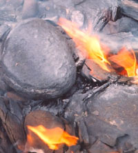
The figure is reproduced from Løseth et al (2011) according to The Geological Society of America's fair use guidelines. Thank you GSA! The flaming Kimmeridge Clay photograph is public domain. 

Please sir, may I have some processing products?

Just like your petrophysicist, your seismic processor has some awesome stuff that you want for your interpretation. She has velocities, fold maps, and loads of data. For some reason, processors almost never offer them up — you have to ask. Here is my processing product checklist:

A beautiful seismic volume to interpret. Of course you need a volume to tie to wells and pick horizons on. These days, you usually want a prestack time migration. Depth migration may or may not be something you want to pay for. But there's little point in stopping at poststack migration because if you ever want to do seismic analysis (like AVO for example), you're going to need a prestack time migration. The processor can smooth or enhance this volume if they want to (with your input, of course). 

Unfiltered, attribute-friendly data. Processors like to smooth things with filters like fxy and fk. They can make your data look nicer, and easier to pick. But they mix traces and smooth potentially important information out—they are filters after all. So always ask for the unfiltered data, and use it for attributes, especially for computing semblance and any kind of frequency-based attribute. You can always smooth the output if you want.

Limited-angle stacks. You may or may not want the migrated gathers too—sometimes these are noisy, and they can be cumbersome for non-specialists to manipulate. But limited-angle stacks are just like the full stack, except with fewer traces. If you did prestack migration they won't be expensive, get them exported while you have the processor's attention and your wallet open. Which angle ranges you ask for depends on your data and your needs, but get at least three volumes, and be careful when you get past about 35˚ of offset. 

Rich, informative headers. Ask to see the SEG-Y file header before the final files are generated. Ensure it contains all the information you need: acquisition basics, processing flow and parameters, replacement velocity, time datum, geometry details, and geographic coordinates and datums of the dataset. You will not regret this and the data loader will thank you.

Processing report. Often, they don't write this until they are finished, which is a shame. You might consider asking them to write up a shared Google Docs or a private wiki as they go. That way, you can ensure you stay engaged and informed, and can even help with the documentation. Make sure it includes all the acquisition parameters as well as all the processing decisions. Those who come after you need this information!

Parameter volumes. If you used any adaptive or spatially varying parameters, like anisotropy coefficients for example, make sure you have maps or volumes of these. Don't forget time-varying filters. Even if it was a simple function, get it exported as a volume. You can visualize it with the stacked data as part of your QC. Other parameters to ask for are offset and azimuth diversity.

Migration velocity field (get to know velocities). Ask for a SEG-Y volume, because then you can visualize it right away. It's a good idea to get the actual velocity functions as well, since they are just small text files. You may or may not use these for anything, but they can be helpful as part of an integrated velocity modeling effort, and for flagging potential overpressure. Use with care—these velocities are processing velocities, not earth measurements.

The SEG's salt model, with velocities. Image:Sandia National Labs.Surface elevation map. If you're on land, or the sea floor, this comes from the survey and should be very reliable. It's a nice thing to add to fancy 3D displays of your data. Ask for it in depth and in time. The elevations are often tucked away in the SEG-Y headers too—you may already have them.

Fold data. Ask for fold or trace density maps at important depths, or just get a cube of all the fold data. While not as illuminating as illumination maps, fold is nevertheless a useful thing to know and can help you make some nice displays. You should use this as part of your uncertainty analysis, especially if you are sending difficult interpretations on to geomodelers, for example. 

I bet I have missed something... is there anything you always ask for, or forget and then have to extract or generate yourself? What's on your checklist?

Bad Best Practice

Applied scientists get excited about Best Practice. New professionals and new hires often ask where 'the manual' is, and senior technical management or chiefs often want to see such documentation being spread and used by their staff. The problem is that the scientists in the middle strata of skill and influence think Best Practice is a difficult, perhaps even ludicrous, concept in applied geoscience. It's too interpretive, too creative.

But promoting good ideas and methods is important for continuous improvement. At the 3P Arctic Conference in Halifax last week, I saw an interesting talk about good seismic acquisiton practice in the Arctic of Canada. The presenter was Michael Enachescu of MGM Energy, well known in the industry for his intuitive and integrated approach to petroleum geoscience. He gave some problems with the term best practice, advocating instead phrases like good practice:

  • There's a strong connotation that it is definitively superlative
  • The corollary to this is that other practices are worse
  • Its existence suggests that there is an infallible authority on the subject (an expert)
  • Therefore the concept stifles innovation and even small steps towards improvement

All this is reinforced by the way Best Practice is usually written and distributed:

  • Out of frustration, a chief commissions a document
  • One or two people build a tour de force, taking 6 months to do it
  • The read-only document is published on the corporate intranet alongside other such documents
  • Its existence is announced and its digestion mandated

Unfortunately, the next part of the story is where things go wrong:

  • Professionals look at the document and find that it doesn't quite apply to their situation
  • Even if it does apply, they are slightly affronted at being told how to do their job
  • People know about it but lack the technology or motivation to change how they were already working
  • Within 3 years there is enough new business, new staff, and new technology that the document is forgotten about and obselete, until a high-up commissions a document...

So the next time you think to yourself, "We need a Best Practice for this", think about trying something different:

  • Forget top-down publishing, and instead seed editable, link-rich documents like wiki pages
  • Encourage discussion and ownership by the technical community, not by management
  • Request case studies, which emphasize practical adaptability, not theory and methodology
  • Focus first on the anti-pattern: common practice that is downright wrong

How do you spread good ideas and methods in your organization? Does it work? How would you improve it?

How to cheat at spot the difference

Yesterday I left you, dear reader, with a spot the difference puzzle. Here it is again, with my answer:

SpotTheDiff_result.png

Notice how my answer (made with GIMP) is not just a list of differences or a squiggly circle around each one. It's an exact map of the location and nature of every difference. I like the effect of seeing which 'direction' the difference goes in: blue things are in the left image but not the right. One flaw in this method is that I have reduced the image to a monochrome image; changes in colour only would not show up. 

Another way to do it, a way that would catch even a subtle colour change, is to simply difference the images. Let's look at a detail from the image—the yellow box; the difference is the centre image:

SpotDiff_More_examples.png

The right-hand image here is a further processing of the difference, using a process in ImageJ that inverts the pixels' values, making dark things bright and viceversa. This reveals a difference we would probably never have otherwise noticed: the footprint of the lossy JPEG compression kernel. Even though the two input images were compressed with 98% fidelity, we have introduced a subtle, but pervasive, artifact.

So what? Is this just an image processing gimmick? It depends how much you care about finding these differences. Not only was it easier to find all the differences this way, but now I know for certain that I have not missed any. We even see one or two very tiny differences that were surely unintentional (there's one just next to the cat's right paw). If differences (or similarities) mean a lot to you, because a medical prognosis or well location depends on their identification, the small ones might be very important!

Here's a small tutorial showing how I made the line difference, in case you are interested →

Visual crossplotting

To clarify, add detail
Edward Tufte

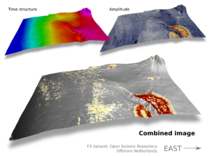
Pyroclastic flow on Nabro, Eritrea. Click for a larger image. NASA.Recently, the prolific geoblogger Brian Romans posted a pair of satellite images of a pyroclastic flow on Nabro in Eritrea. One image was in the visible spectrum, the other was a thermal image. Correlating them by looking back and forth at the images is unsatisying, so I spent 10 minutes merging the data into a single view, making the correlation immediate and intuitive. 

Maps like this are always better than abstractions of data like graphs or crossplots (or scatter plots, if you prefer). Plots get unwieldy with more than three dimensions, and there are almost always more dimensions to the data, especially in geoscience. In the image above there are at least half a dozen dimensions to the data: x and y position, elevation, slope, rugosity, vegetation (none!), heat intensity, heat distribution,... And these other dimensions, however tenuous or qualitative, might actually be important—they provide context, circumstantial evidence, if you will.

When I review papers, one of the comments I almost always make is: get all your data into one view—help your reader make the comparison. Instead of two maps showing slightly different seismic attributes, make one view and force the comparison. Be careful with colours: don't use them all up for one of the attributes, leaving nothing for the other. Using greys and blues for one leaves reds and yellows for the other. This approach is much more effective than a polygon around your anomaly, say, because then you have indelibly overlain your interpretation too early in the story: wait until you have unequivocally demonstrated the uncanny correlation.

If you're still not convinced that the richer image conveys more information, see how long it takes you to do this Spot The Difference. Come back tomorrow for the answer (and the point!)...

Creative Commons licensed image from Wikimedia Commons, work of User Muband (Japan)

GIMP is your friend!

Pair picking

Even the Lone Ranger didn't work alone all of the timeImagine that you are totally entrained in what you are doing: focused, dedicated, and productive. If you've lost track of time, you are probably feeling flow. It's an awesome experience when one person gets it, imagine the power when teams get it. Because there are so many interruptions that can cause turbulence, it can be especially difficult to establish coherent flow for the subsurface team. But if you learn how to harness and hold onto it, it's totally worth it.

Seismic interpreters can seek out flow by partnering up and practising pair picking. Having a partner in the passenger seat is not only ideal for training, but it is a superior way to get real work done. In other industries, this has become routine because it works. Software developers sometimes code in pairs, and airline pilots share control of an aircraft. When one person is in charge of the controls, the other is monitoring, reviewing, and navigating. One person for tactical jobs, one for strategic surveillance.

Here are some reasons to try pair picking:

Solve problems efficiently — If you routinely have an affiliate, you will have someone to talk to when you run into a challenging problem. Mundane or sticky workarounds become less tenuous when you have a partner. You'll adopt more sensible solutions to your fit-for-purpose hacks.

Integrate smoothly — There's a time for hand-over, and there will be times when you must call upon other people's previous work to get your job done. 'No! Don't use Top_Cretaceous_candidate_final... use Evan_K_temp_DO-NOT-USE.' Pairing with the predecessors and successors of your role will get you better-aligned.

Minimize interruptionitis — if you have to run to a meeting, or the phone rings, your partner can keep plugging away. When you return you will quickly rejoin. It is best to get into a visualization room, or some other distraction-free room with a large screen, so as to keep your attention and minimize the effect of interruptions.

Mutual accountability — build allies based on science, technology, and critical thinking, not gossip or politics. Your team will have no one to blame, and you'll feel more connected around the office. Is knowledge hoarded and privileged or is it open and shared? If you pick in pairs, there is always someone who can vouch for your actions.

Mentoring and training — by pair picking, newcomers quickly get to watch the flow of work, not just a schematic flow-chart. Instead of just an end-product, they see the clicks, the indecision, the iteration, and the pace at which tasks unfold.

Practicing pair picking is not just about sharing tasks, it is about channeling our natural social energies in the pursuit of excellence. It may not be practical all of the time, and it may make you feel vulnerable, but pairing up for seismic interpretation might bring more flow to your workflow.

If you give it a try, please let us know how it goes!

E is for Envelope 2

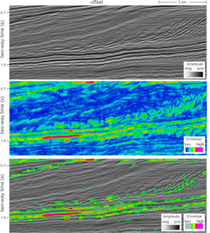
This seismic profile offshore Netherlands is shown three ways to illustrate the relationship between amplitude and envelope, which we introduced yesterday. 

The first panel consists of seismic amplitude values, the second panel is the envelope, and the third panel is a combination of the two (co-rendered with transparency). I have given them different color scales because amplitude values oscillate about zero and envelope values are always positive.

The envelope might be helpful in this case for simplifying the geology at the base of the clinoforms, but doesn't seem to provide any detail along the high relief slopes.

It also enhances the bright spot in the toesets of the clinoforms, but, more subtly, it suggests that there are 3 key interfaces, out of a series of about 10 peaks and troughs. Used in this way, it may help the interpreter decide which reflections are important, and which reflections are noise (sidelobe).

Another utility of envelope is that it is independent of phase. If the maximum on the envelope does not correspond to a peak or trough on the seismic amplitudes, the seismic amplitudes may not be zero phase. In environments where phase is wandering, either pre-stack or post-stack domain, the envelope attribute is a handy accompaniment to constrain reflection picking or AVO analyses: envelope vs offset, or EVO. It also makes me wonder if adding envelopes to the modeling of synthetic seismiograms might yield better well ties?

Rock physics cheatsheet

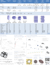
Today, I introduce to you the rock physics cheatsheet. It contains useful information for people working on problems in seismic rock physics, inversion, and the mechanical properties of rocks. Admittedly, there are several equations, but I hope they are laid out in a simple and systematic way. This cheatsheet is the third instalment, following up from the geophysics cheatsheet and basic cheatsheet we posted earlier. 

To me, rock physics is the crucial link between earth science and engineering applications, and between reservoir properties and seismic signals. Rocks are, in fact, a lot like springs. Their intrinsic elastic parameters are what control the extrinsic seismic attributes that we collect using seismic waves. With this cheatsheet in hand you will be able to model fluid depletion in a time-lapse sense, and be able to explain to somebody that Young's modulus and brittleness are not the same thing.

So now with 3 cheatsheets at your fingertips, and only two spaces on the inside covers of you notebooks, you've got some rearranging to do! It's impossible to fit the world of seismic rock physics on a single page, so if you feel something is missing or want to discuss anything on this sheet, please leave a comment.

Click to download the PDF (1.5MB)

The Agile* interpreter's canon

There are only two types of interpretation: those that have been revised and those that need to be.
Don Herron

As Matt mentioned before, we have been forming a concept we call agile interpretation.

Perhaps the essence of the adage "seismic interpretation is an art" suggests that there shouldn't really be a hard and fast set of rules; but having no rules begets chaos and stagnation. We think seismic interpretation is a craft. As with any craft, harnessing skill and creativity enable richer and more meaningful results. Working within a framework of principles allows one's art to flourish; paint not only with brighter, more appealing colors, but with more tailored technique for putting brush to canvas.

We have created this one-page guide as reference for seismic interpreters. Pull it out before starting, a few times in the middle, and then as a checklist or summary nearing completion of your project. We hope it's valuable for the newbie, for sorting out a plan of attack, and for seasoned veterans, to refresh work-worn concepts and tools.

We're looking to get consensus here on the things people actually do when they interpret seismic; this is very much a straw man. Maybe you have adopted some tricks that aren't obivous to the rest of us. Please leave a message in the comments section of this entry if you have any tips that would improve this handout.

Happy interpreting!

Geophysics cheatsheet

A couple of weeks ago I posted the first cheatsheet, with some basic science tables and reminders. The idea is that you print it out, stick it in the back of your notebook, and look like a genius and/or smart alec next time you're in a meeting and someone asks, "How long was the Palaeogene?" (21 Ma) or "Is the P50 the same as the Most Likely? I can never remember," (no, it's not).

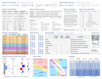
Today I present the next instalment: a geophysics cheatsheet. It contains mostly basic stuff, and is aimed at the interpreter rather than the weathered processor or number-crunching seismic analyst. I have included Shuey's linear approximation of the Zoeppritz equations; it forms the basis for many simple amplitude versus offset (AVO) analyses. But there's also the Aki–Richards equation, which is often used in more advanced pre-stack AVO analysis. There are some reminders of typical rock properties, modes of seismic multiples, and seismic polarity. 

As before, if there's anything you think I've messed up, or wrongly omitted, please leave a comment. We will be doing more of these, on topics like rock physics, core description, and log analysis. Further suggestions are welcome!

Click to download the PDF (1.6MB)