The road to Modelr: my EuroSciPy poster

At EuroSciPy recently, I gave a poster-ized version of the talk I did at SciPy. Unlike most of the other presentations at EuroSciPy, my poster didn't cover a lot of the science (which is well understood), or the code (which is esoteric).

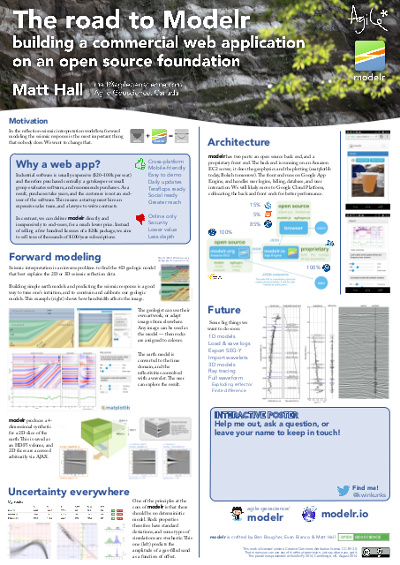
Instead it focused on the advantages of spreading software via web applications, rather than only via source code, and on the challenges that we overcame — well, that we're still overcoming — to get our Modelr tool out there. I wanted other programmer-scientists to think about running some of their code as a web app for others to enjoy, but to be aware of the effort involved in doing this.

I've written before about my dislike of posters, though I'm told they are an important component at, say, the AGU Fall Meeting. I admit I do quite like the process of making them, and — on advice from Colin Purrington's useful page — I left a space on the poster for people to write comments or leave sticky notes. As a result, I heard about Docker, a lead I'll certainly follow up,

What's new in modelr

This wasn't part of the poster, but I might as well take the chance to let you know what we've updated recently:

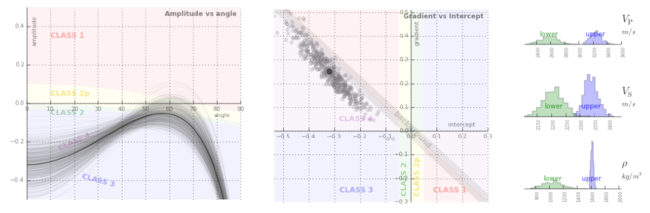
  • You can now add noise to models by specifying the signal:noise.
  • Instead of automatic scaling, you can choose your own gain.
  • The app now returns the elastic moduli of the rocks in the model.
  • You can choose a spatial cross-section view or a space–offset–frequency view.

All of these features are now available to subscribers for only $9/month. Amazing value :)

Figshare

I've stored my poster on Figshare, a data storage site and part of Macmillan's Digital Science effort. What I love about Figshare, apart from the convenience of cloud-based storage and easy access for others, is that every item gets a digital object identifier or DOI. You've probably seen these on journal articles. They're a bit like other persistent and unique IDs for publications, such as ISBNs for books, but the idea is to provide more interactivity by making it easily linkable: you can get to any object with a DOI by prepending it with "http://dx.doi.org/".

Reference

Hall, M (2014). The road to modelr: building a commercial web app on an open source foundation. EuroSciPy, Cambridge, UK, August 29–30, 2014. Poster presentation. DOI:10.6084/m9.figshare.1151653

Julia in a nutshell

Julia is the most talked-about language in the scientific Python community. Well, OK, maybe second to Python... but only just. I noticed this at SciPy in July, and again at EuroSciPy last weekend.

As promised, here's my attempt to explain why scientists are so excited about it.

Why is everyone so interested in Julia?

At some high level, Julia seems to solve what Steven Johnson (MIT) described at EuroSciPy on Friday as 'the two-language problem'. It's also known as Outerhout's dichotomy. Basically, there are system languages (hard to use, fast), and scripting languages (easy to use, slow). Attempts to get the best of boths worlds have tended to result in a bit of a mess. Until Julia.

Really though, why?

Cheap speed. Computer scientists adore C because it's rigorous and fast. Scientists and web developers worship Python because it's forgiving and usually fast enough. But the trade-off has led to various cunning ploys to get the best of both worlds, e.g. PyPy and Cython. Julia is perhaps the cunningest ploy of all, achieving speeds that compare with C, but with readable code, dynamic typing, garbage collection, multiple dispatch, and some really cool tricks like Unicode variable names that you enter in pure LaTeX. And check out this function definition shorthand:

Why is Julia so fast?

Machines don't understand programming languages — the code written by humans has to be translated into machine language in a process called 'compiling'. There are three approaches:

Compiling makes languages fast, because the executed code is tuned to the task (e.g. in terms of the types of variables it handles), and to the hardware it's running on. Indeed, it's only by building special code for, say, integers, that compiled languages achieve the speeds they do.

Julia is compiled, like C or Fortran, so it's fast. However, unlike C and Fortran, which are compiled before execution, Julia is compiled at runtime ('just in time' for execution). So it looks a little like an interpreted language: you can write a script, hit 'run' and it just works, just like you can with Python.

You can even see what the generated machine code looks like:

Don't worry, I can't read it either.

But how is it still dynamically typed?

Because the compiler can only build machine code for specific types — integers, floats, and so on — most compiled languages have static typing. The upshot of this is that the programmer has to declare the type of each variable, making the code rather brittle. Compared to dynamically typed languages like Python, in which any variable can be any type at any time, this makes coding a bit... tricky. (A computer scientist might say it's supposed to be tricky — you should know the type of everything — but we're just trying to get some science done.)

So how does Julia cope with dynamic typing and still compile everything before execution? This is the clever bit: Julia scans the instructions and compiles for the types it finds — a process called type inference — then makes the bytecode, and caches it. If you then call the same instructions but with a different type, Julia recompiles for that type, and caches the new bytecode in another location. Subsequent runs use the appropriate bytecode, with recompilation.

Metaprogramming

It gets better. By employing metaprogramming — on-the-fly code generation for special tasks — it's possible for Julia to be even faster than highly optimized Fortran code (right), in which metaprogramming is unpleasantly difficult. So, for example, in Fortran one might tolerate a relatively slow loop that can only be avoided with code generation tricks; in Julia the faster route is much easier. Here's Steven's example.

Interoperability and parallelism

It gets even better. Julia has been built with interoperability in mind, so calling C — or Python — from inside Julia is easy. Projects like Jupyter will only push this further, and I expect Julia to soon be the friendiest way to speed up that stubborn inner NumPy loop. And I'm told a lot of thoughtful design has gone into Julia's parallel processing libraries... I have never found an easy way into that world, so I hope it's true.


I'm not even close to being able to describe all the other cool things Julia, which is still a young language, can do. Much of it will only be of interest to 'real' programmers. In many ways, Julia seems to be 'Python for C programmers'.

If you're really interested, read Steven's slides and especially his notebooks. Better yet, just install Julia and IJulia, and play around. Here's another tutorial and a cheatsheet to get you started.

Highlights from EuroSciPy

In July, Agile reported from SciPy in Austin, Texas, one of several annual conferences for people writing scientific software in the Python programming language. I liked it so much I was hungry for more, so at the end of my recent trip to Europe I traveled to the city of Cambridge, UK, to participate in EuroSciPy.

The conference was quite a bit smaller than its US parent, but still offered 2 days of tutorials, 2 days of tech talks, and a day of sprints. It all took place in the impressive William Gates Building, just west of the beautiful late Medieval city centre, and just east of Schlumberger's cool-looking research centre. What follows are my highlights...

Okay you win, Julia

Steven Johnson, an applied mathematician at MIT, gave the keynote on the first morning. His focus was Julia, the current darling of the scientific computing community, and part of a new ecosystem of languages that seek to cooperate, not compete. I'd been sort of ignoring Julia, in the hope that it might go away and let me focus on Python, the world's most useful language, and JavaScript, the world's most useful pidgin... but I don't think scientists can ignore Julia much longer.

I started writing about what makes Julia so interesting, but it turned into another post — up next. Spoiler: it's speed. [Edit: Here is that post! Julia in a nutshell.]

Learning from astrophysics

The Astropy project is a truly inspiring community — in just 2 years it has synthesized a dozen or so disparate astronomy libraries into an increasingly coherent and robust toolbox for astronomers and atrophysicists. What does this mean?

  • The software is well-tested and reliable.
  • Datatypes and coordinate systems are rich and consistent.
  • Documentation is useful and evenly distributed.
  • There is a tangible project to rally developers and coordinate funding.

Geophysicists might even be interested in some of the components of Astropy and the related SunPy project, for example:

  • astropy.units, just part of the ever-growing astropy library, as a unit conversion and quantity handler to compare with pint.
  • sunpy datatypes map and spectra for types of data that need special methods.
  • asv is a code-agnostic benchmarking library, a bit like freebench.

Speed dating for scientists

Much of my work is about connecting geoscientists in meaningful collaboration. There are several ways to achieve this, other than through project work: unsessions, wikis, hackathons, and so on. Now there's another way: speed dating.

Okay, it doesn't quite get to the collaboration stage, but Vaggi and his co-authors shared an ingenious way to connect people and give their professional relationship the best chance of success (an amazing insight, a new algorithm, or some software). They asked everyone at a small 40-person conference to complete a questionnaire that asked, among other things, what they knew about, who they knew, and, crucially, what they wanted to know about. Then they applied graph theory to find the most desired new connections (the matrix shows the degree of similarity of interests, red is high), and gave the scientists five 10-minute 'dates' with scientists whose interests overlapped with theirs, and five more with scientists who knew about fields that were new to them. Brilliant! We have to try this at SEG.

Vaggi, F, T Schiavinotto, A Csikasz-Nagy, and R Carazo-Salas (2014). Mixing scientists at conferences using speed dating. Poster presentation at EuroSciPy, Cambridge, UK, August 2014. Code on GitHub.

Vaggi, F, T Schiavinotto, J Lawson, A Chessel, J Dodgson, M Geymonat, M Sato, R Carazo Salas, A Csikasz Nagy (2014). A network approach to mixing delegates at meetings. eLife, 3. DOI: 10.7554/eLife.02273

Other highlights

  • sumatra to generate and keep track of simulations.
  • vispy, an OpenGL-based visualization library, now has higher-level, more Pythonic components.
  • Ian Osvald's IPython add-on for RAM usage.
  • imageio for lightweight I/O of image files.
  • nbagg backend for matplotlib version 1.4, bringin native (non-JS) interactivity.
  • An on-the-fly kernel chooser in upcoming IPython 3 (currently in dev).

All in all, the technical program was a great couple of days, filled with the usual note-taking and hand-shaking. I had some good conversations around my poster on modelr. I got a quick tour of the University of Cambridge geophysics department (thanks to @lizzieday), which made me a little nostalgic for British academic institutions. A fun week!

Burrowing by burning

Most kind of mining are low-yield games. For example, the world's annual gold production would fit in a 55 m2 room. But few mining operations I'm aware of are as low yield as the one that ran in Melle, France, from about 500 till 950 CE, producing silver for the Carolingian empire and Charlemagne's coins. I visited the site on Saturday.

The tour made it clear just how hard humans had to work to bring about commerce and industry in the Middle Ages. For a start, of course they had no machines, just picks and shovels. But the Middle Jurassic limestone is silicic and very hard, so to weaken the rock they set fires against the face and thermally shocked the rock to bits. The technique, called fire-setting, was common in the Middle Ages, and was described in detail by Georgius Agricola in his book De Re Metallica (right; aside: the best translation of this book is by Herbert Hoover!). Apart from being stupefyingly dangerous, the method is slow: each fire got the miners about 4 cm further into the earth. Incredibly, they excavated about 20 km of galleries this way, all within a few metres of the surface.

The fires were set against the walls and fuelled with wood, mostly beech. Recent experiments have found that one tonne of wood yielded about one tonne of rock. Since a tonne of rock yields 5 kg of galena, and this in turn yields 10 g of silver, we see that producing 1.1 tonnes of silver per year — enough for 640,000 deniers — was quite a feat!

There are several limits to such a resource intensive operation: wood, distance from face to works, maintenance, and willing human labour, not to mention the usual geological constraints. It is thought that, in the end, operations ended due to a shortage of wood.

Several archaeologists visit the site regularly (here's one geospatial paper I found mentioning the site: Arles et al. 2013), and the evidence of their attempts to reproduce the primitive metallurgical methods were on display. Here's my attempt to label everything, based on what I could glean from the tour guide's rapid French:

The image of the denier coin is licensed CC-BY-SA by Wikipedia user Lequenne Gwendoline

The hack is back: An invitation to get creative

We're organizing another hackathon! It's free, and it's for everyone — not just programmers. So mark your calendar for the weekend of 25 and 26 October, sign up with a friend, and come to Denver for the most creative 48 hours you'll spend this year. Then stay for the annual geophysics fest that is the SEG Annual Meeting!

First things first: what is a hackathon? Don't worry, it's not illegal, and it has nothing to do with security. It has to do with ideas and collaborative tool creation. Here's a definition from Wikipedia:

A hackathon (also known as a hack day, hackfest, or codefest) is an event in which computer programmers and others involved in software development, including graphic designers, interface designers and project managers, collaborate intensively on software projects.

I would add that we just need a lot of scientists — you can bring your knowledge of workflows, attributes, wave theory, or rock physics. We need all of that.

Creativity in geophysics

The best thing we can do with our skills — and to acquire new ones — is create things. And if we create things with and alongside others, we learn from them and they learn from us, and we make lasting connections with people. We saw all this last year, when we built several new geophysics apps:

hackathon_2014_calendar.png

The event is at the THRIVE coworking space in downtown Denver, less than 20 minutes' walk from the convention centre — a Manhattan distance of under 1 mile. They are opening up especially for us — so we'll have the place to ourselves. Just us, our laptops, high-speed WiFi, and lots of tacos. 

Sign up here.It's going to be awesome.

The best in the biz

GeoTeric_logo.jpg

This business is blessed with some forward-looking companies that know all about innovation in subsurface geoscience. We're thrilled to have some of them as sponsors of our event, and I hope they will also be providing coders and judges for the event itself. So far we have generous support from dGB — creators of the OpendTect seismic interpretation platform — and ffA — creators the GeoTeric seismic attribute analysis toolbox. A massive Thank You to them both.

If you think your organization might be up for supporting the event, please get in touch! And remember, a fantastic way to support the event — for free! — is just to come along and take part. Sign your team up here!

Student grants

We know there's a lot going on at SEG on this same weekend, and we know it's easier to get money for traditional things like courses. So... We promise that this hackathon will bring you at least as much lasting joy, insight, and skill development as any course. And, if you'll write and tell us what you'd build, we'll consider you for one of four special grants of $250 to help cover your extra costs. No strings. Send your ideas to matt@agilegeoscience.com.

Update

on 2014-09-07 12:17 by Matt Hall

OpenGeoSolutions, the Calgary-based tech company that's carrying the FreeUSP torch and exporing the frequency domain so thoroughly, has sponsred the hackathon again this year. Thank you to Jamie and Chris and everyone else at OGS!

At home with Leonardo

Well, OK, Leonardo da Vinci wasn't actually there, having been dead 495 years, but on Tuesday morning I visited the house at which he spent the last three years of his life. I say house, it's more of a mansion — the Château du Clos Lucé is a large 15th century manoir near the centre of the small market town of Amboise in the Loire valley of northern France. The town was once the royal seat of France, and the medieval grandeur still shows. 

Leonardo was invited to France by King Francis I in 1516. Da Vinci had already served the French governor of Milan, and was feeling squeezed from Rome by upstarts Rafael and Michelangelo. It's nice to imagine that Frank appreciated Leo's intellect and creativity — he sort of collected artists and writers — but let's face it, it was probably the Italian's remarkable capacity for dreaming up war machines, a skill he had honed in the service of mercenary and cardinal Cesare Borgia. Leonardo especially seemed to like guns; here are models of a machine gun and a tank, alongside more peaceful concoctions:

Inspired by José Carcione's assertion that Leonardo was a geophysicst, and plenty of references to fossils (even Palaeodictyon) in his notebooks, I scoured the place for signs of Leonardo dablling in geology or geophysics, but to no avail. The partly-restored Renaissance floor tiles did have some inspiring textures and lots of crinoid fossils... I wonder if he noticed them as he shuffled around?

If you are ever in the area, I strongly recommend a visit. Even my kids (10, 6, and 4) enjoyed it, and it's close to some other worthy spots., specifically Chenonceau (for anyone) and Cheverny (for Tintin fans like me). The house, the numerous models, and the garden (below — complete with tasteful reproductions from Leonardo's works) were all terrific.

Check out José Carcione's two chapters about Leonardo and
his work in 52 Things You Should Know About Geophysics.
Download the chapter for free! [PDF, 3.8MB]

What I learned at Wikimania

As you may know, I like going to conferences outside the usual subsurface circuit. For this year's amusement, I spent part of last week at the annual Wikimania conference, which this year was in London, UK. I've been to Wikimania before, but this year the conference promised to be bigger and/or better than ever. And I was looking for an excuse to visit the motherland...

What is Wikimania?

Wikipedia, one of humanity's greatest achievements, has lots of moving parts:

  • All the amazing content on Wikipedia.org — the best encyclopedia the world has ever seen (according to a recent study by Rodrigues and Silvério).
  • The huge, diverse, distributed community of contributors and editors that writes and maintains the content.
  • The free, open source software it runs on, MediaWiki, and the community of developers that built it.
  • The family of sister projects: Wikimedia Commons for images, Wikidata for facts, WikiSource for references, Wiktionary for definitions, and several others.
  • The Wikimedia Foundation, the non-profit that makes all this amazing stuff happen.

Wikimania is the gathering for all of these pieces. And this year the event drew over 2000 employees of the Foundation, software contributors, editors, and consultants like me. I can't summarize it all, so here are a few highlights...

Research reviews

My favourite session, The state of WikiMedia scholarship, was hosted by Benjamin Mako Hill, Tilman Bayer, and Aaron Shaw. These guys are academics conducting research into the sociological side of wikis. They took it upon themselves to survey most of the 800 papers that appeared in the last 12 months, and to pick a few themes and highlights them for everyone. A little like the Geophysics Bright Spots column in The Leading Edge, but for the entire discipline. Very cool — definitely an idea to borrow!

A definition of community

Communities are one thing, but what sets the Wikimania community apart is its massive productivity. It has created one of the premier intellectual works in history, and done so in under 10 years, and without a leader or a Gantt chart. So it's interesting to hear about what makes this community work. What would you guess? Alignment? Collaboration? Altruism?

No, it seems to be conflict. Conflict, centered firmly on content—specifically sources, wording, accuracy, and article structure—is more prevalent in the community than collaboration (Kim Osman, WikiSym 2013). It's called it 'generative friction', and it underlines something I think is intuitively obvious: communities thrive on diversity, not homogeneity.

How to make a difference

The most striking talk, illustrating perfectly how the world today is a new and wonderful place, was by one of the most inspiring leaders I've ever seen in action: Clare Sutcliffe. In 2012, she discovered that kids weren't getting a chance to give computers instructions (other than 'post this', or 'buy that') in most UK primary schools. Instead of writing a paper about it, or setting up a research institute, or indeed blogging about it, she immediately started doing something about it. Her program, Code Club, is now running in more than 2000 schools. Today, less than 3 years after starting, Code Club is teaching teachers too, and has spread internationally. Amazing and inspiring.

Amusingly, here's a (paraphrased) comment she got from a computer science professor at the end:

I teach computer science at university, where we have to get the kids to unlearn all the stuff they think they know about programming. What are you teaching them about computer science and ethics, or is it all about making games?

Some people are beyond help.

The product is not the goal

I'll finish off with a remark by the new Executive Director of the WikiMedia Foundation, Lila Tretikov. Now that Wikipedia's quality issues are well and truly behind it — the enemy now is bias. At least 87% of edits are by men. She wondered if it might be time to change the goal of the community from 'the greatest possible article', to 'the greatest possible participation'. By definition, the greatest article is also presumably unbiased.

In other words, instead of imagining a world where everyone has free access to the sum of all human knowledge, she is asking us to imagine a world where everyone contributes to the sum of all human knowledge. If you can think of a more profound idea than this — let's hear it in the comments!

The next Wikimania will be in Mexico City, in July 2015. See you there!

Here's a thought. All this stuff is free — yay! But happy thoughts aren't enough to get stuff done. So if you value this corner of the Internet, please consider donating to the Foundation. Better still, if your company values it — maybe it uses the MediaWiki software for its own wiki — then it can help with the software's development by donating. Instead of giving Microsoft $1M for a rubbish SharePoint pseudowiki, download MediaWiki for free and donate $250k to the foundation. It's a win-win... and it's tax-deductible!

The Blangy equation

After reading Chris Liner's recent writings on attenuation and negative Q — both in The Leading Edge and on his blog — I've been reading up a bit on anisotropy. The idea was to stumble a little closer to writing the long-awaited Q is for Q post in our A to Z series. As usual, I got distracted...

In his 1994 paper AVO in tranversely isotropic media—An overview, Blangy (now the chief geophysicist at Hess) answered a simple question: How does anisotropy affect AVO? Stigler's law notwithstanding, I'm calling his solution the Blangy equation. The answer turns out to be: quite a bit, especially if impedance contrasts are low. In particular, Thomsen's parameter δ affects the AVO response at all offsets (except zero of course), while ε is relatively negligible up to about 30°.

The key figure is Figure 2. Part (a) shows isotropic vs anisotropic Type I, Type II, and Type III responses:

Unpeeling the equation

Converting the published equation to Python was straightforward (well, once Evan pointed out a typo — yay editors!). Here's a snippet, with the output (here's all of it):

For the plot below, I computed the terms of the equation separately for the Type II case. This way we can see the relative contributions of the terms. Note that the 3-term solution is equivalent to the Aki–Richards equation.

Interestingly, the 5-term result is almost the same as the 2-term approximation.

Reproducible results

One of the other nice features of this paper — and the thing that makes it reproducible — is the unambiguous display of the data used in the models. Often, this sort of thing is buried in the text, or not available at all. A table makes it clear:

Last thought: is it just me, or is it mind-blowing that this paper is now over 20 years old?

Reference

Blangy, JP (1994). AVO in tranversely isotropic media—An overview. Geophysics 59 (5), 775–781.

Don't miss the IPython Notebook that goes with this post.

July linkfest

It's linkfest time again. All the links, in one handy post.

First up — I've seen some remarkable scientific visualizations recently. For example, giant ocean vortices spiralling across the globe (shame about the rainbow colourbar though). Or the trillion-particle Dark Sky Simulation images we saw at SciPy. Or this wonderful (real, not simulated) video by the Perron Group at MIT:

Staying with visuals, I highly recommend reading anything by Mike Bostock, especially if you're into web technology. The inventor of D3.js, a popular data viz library, here's his exploration of algorithms, from sampling to sorting. It's more conceptual than straight up visualization of data, but no less insightful. 

And I recently read about some visual goodness combined with one of my favourite subjects, openness. Peter Falkingham, a palaeontologist at the Royal Vetinary College and Brown University, has made a collection of 3D photographs of modern tracks and traces available to the world. He knows his data is more impactful when others can use it too.

Derald Smith and sedimentology

From Smith et al. (2009) in SEPM Special Publication No. 97.The geological world was darkened by the death of Derald Smith on 18 June. I met Derald a few times in connection with working on the McMurray Formation of Alberta, Canada during my time at ConocoPhillips. We spent an afternoon examining core and seismic data, and speculating about counter-point-bars, a specialty of his. He was an intuitive sedimentologist whose contributions will be remembered for many years.

Another geological Smith is being celebrated in September at the Geological Society of London's annual William Smith Meeting. The topic this year is The Future of Sequence Stratigraphy: Evolution or Revolution? Honestly, my first thought was "hasn't that conversation been going on since 1994?", but on closer inspection, it promises to be an interesting two days on 'source-to-sink', 'landscape into rock', and some other recent ideas.

The issue of patents reared up in June when Elon Musk of Tesla Motors announced the relaxation of their patents — essentially a promise not to sue anyone using one of their patented technology. He realizes that a world where lots of companies make electric vehicles is better for Tesla. I wrote a piece about patents in our industry.

Technology roundup

A few things that caught our eye online:

Last thing: did you know that the unit of acoustic impedance is the Rayl? Me neither. 


Previous linkfests: AprilJanuaryOctober.

The figure is from Smith et al. (2009), Stratigraphy of counter-point-bar and eddy accretion deposits in low-energy meander belts of the Peace–Athabasca delta, northeast Alberta, Canada. In: SEPM Special Publication No. 97, ISBN 978-1-56576-305-0, p. 143–152. It is copyright of SEPM, and used here in accordance with their terms.

Graphics that repay careful study

The Visual Display of Quantitative Information by Edward Tufte (2nd ed., Graphics Press, 2001) celebrates communication through data graphics. The book provides a vocabulary and practical theory for data graphics, and Tufte pulls no punches — he suggests why some graphics are better than others, and even condemns failed ones as lost opportunities. The book outlines empirical measures of graphical performance, and describes the pursuit of graphic-making as one of sequential improvement through revision and editing. I see this book as a sort of moral authority on visualization, and as the reference book for developing graphical taste.

Through design, the graphic artist allows the viewer to enter into a transaction with the data. High performance graphics, according to Tufte, 'repay careful study'. They support discovery, probing questions, and a deeper narrative. These kinds of graphics take a lot of work, but they do a lot of work in return. In later books Tufte writes, 'To clarify, add detail.'

A stochastic AVO crossplot

Consider this graphic from the stochastic AVO modeling section of modelr. Its elements are constructed with code, and since it is a program, it is completely reproducible.

Let's dissect some of the conceptual high points. This graphic shows all the data simultaneously across 3 domains, one in each panel. The data points are sampled from probability density estimates of the physical model. It is a large dataset from many calculations of angle-dependent reflectivity at an interface. The data is revealed with a semi-transparent overlay, so that areas of certainty are visually opaque, and areas of uncertainty are harder to see.

At the same time, you can still see every data point that makes the graphic giving a broad overview (the range and additive intensity of the lines and points) as well as the finer structure. We place the two modeled dimensions with templates in the background, alongside the physical model histograms. We can see, for instance, how likely we are to see a phase reversal, or a Class 3 response subject to the physical probability estimates. The statistical and site-specific nature of subsurface modeling is represented in spirit. All the data has context, and all the data has uncertainty.

Rules for graphics that work

Tufte summarizes that excellent data graphics should:

  • Show all the data.
  • Provoke the viewer into thinking about meaning.
  • Avoid distorting what the data have to say.
  • Present many numbers in a small space.
  • Make large data sets coherent.
  • Encourage the eye to compare different pieces of the data.
  • Reveal the data at several levels of detail, from a broad overview to the fine structure.
  • Serve a reasonably clear purpose: description, exploration, tabulation, or decoration.
  • Be closely integrated with the statistical and verbal descriptions of a data set.

The data density, or data-to-ink ratio, looks reasonably high in my crossplot, but it could like still be optimized. What would you remove? What would you add? What elements need revision?