10 ways to improve your data store

When I look at the industry's struggle with the data mess, I see a parallel with science's struggle with open data. I've written lots about that before, but the basic idea is simple: scientists need discoverable, accessible, documented, usable data. Does that sound familiar?

I wrote yesterday that I think we have to get away from the idea that we can manage data like we might manage a production line. Instead, we need to think about more organic, flexible strategies that cope with and even thrive on chaos. I like, or liked until yesterday, the word 'curation', because it implies ongoing care and a focus on the future. But my friend Eric Marchand was right in his comment yesterday — the dusty connotation is too strong, and dust is bad for data. I like his supermarket analogy: packaged, categorized items, each with a cost of production and a price. A more lively, slightly chaotic market might match my vision better — multiple vendors maintaining their own realms. One can get carried away with analogies, but I like this better than a library or museum.

The good news is that lots of energetic and cunning people have been working on this idea of open data markets. So there are plenty of strategies we can try, alongside the current strategy of giving giant service companies millions of dollars for their TechCloud® Integrated ProSIGHT™ Data Management Solutions.

Serve your customer:

  • Above all else, build what people need. It's amazing that this needs to be said, but ask almost anyone what they think of IT at their company and you will know that it is not how it works today. Everything you build should be in response to the business pulling. 
  • This means you have to get out of the building and talk to your customers. In person, one-one-one. Watch them use your systems. Listen to them. Respond to them. 

Knock down the data walls:

  • Learn and implement open data practices inside the organization. Focus on discoverability, accessiblity, documentation of good-enough data, not on building The One True Database. 
  • Encourage and fund open data practices among providers of public data. There is a big role here for our technical societies, I believe, but I don't think they have seen it yet.

I've said it before: hire loads of geeks:

  • The web (well, intranet) is your pipeline. Build and maintain proper machine interfaces (APIs and web APIs) for data. What, you don't know how to do this? I know; it means hiring web-savvy data-obsessed programmers.
  • Bring back the hacker technologists that I think I remember from the nineties. Maybe it's a myth memory, but sprinkled around big companies there used to be super-geeks with degrees in astrophysics, mad UNIX skills, and the Oracle admin password. Now it's all data managers with Petroleum Technology certificates who couldn't write an awk script if your data depended on it (it does). 
  • Institute proper data wrangling and analysis training for scientists. I think this is pretty urgent. Anecdotal evidence: the top data integration tools in our business is PowerPoint... or an Excel chart with two y-axes if we're talking about engineers. (What does E&P mean?)

Three more things:

  • Let data live where it wants to live (databases, spreadsheets, wikis, SharePoint if you must). Focus on connecting data with APIs and data translators. It's pointless trying to move data to where you want it to be — you're just making it worse. ("Oh, you moved my spreadsheet? Fine, I will copy my spreadsheet.")
  • Get out of the company and find out what other people are doing. Not the other industry people struggling with data — they are just as clueless as we are. Find out what the people who are doing amazing things with data are doing: Google, Twitter, Facebook, data.gov, Wikipedia, Digital Science, The New York Times, The Guardian,... there are so many to choose from. We should invite these people to our conferences; they can help us.
  • If you only do one thing, fix search in your company. Stop tinkering with semantic ontologies and smart catalogs, just buy Google Search Appliance and fix it. You can get this one done by Christmas.

Last thing. If there's one mindset that will really get in the way, it's the project mindset. If we want to go beyond coping with the data mess, far beyond it to thriving on it, then we have to get comfortable with the idea that this is not a project. The word is banned, along with 'initiative', 'governance', and Gantt charts. The requirements you write on the back of a napkin with three colleagues will be just as useful as the ones you get back from three months of focus groups.

No, this is the rest of your career. This is never done, next year there are better ideas, more flexible libraries, faster hardware, and new needs. It's like getting fit: this ain't an 8-week get-fit program, it's an eternity of crunches.

The photograph of Covent Market in London, Ontario is from Boris Kasimov on Flickr.

Data management fairy tales

On Tuesday I read this refreshing post in LinkedIn by Jeffrey Maskell of Westheimer Energy Consultants. It's a pretty damning assessment of the current state of data management in the petroleum industry:

The fact is that no major technology advances have been seen in the DM sector for some 20 years. The [data management] gap between acquisition and processing/interpretation is now a void and is impacting the industry across the board...

I agree with him. But I don't think he goes far enough on the subject of what we should do about it. Maskell is, I believe, advocating more effort (and more budget) developing what the data management crowd have been pushing for years. In a nutshell:

I agree that standards, process, procedures, workflows, data models are all important; I also agree that DM certification is a long term desirable outcome. 

These words make me sad. I'd go so far as to say that it's the pursuit of these mythical ideas that's brought about today's pitiful scene. If you need proof, just look around you. Go look at your shared drive. Go ask someone for a well file. Go and (a) find then (b) read your IT policies and workflow documents — they're all fairy tales.

Maskell acknowledges at least that these are not enough; he goes on:

However I believe the KEY to achieving a breakthrough is to prove positively that data management can make a difference and that the cost of good quality data management is but a very small price to pay...

No, the key to achieving a breakthrough is a change of plan. Another value of information study just adds to the misery.

Here's what I think: 'data management' is an impossible fiction. A fairy tale.

You can't manage data

I'm talking to you, big-company-data-management-person.

Data is a mess, and it's distributed across your organization (and your partners, and your government, and your data vendors), and it's full of inconsistencies, and people store local copies of everything because of your broken SharePoint permissions, and... data is a mess.

The terrible truth you're fighting is that subsurface data wants to be a mess. Subsurface geoscience is not accounting. It's multi-dimensional. It's interdependent. Some of it is analog. There are dozens, maybe hundreds of formats, many of which are proprietary. Every single thing is unquantifiably uncertain. There are dozens of units. Interpretation generates more data, often iteratively. Your organization won't fund anything to do with IT properly — "We're an oil company, not a technology company!" — but it's OK because VPs only last 2 years. Well, subsurface facts last for decades.

You can't manage data. Try something else.

The principle here is: cope don't fix.

People earnestly trying to manage data reminds me of Yahoo trying to catalog the Internet in 1995. Bizarrely, they're still doing it... for 3 more months anyway. But we all know there's only one way to find things on the web today: search. Search transcends the catalog. 

So what transcends data management? I've got my own ideas, but first I really, really want to know what you think. What's one thing we could do — or stop doing — to make things a bit better?

Slicing seismic arrays

Scientific computing is largely made up of doing linear algebra on matrices, and then visualizing those matrices for their patterns and signals. It's a fundamental concept, and there is no better example than a 3D seismic volume.

Seeing in geoscience, literally

Digital seismic data is nothing but an array of numbers, decorated with header information, sorted and processed along different dimensions depending on the application.

In Python, you can index into any sequence, whether it be a string, list, or array of numbers. For example, we can index into the fourth character (counting from 0) of the word 'geoscience' to select the letter 's':

>>> word = 'geosciences'
>>> word[3]
's'

Or, we can slice the string with the syntax word[start:end:step] to produce a sub-sequence of characters. Note also how we can index backwards with negative numbers, or skip indices to use defaults:

>>> word[3:-1]  # From the 4th character to the penultimate character.
'science'
>>> word[3::2]  # Every other character from the 4th to the end.
'sine'

Seismic data is a matrix

In exactly the same way, we index into a multi-dimensional array in order to select a subset of elements. Slicing and indexing is a cinch using the numerical library NumPy for crunching numbers. Let's look at an example... if data is a 3D array of seismic amplitudes:

timeslice = data[:,:,122] # The 122nd element from the third dimension.
inline = data[30,:,:]     # The 30th element from the first dimension.
crossline = data[:,60,:]  # The 60th element from the second dimension.

Here we have sliced all of the inlines and crosslines at a specific travel time index, to yield a time slice (left). We have sliced all the crossline traces along an inline (middle), and we have sliced the inline traces along a single crossline (right). There's no reason for the slices to remain orthogonal however, and we could, if we wished, index through the multi-dimensional array and extract an arbitrary combination of all three.

Questions involving well logs (a 1D matrix), cross sections (2D), and geomodels (3D) can all be addressed with the rigours of linear algebra and digital signal processing. An essential step in working with your data is treating it as arrays.

View the notebook for this example, or get the get the notebook from GitHub and play with around with the code.

Sign up!

If you want to practise slicing your data into bits, and other power tools you can make, the Agile Geocomputing course will be running twice in the UK this summer. Click one of the buttons below to buy a seat.

Eventbrite - Agile Geocomputing, Aberdeen

Eventbrite - Agile Geocomputing, London

More locations in North America for the fall. If you would like us to bring the course to your organization, get in touch.

How to load SEG-Y data

Yesterday I looked at the anatomy of SEG-Y files. But it's pathology we're really interested in. Three times in the last year, I've heard from frustrated people. In each case, the frustration stemmed from the same problem. The epic email trails led directly to these posts. Next time I can just send a URL!

In a nutshell, the specific problem these people experienced was missing or bad trace location data. Because I've run into this so many times before, I never trust location data in a SEG-Y file. You just don't know where it's been, or what has happened to it along the way — what's the datum? What are the units? And so on. So all you really want to get from the SEG-Y are the trace numbers, which you can then match to a trustworthy source for the geometry.

Easy as 1-2-3, er, 4

This is my standard approach to loading data. Your mileage will vary, depending on your software and your data. 

  1. Find the survey geometry information. For 2D data the geometry is usually in a separate navigation ('nav') file. For 3D you are just looking for cornerpoints, and something indicating how the lines and crosslines are numbered (they might not start at 1, and might not be oriented how you expect). This information may be in the processing report or, less reliably, in the EBCDIC text header of the SEG-Y file.
  2. Now define the survey geometry. You need a location for every trace for a 2D, and the survey's cornerpoints for a 3D. The geometry is a description of where the line goes on the earth, in surface coordinates, and where the starting trace is, how many traces there are, and what the trace spacing is. In other words, the geometry tells you where the traces go. It's variously called 'navigation', 'survey', or some other synonym.
  3. Finally, load the traces into their homes, one vintage (survey and processing cohort) at a time for 2D. The cross-reference between the geometry and the SEG-Y file is the trace or CDP number for a 2D, and the line and crossline numbers for a 3D.
  4. Check everything twice. Does the map look right? Is the survey the right shape and size? Is the line spacing right? Do timeslices look OK?

Where to get the geometry data?

So, where to find cornerpoints, line spacings, and so on? Sadly, the header cannot be trusted, even in newly-processed data. If you have it, the processing report is a better bet. It often helps to talk to someone involved in the acquisition and processing too. If you can corroborate with data from the acqusition planning (line spacings, station intervals, and so on), so much the better — but remember that some acquisition parameters may have changed during the job.

Of vital importance is some independent corroboration— a map, ideally —of the geometry and the shape and orientation of the survey. I can't count the number of back-to-front surveys I've seen. I even saw one upside-down (in the z dimension) once, but that's another story.

Next time, I'll break down the loading process a bit more, with some step-by-step for loading the data somewhere you can see it.

What is SEG-Y?

The confusion starts with the name, but whether you write SEGY, SEG Y, or SEG-Y, it's probably definitely pronounced 'segg why'. So what is this strange substance?

SEG-Y means seismic data. For many of us, it's the only type of seismic file we have much to do with — we might handle others, but for the most part they are closed, proprietary formats that 'just work' in the application they belong to (Landmark's brick files, say, or OpendTect's CBVS files). Processors care about other kinds of data — the SEG has defined formats for field data (SEG-D) and positional data (SEG-P), for example. But SEG-Y is the seismic file for everyone. Kind of.

The open SEG-Y "standard" (those air quotes are an important feature of the standard) was defined by SEG in 1975. The first revision, Rev 1, was published in 2002. The second revision, Rev 2, was announced by the SEG Technical Standards Committee at the SEG Annual Meeting in 2013 and I imagine we'll start to see people using it in 2014. 

What's in a SEG-Y file?

SEG-Y files have lots of parts:

The important bits are the EBCDIC header (green) and the traces (light and dark blue).

The EBCDIC text header is a rich source of accurate information that provides everything you need to load your data without problems. Yay standards!

Oh, wait. The EBCDIC header doesn't say what the coordinate system is. Oh, and the datum is different from the processing report. And the dates look wrong, and the trace length is definitely wrong, and... aargh, standards!

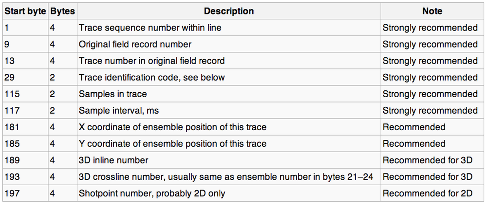
The other important bit — the point of the whole file really — is the traces themselves. They also have two parts: a header (light blue, above) and the actual data (darker blue). The data are stored on the file in (usually) 4-byte 'words'. Each word has its own address, or 'byte location' (a number), and a meaning. The headers map the meaning to the location, e.g. the crossline number is stored in byte 21. Usually. Well, sometimes. OK, it was one time.

According to the standard, here's where the important stuff is supposed to be:

I won't go into the unpleasantness of poking around in SEG-Y files right now — I'll save that for next time. Suffice to say that it's often messy, and if you have access to a data-loading guru, treat them exceptionally well. When they look sad — and they will look sad — give them hugs and hot tea. 

What's so great about Rev 2?

The big news in the seismic standards world is Revision 2. According to this useful presentation by Jill Lewis (Troika International) at the Standards Leadership Council last month, here are the main features:

  • Allow 240 byte trace header extensions.
  • Support up to 231 (that's 2.1 billion!) samples per trace and traces per ensemble.
  • Permit arbitrarily large and small sample intervals.
  • Support 3-byte and 8-byte sample formats.
  • Support microsecond date and time stamps.
  • Provide for additional precision in coordinates, depths, elevations.
  • Synchronize coordinate reference system specification with SEG-D Rev 3.
  • Backward compatible with Rev 1, as long as undefined fields were filled with binary zeros.

Two billion samples at µs intervals is over 30 minutes Clearly, the standard is aimed at <ahem> Big Data, and accommodating the massive amounts of data coming from techniques like variable timing acquisition, permanent 4D monitoring arrays, and microseismic. 

Next time, we'll look at loading one of these things. Not for the squeamish.

Ternary diagrams

I like spectrums (or spectra, if you must). It's not just because I like signals and Fourier transforms, or because I think frequency content is the most under-appreciated attribute of seismic data. They're also an important thinking tool. They represent a continuum between two end-member states, both rare or unlikely; in between there are shades of ambiguity, and this is usually where nature lives.

Take the sport–game continuum. Sports are pure competition — a test of strength and endurance, with few rules and unequivocal outcomes. Surely marathon running is pure sport. Contrast that with a pure game, like darts: no fitness, pure technique. (Establishing where various pastimes lie on this continuum is a good way to start an argument in a pub.)

There's a science purity continuum too, with mathematics at one end and social sciences somewhere near the other. I wonder where geology and geophysics lie...

Degrees of freedom 

The thing about a spectrum is that it's two-dimensional, like a scatter plot, but it has only one degree of freedom, so we can map it onto one dimension: a line.

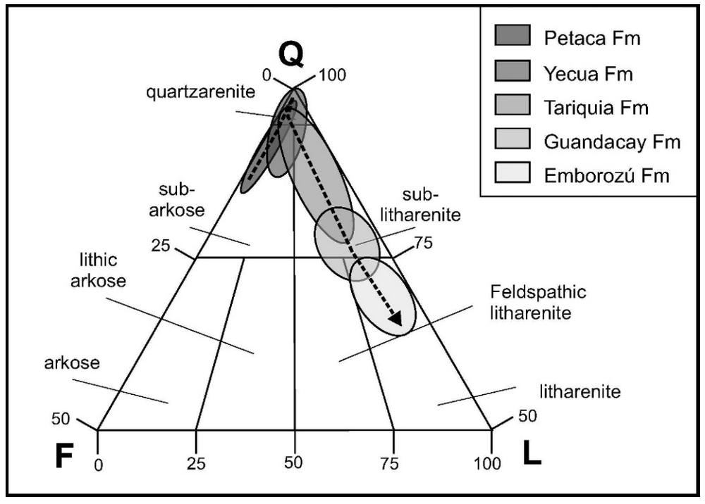
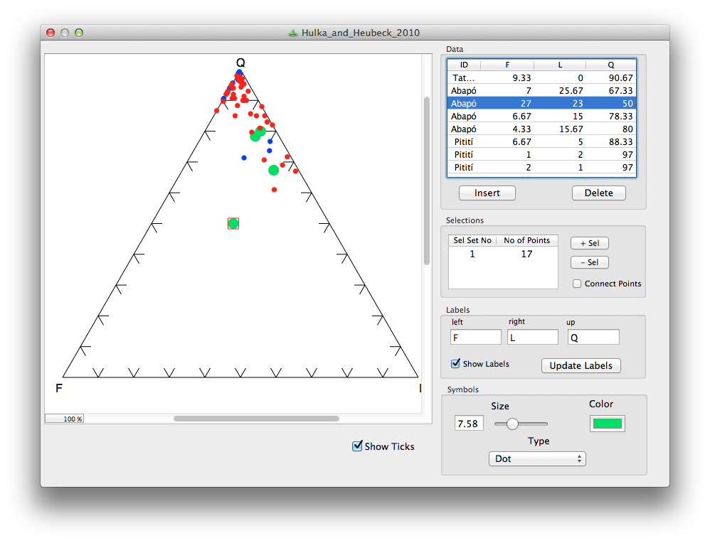
The three-dimensional equivalent of the spectrum is the ternary diagram: 3-parameter space mapped onto 2D. Not a projection, like a 3D scatter plot, because there are only two degrees of freedom — the parameters of a ternary diagram cannot be independent. This works well for volume fractions, which must sum to one. Hence their popularity for the results of point-count data, like this Folk classification from Hulk & Heubeck (2010).

We can go a step further, natch. You can always go a step further. How about four parameters with three degrees of freedom mapped onto a tetrahedron? Fun to make, not so fun to look at. But not as bad as a pentachoron.

How to make one

The only tools I've used on the battlefield, so to speak are Trinity, for ternary plots, and TetLab, for tetrahedrons (yes, I went there), both Mac OS X only, and both from Peter Appel of Christian-Albrechts-Universität zu Kiel. But there are more...

Do you use ternary plots, or are they nothing more than a cute way to show some boring data? How do you make them? Care to share any? 

The cartoon is from xkcd.com, licensed CC-BY-NC. The example diagram and example data are from Hulka, C and C Heubeck (2010). Composition and provenance history of Late Cenozoic sediments in southeastern Bolivia: Implications for Chaco foreland basin evolution and Andean uplift. Journal of Sedimentary Research 80, 288–299. DOI: 10.2110/jsr.2010.029 and available online from the authors. 

Standards, streamers, and Sherlock

Yesterday afternoon at the SEG Annual Meeting I spent some time with Jill Lewis from Troika and Rune Hagelund, a consultant. They have both served on the SEG Standards Committee, helping define the SEG-D and SEG-Y standards for field data and processed data respectively. The SEG standards are — in my experience — almost laughably badly implemented by most purveyors of data. Why is this? Is the standard too inflexible? Are the field definitions unclear? The confusion can lead to real problems: I know I've inadvertently loaded a seismic survey back to front. If you feel passionately about it, the committee is always looking for feedback.

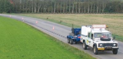
Land streamerI wandered past a poster yesterday morning about land streamers. The last I'd seen of this idea — dragging a train of geophones behind a truck — was a U of C test at Priddis, Alberta, by Gabriella Suarez and Rob Stewart. I haven't been paying much attention, but this was the first commercial implementation I'd seen – a shallow acquifer study in Sweden, reported by Boiero et al. The truck has the minivibe source right behind it, and the streamer after that. Quicker than juggies!

I don't know if this is a function of my recent outlook on conferences, but this was the first conference I've been to where all of the best things have been off-site. Perhaps the best part of the week was last night — a 3-hour geek-fest with Evan, Ben Bougher, Sam Kaplan, and Bernal Manzanilla. The conversation covered compressive sensing, stochastic resonance, acoustic lenses, and the General Inverse-Problemness of All Things.

As I mentioned last week, I hung out every day in the press room, waiting for wiki-curious visitors. We didn't have many drop-ins (okay, four), but I had some great chats with SEG staff, my friend Mike Stone, and a couple of other enthusiasts. I also started some fun projects to move some quality content into SEG Wiki. If you're at all interested in seeing a vibrant, community-driven space for geophysical knowledge, do get involved.

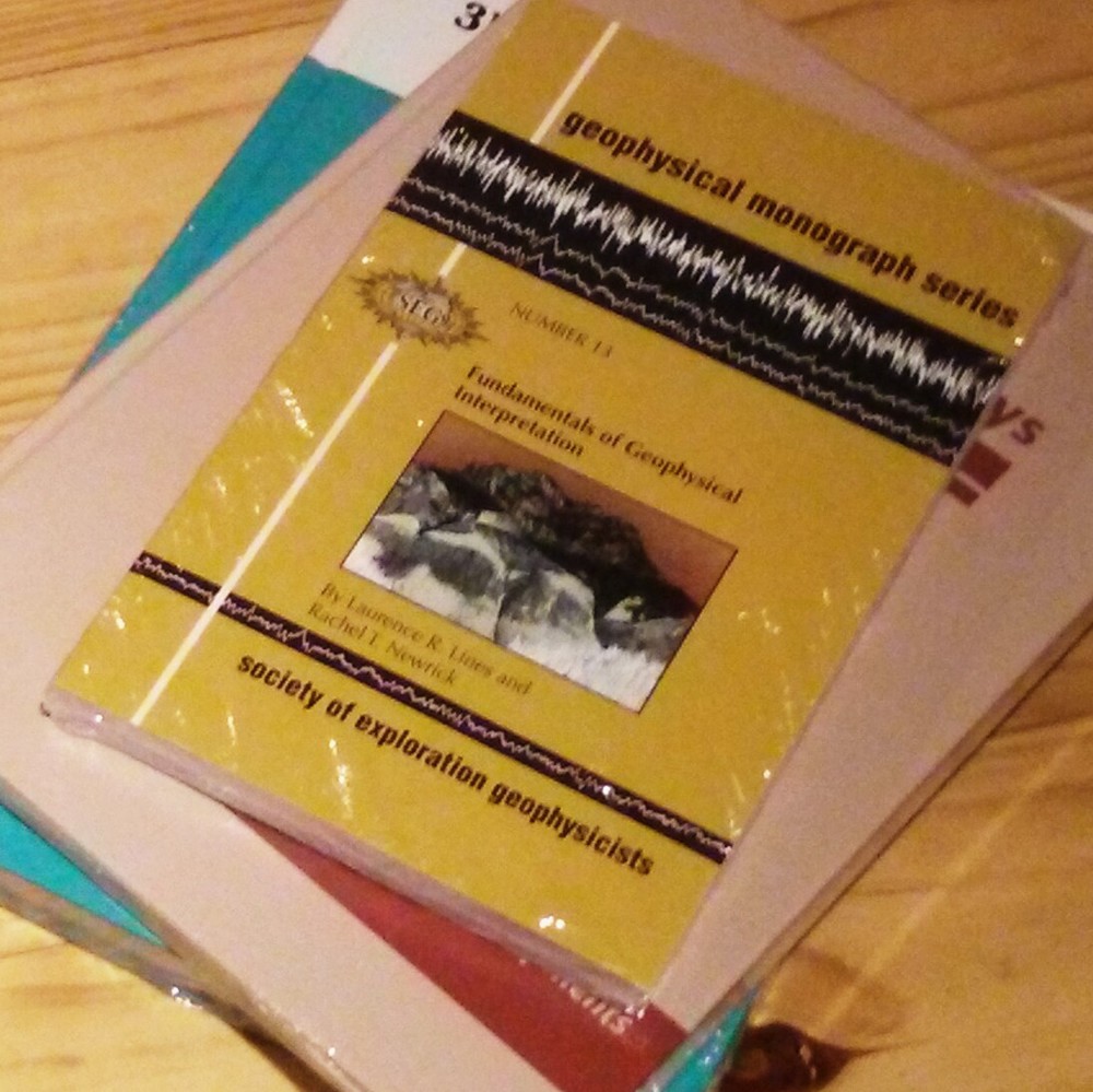
I bought some books in the Book Mart yesterday: Planning Land 3D Seismic Surveys by Andreas Cordsen et al., 3D Seismic Survey Design by Gijs Vermeer, and Fundamentals of Geophysical Interpretation by Larry Lines and Rachel Newrick. We're increasingly interested in modeling, and acquisition is where it all begins; Lines and Newrick was mostly just a gap on the shelf, but it also covers some topics I have little familiarity with, such as electromagnetics. Jennifer Cobb, SEG publications manager, showed me the intriguing new monograph by geophysical legend Enders Robinson and TLE Editor Dean Clark — I can't quite remember the title but it had something to do with Sherlock Holmes and Albert Einstein — a story about scientific investigation and geophysics. Looking forward to picking that up.

That's it for me this year; I'm writing this on the flight home. Evan is staying for the workshops and will report on those. As usual, I'm leaving with a lot of things to follow up on over the next weeks and months. I'm also trying to sift my feelings about the Annual Meeting, and especially the Exhibition. So many people, so much time, so much marketing...

Five more things about colour

Last time I shared some colourful games, tools, and curiosities, including the weird chromostereopsis effect (right). Today, I've got links to much, much more 'further reading' on the subject of colour...


The provocation for this miniseries was Robert 'Blue Marble' Simmon's terrific blog series on colour, which he's right in the middle of. Robert is a data visualization pro at NASA Earth Observatory, so we should all listen to him. Here's his collection (updated after the original writing of this post):

Perception is everything! One of Agile's best friends is Matteo Niccoli, a quantitative geophysicist in Norway (for now). And one of his favourite subjects is colour — there are loads of great posts on his blog. He also has a fine collection of perceptual colour bars (left) for most seismic interpretation software. If you're still using Spectrum for maps, you need his help.

Dave Green is a physicist at the University of Cambridge. Like Matteo, he has written about the importance of using colour bars which have a linear increase in perceived brightness. His CUBEHELIX scheme (above) adapts easily to your needs — try out his colour bar creator. And if this level of geekiness gets you going, try David Dalrymple or Gregor Aisch.

ColorBrewer is a legendary web app and add-in for ArcGIS. It's worth playing with the various colour schemes, especially if you need a colour bar that is photocopy friendly, or that can still be used by colour blind people. The equally excellent, perhaps even slightly more excellent, i want hue is also worth playing with (thanks to Robert Simmon for that one). 

In scientific publishing, the Nature family of journals has arguably the finest graphics. Nature Methods carries a column called Points of View, which looks at scientific visualization. This mega-post on their Methagora blog links to them all, and covers everything from colour and 3D graphics to broader issues of design and typography. Wonderful stuff.

Since I don't seem to have exhausted the subject yet, we'll save a couple of practical topics for next time:

  1. A thought experiment: How many attributes can a seismic interpreter show with colour in a single display?
  2. Provoked by a reader via email, we'll think about that age old problem for thickness maps — should the thicks be blue or red?

Five things about colour

The fact that colour is a slippery subject is powerfully illustrated by my favourite optical illusion. Look at this:

Squares A and B are the same shade of grey. It's so hard to believe that you might need to see the proof to be convinced. 

Chromostereopsis is a similarly disarming effect that you may have noticed on maps with bright spectrum colour bars. Most people perceive blue and red on different depth planes, so the pseudo-3D effect can work in your favour and make the map 'pop' (This is not a good reason to use a spectrum colour bar, however... more on this next time). I notice that at least one set designer knows about the effect, making William Shatner pop on the TV show Have I Got News For You:

Color is a fun way to test your colour intuition. The game starts easy, but is very hard by the end as you simulatneously match colour tetrads. The first time I played I managed 9.8, which I am not-very-secretly quite pleased about. But I haven't been able to repeat the performance.

X-Rite's Online Color Challenge is also tough. You have to sort the very subtle colours into order. It takes a while to play but is definitely worth it. If your job depends on spotting subtle effects in images (like seismic data, for example) then stand by to learn something about your detection system. 

Color blindness will change how these games work, of course, and should change how we make maps, figures, and slides. Since up to about 5% of a large audience might be colour blind, you might want to think about how your presentations look to them. You can easily check with Vischeck and correct images for colourblind people with the Daltonizer. They can still be beautiful, but you can avoid certain colour combinations and reach a wider audience.

I have lots more links about colour to share in the next post, including some required reading from Rob Simmon and Matteo Niccoli, among others. In the meantime, have you come across any handy colour tools, or has colour ever caught you out? Let us know in the comments.

The image of William Shatner is copyright and courtesy of Hat Trick Productions Ltd, London, UK, and used with permission.

Machines can read too

The energy industry has a lot of catching up to do. Humanity is faced with difficult, pressing problems in energy production and usage, yet our industry remains as secretive and proprietary as ever. One rich source of innovation we are seriously under-utilizing is the Internet. You have probably heard of it.

Machine experience design

semantic.jpg

Web sites are just the front-end of the web. Humans have particular needs when they read web pages — attractive design, clear navigation, etc. These needs are researched and described by the rapidly growing field of user experience design, often called UX. (Yes, the ways in which your intranet pages need fixing are well understood, just not by your IT department!)

But the web has a back-end too. Rather than being for human readers, the back-end is for machines. Just like human readers, machines—other computers—also have particular needs: structured data, and a way to make queries. Why do machines need to read the web? Because the web is full of data, and data makes the world go round. 

So website administrators need to think about machine experience design too. As well as providing beautiful web pages for humans to read, they should provide widely-accepted machine-readable format such as JSON or XML, and a way to make queries.

What can we do with the machine-readable web?

The beauty of the machine-readable web, sometimes called the semantic web, or Web 3.0, is that developers can build meta-services on it. For example, a website like hipmunk.com that finds the best flights, wherever they are. Or a service that provides charts, given some data or a function. Or a mobile app that knows where to get the oil price. 

In the machine-readable web, you could do things like:

  • Write a program to analyse bibliographic data from SEG, SPE and AAPG.
  • Build a mobile app to grab log mnemonics info from SLB's, HAL's, and BHI's catalogs.
  • Grab course info from AAPG, PetroSkills, and Nautilus to help people find training they need.

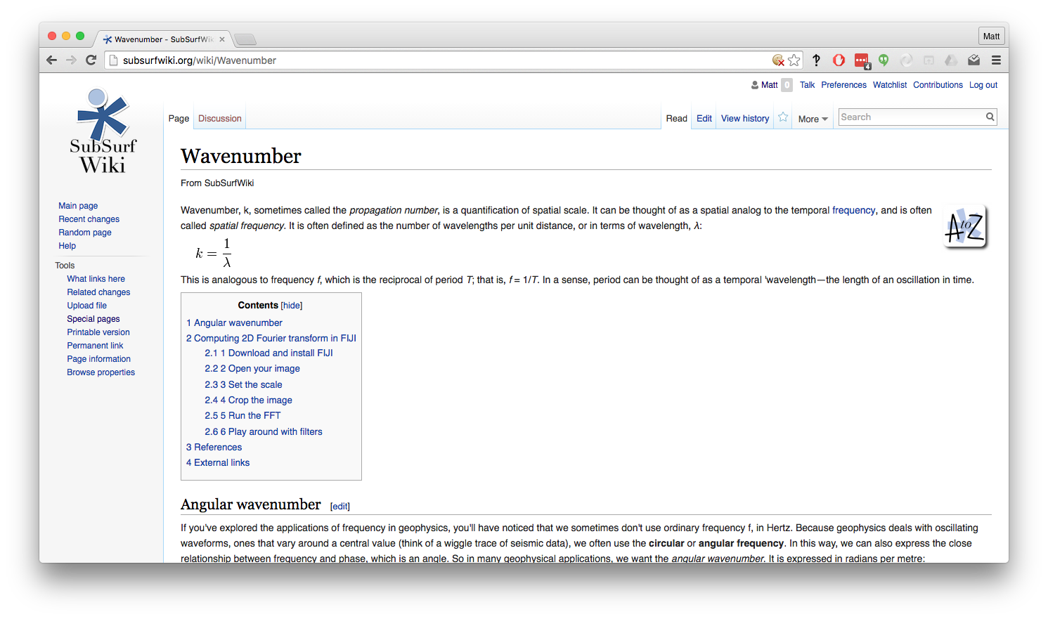
Most wikis have a public application programming interface, giving direct, machine-friendly access to the wiki's database. Here are two views of one wiki page — click on the images to see the pages:

At SEG last year, I suggested to a course provider that they might consider offering machine access to their course catalog—so that developers can build services that use their course information and thus send them more students. They said, "Don't worry, we're building better search tools for our users." Sigh.

In this industry, everyone wants to own their own portal, and tends to be selfish about their data and their users. The problem is that you don't know who your users are, or rather who they could be. You don't know what they will want to do with your data. If you let them, they might create unimagined value for you—as hipmunk.com does for airlines with reasonable prices, good schedules, and in-flight Wi-Fi. 

I can't wait for the Internet revolution to hit this industry. I just hope I'm still alive.