What is AVO-friendly processing?

It's the Geophysics Hackathon next month! Come down to Propeller in New Orleans on 17 and 18 October, and we'll feed you and give you space to build something cool. You might even win a prize. Sign up — it's free!

Thank you to the sponsors, OpenGeoSolutions and Palladium Consulting — both fantastic outfits. Hire them.

AVO-friendly processing gets called various things: true amplitude, amplitude-friendly, and controlled amplitude, controlled phase (or just 'CACP'). And, if you've been involved in any processing jobs you'll notice these phrases get thrown around a lot. But seismic geophysics has a dirty little secret... we don't know exactly what it is. Or, at least, we can't agree on it.

A LinkedIn discussion in the Seismic Data Processing group earlier this month prompted this post:

I can't compile a list of exactly which processes will harm your AVO analysis (can anyone? Has anyone??), but I think I can start a list of things that you need to approach with caution and skepticism:

  • Anything that is not surface consistent. What does that mean? According to Oliver Kuhn (now at Quantec in Toronto):
Surface consistent: a shot-related [process] affects all traces within a shot gather in the same way, independent of their receiver positions, and, a receiver-related [process] affects all traces within a receiver gather in the same way, independent of their shot positions.
  • Anything with a window — spatial or temporal. If you must use windows, make them larger or longer than your areas and zones of interest. In this way, relative effects should be preserved.
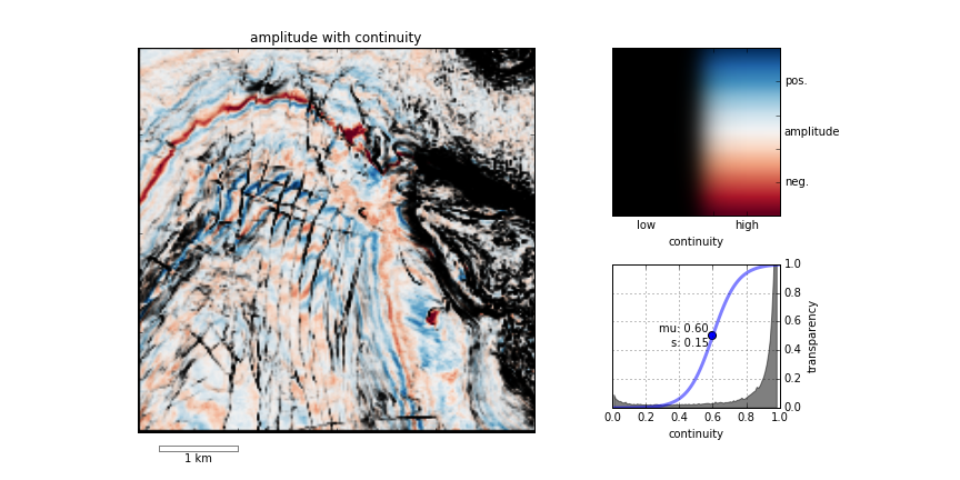
  • Anything that puts the flattening of gathers before the accuracy of the data (<cough> trim statics). Some flat gathers don't look flat. (The thumbnail image for this post is from Duncan Emsley's essay in 52 Things.)
  • Anything that is a sort of last resort, post hoc attempt to improve the data — what we might call 'cosmetic' treatments. Things like wavelet stretch correction and spectral shaping are good for structural interpreters, but not for seismic analysts. At the very least, get volumes without them, and convince yourself they did no harm.
  • Anything of which people say, "This should be fine!" but offer no evidence.

Back to my fourth point there... spectral shaping and wavelet stretch correction (e.g. this patented technique I was introduced to at ConocoPhillips) have been the subject of quite a bit of discussion, in my experience. I don't know why; both are fairly easy to model, on the face of it. The problem is that we start to get into the sticky question of what wavelets 'see' and what's a wavelet anyway, and hang on a minute why does seismic reflection even work? Personally, I'm skeptical, especially as we get more used to, and better at, looking at spectral decompositions of stacked and pre-stack data.

Divergent paths

I have seen people use seismic data with very different processing paths for structural interpretation and for AVO analysis. This can happen on long-term projects, where the structural framework depends on an old post-stack migration that was later reprocessed for AVO friendliness. This is a bad idea — you won't be able to put the quantitative results into the structural framework without introducing substantial error.

What we need is a clinical trial of processing algorithms, in which they are tested against a known model like Marmousi, and their effect on attributes is documented. If such studies exist, I'd love to hear about them. Come to think of it, this would make a good topic for a hackathon some day... Maybe Dallas 2016?

How to QC a seismic volume

I've had two emails recently about quality checking seismic volumes. And last month, this question popped up on LinkedIn:

We have written before about making a data quality volume for your seismic — a handy way to incorporate uncertainty into risk maps — but these recent questions seem more concerned with checking a new volume for problems.

First things first

Ideally, you'd get to check the volume before delivery (at the processing shop, say), otherwise you might have to actually get it loaded before you can perform your QC. I am assuming you've already been through the processing, so you've seen shot gathers, common-offset gathers, etc. This is all about the stack. Nonetheless, the processor needs to prepare some things:

  • The stack volume, of course, with and without any 'cosmetic' filters (eg fxy, fk).
  • A semblance (coherency, similarity, whatever) volume.
  • A fold volume.
  • Make sure the processor has some software that can rapidly scan the data, plot amplitude histograms, compute a spectrum, pick a horizon, and compute phase. If not, install OpendTect (everyone should have it anyway), or you'll have to load the volume yourself.

There are also some things you can do ahead of time. 

  1. Be part of the processing from the start. You don't want big surprises at this stage. If a few lines got garbled during file creation, no problem. If there's a problem with ground-roll attentuation, you're not going to be very popular.
  2. Make sure you know how the survey was designed — where the corners are, where you would expect live traces to be, and which way the shot and receiver lines went (if it was an orthogonal design). Get maps, take them with you.
  3. Double-check the survey parameters. The initial design was probably changed. The PowerPoint presentation was never updated. The processor probably has the wrong information. General rule with subsurface data: all metadata is probably wrong. Ideally, talk to someone who was involved in the planning of the survey.
  4. You didn't skip (2) did you? I'm serious, double check everything.

Crack open the data

OK, now you are ready for a visit with the processor. Don't fall into the trap of looking at the geology though — it will seduce you (it's always pretty, especially if it's the first time you've seen it). There is work to do first.

  1. Check the cornerpoints of the survey. I like the (0, 0) trace at the SW corner. The inline and crossline numbering should be intuitive and simple. Make sure the survey is the correct way around with respect to north.
  2. Scan through timeslices. All of them. Is the sample interval what you were expecting? Do you reach the maximum time you expected, based on the design? Make sure the traces you expect to be live are live, and the ones you expect to be dead are dead. Check for acquisition footprint. Start with greyscale, then try another colourmap.
  3. Repeat (5) but in a similarity volume (or semblance, coherency, whatever). Look for edges, and geometric shapes. Check again for footprint.
  4. Look through the inlines and crosslines. These usually look OK, because it's what processors tend to focus on.
  5. Repeat (7) but in a similarity volume.

Dive into the details

  1. Check some spectrums. Select some subsets of the data — at least 100 traces and 1000 ms from shallow, deep, north, south, east, west — and check the average spectrums. There should be no conspicuous notches or spikes, which could be signs of all sorts of things from poorly applied filters to reverberation.
  2. Check the amplitude histograms from those same subsets. It should be 32-bit data — accept no less. Check the scaling — the numbers don't mean anything, so you can make them range over whatever you like. Something like ±100 or ±1000 tends to make for convenient scaling of amplitude maps and so on; ±1.0 or less can be fiddly in some software. Check for any departures from an approximately Laplacian (double exponential) distribution: clipping, regular or irregular spikes, or a skewed or off-centre distribution:
  1. Interpret a horizon and check its phase. See Purves (Leading Edge, October 2014) or SubSurfWiki for some advice.
  2. By this time, the fold volume should yield no surprises. If any of the rest of this checklist throws up problems, the fold volume might help troubleshoot.
  3. Check any other products you asked for. If you asked for gathers or angle stacks (you should), check them too.

Last of all, before actual delivery, talk to whoever will be loading the data about what kind of media they prefer, and what kind of file organization. They may also have some preferences for the contents of the SEG-Y file and trace headers. Pass all of this on to the processor. And don't forget to ask for All The Seismic

What about you?

Have I forgotten anything? Are there things you always do to check a new seismic volume? Or if you're really brave, maybe you have some pitfalls or even horror stories to share...

Introducing Bruges

bruges_rooves.png

Welcome to Bruges, a Python library (previously known as agilegeo) that contains a variety of geophysical equations used in processing, modeling and analysing seismic reflection and well log data. Here's what's in the box so far, with new stuff being added every week:


Simple AVO example

VP [m/s] VS [m/s] ρ [kg/m3]
Rock 1 3300 1500 2400
Rock 2 3050 1400 2075

Imagine we're studying the interface between the two layers whose rock properties are shown here...

To compute the zero-offset reflection coefficient at zero offset, we pass our rock properties into the Aki-Richards equation and set the incident angle to zero:

 >>> import bruges as b
 >>> b.reflection.akirichards(vp1, vs1, rho1, vp2, vs2, rho2, theta1=0)
 -0.111995777064

Similarly, compute the reflection coefficient at 30 degrees:

 >>> b.reflection.akirichards(vp1, vs1, rho1, vp2, vs2, rho2, theta1=30)
 -0.0965206980095

To calculate the reflection coefficients for a series of angles, we can pass in a list:

 >>> b.reflection.akirichards(vp1, vs1, rho1, vp2, vs2, rho2, theta1=[0,10,20,30])
 [-0.11199578 -0.10982911 -0.10398651 -0.0965207 ]

Similarly, we could compute all the reflection coefficients for all incidence angles from 0 to 70 degrees, in one degree increments, by passing in a range:

 >>> b.reflection.akirichards(vp1, vs1, rho1, vp2, vs2, rho2, theta1=range(70))
 [-0.11199578 -0.11197358 -0.11190703 ... -0.16646998 -0.17619878 -0.18696428]

A few more lines of code, shown in the Jupyter notebook, and we can make some plots:


Elastic moduli calculations

With the same set of rocks in the table above we could quickly calculate the Lamé parameters λ and µ, say for the first rock, like so (in SI units),

 >>> b.rockphysics.lam(vp1, vs1, rho1), b.rockphysics.mu(vp1, vs1, rho1)
 15336000000.0 5400000000.0

Sure, the equations for λ and µ in terms of P-wave velocity, S-wave velocity, and density are pretty straightforward: 


but there are many other elastic moduli formulations that aren't. Bruges knows all of them, even the weird ones in terms of E and λ.


All of these examples, and lots of others — Backus averaging,  examples are available in this Jupyter notebook, if you'd like to work through them on your own.


Bruges is a...

It is very much early days for Bruges, but the goal is to expose all the geophysical equations that geophysicists like us depend on in their daily work. If you can't find what you're looking for, tell us what's missing, and together, we'll make it grow.

What's a handy geophysical equation that you employ in your work? Let us know in the comments!

Attribute analysis and statistics

Last week I wrote a basic introduction to attribute analysis. The post focused on the different ways of thinking about sampling and intervals, and on how instantaneous attributes have to be interpolated from the discrete data. This week, I want to look more closely at those interval attributes. We'd often like to summarize the attributes of an interval info a single number, perhaps to make a map.

Before thinking about amplitudes and seismic traces, it's worth reminding ourselves about different kinds of average. This table from SubSurfWiki might help... 

A peculiar feature of seismic data. from a statistical point of view, is the lack of the very low frequencies needed to give it a trend. Because of this, it oscillates around zero, so the average amplitude over a window tends to zero — seismic data has a mean value of zero. So not only do we have to think about interpolation issues when we extract attributes, we also have to think about statistics.

Fortunately, once we understand the issue it's easy to come up with ways around it. Look at the trace (black line) below:

The mean is, as expected, close to zero. So I've applied some other statistics to represent the amplitude values, shown as black dots, in the window (the length of the plot):

  • Average absolute amplitude (light green) — treat all values as positive and take the mean.
  • Root-mean-square amplitude (dark green) — tends to emphasize large values, so it's a bit higher.
  • Average energy (magenta) — the mean of the magnitude of the complex trace, or the envelope, shown in grey.
  • Maximum amplitude (blue) — the absolute maximum value encountered, which is higher than the actual sample values (which are all integers in this fake dataset) because of interpolation.
  • Maximum energy (purple) — the maximum value of the envelope, which is higher still because it is phase independent.

There are other statistics besides these, of course. We could compute the median average, or some other mean. We could take the strongest trough, or the maximum derivative (steepest slope). The options are really only limited by your imagination, and the physical relationship with geology that you expect.

We'll return to this series over the summer, asking questions like How do you know what to expect? and Does a physically realistic relationship even matter? 


To view and run the code that I used in creating the figures for this post, grab the iPython/Jupyter Notebook.

An attribute analysis primer

A question on Stack Exchange the other day reminded me of the black magic feeling I used to have about attribute analysis. It was all very meta: statistics of combinations of attributes, with shifted windows and crazy colourbars. I realized I haven't written much about the subject, despite the fact that many of us spend a lot of time trying to make sense of attributes.

Time slices, horizon slices, and windows

One of the first questions a new attribute-analyser has is, "Where should the window be?" Like most things in geoscience: it depends. There are lots of ways of doing it, so think about what you're after...

  • Timeslice. Often the most basic top-down view is a timeslice, because they are so easy to make. This is often where attribute analysis begins, but since timeslices cut across stratigraphy, not usually where it ends.
  • Horizon. If you're interested in the properties of a strong reflector, such as a hard, karsted unconformity, maybe you just want the instantaneous attribute from the horizon itself.
  • Zone. If the horizon was hard to interpret, or is known to be a gradual facies transition, you may want to gather statistics from a zone around it. Or perhaps you couldn't interpret the thing you really wanted, but only that nice strong reflection right above it... maybe you can bootstrap yourself from there. 
  • Interval. If you're interested in a stratigraphic interval, you can bookend it with existing horizons, perhaps with a constant shift on one or both of them.
  • Proportional. If seismic geomorphology is your game, then you might get the most reasonable inter-horizon slices from proportionally slicing in between stratigraphic surface. Most volume interpretation software supports this. 

There are some caveats to simply choosing the stratigraphic interval you are after. Beware of choosing an interval that strong reflectors come into and out of. They may have an unduly large effect on most statistics, and could look 'geological'. And if you're after spectral attributes, do remember that the Fourier transform needs time! The only way to get good frequency resolution is to provide long windows: a 100 ms window gives you frequency information every 10 Hz.

Extraction depends on sample interpolation

When you extract an attribute, say amplitude, from a trace, it's easy to forget that the software has to do some approximation to give you an answer. This is because seismic traces are not continuous curves, but discrete series, with samples typically every 1, 2, or 4 milliseconds. Asking for the amplitude at some arbitrary time, like the point at which a horizon crosses a trace, means the software has to interpolate between samples somehow. Different software do this in different ways (linear, spline, polynomial, etc), and the methods give quite different results in some parts of the trace. Here are some samples interpolated with a spline (black curve) and linearly (blue). The nearest sample gives the 'no interpolation' result.

As well as deciding how to handle non-sampled parts of the trace, we have to decide how to represent attributes operating over many samples. In a future post, we'll give some guidance for using statistics to extract information about the entire window. What options are available and how do we choose? Do we take the average? The maximum? Something else?

There's a lot more to come!

As I wrote this post, I realized that this is a massive subject. Here are some aspects I have not covered today:

  • Calibration is a gaping void in many published workflows. How can we move past "that red blob looks like a point bar so I drew a line around it in PowerPoint" to "there's a 70% chance of finding reservoir quality sand at that location"?
  • This article was about  single-trace attributes at single instants or over static windows. Multi-trace and volume attributes, like semblance, curvature, and spectral decomposition, need a post of their own.
  • There are a million attributes (though only a few that count, just ask Art Barnes) so choosing which ones to use can be a challenge. Criteria range from what software licenses you have to what is physically reasonable.
  • Because there are a million attributes, the art of combining attributes with statistical methods like principal component analysis or multi-linear regression needs a look. This gets into seismic inversion.

We'll return to these ideas over the next few weeks. If you have specific questions or workflows to share, please leave a comment below, or get in touch by email or Twitter.

To view and run the code that I used in creating the figures for this post, grab the iPython/Jupyter Notebook.

Corendering more attributes

My recent post on multi-attribute data visualization painted two seismic attributes from on a timeslice. Let's look now at corendering attributes extracted on a seismic horizon. I'll reproduce the example Matt gave in his post on colouring maps.

Although colour choices come down to personal preference, there are some points to keep in mind:

  • Data that varies relatively gradually across the canvas — e.g. elevation here — should use a colour scale that varies monotonically in hue and luminance, e.g. CubeHelix or Matteo Niccoli's colourmaps.
  • Data that varies relatively quickly across the canvas — e.g. my similarity data, (a member of the family that includes coherencesemblance, and so on) — should use a monochromatic colour scale, e.g. black–white. 
  • If we've chosen our colourmaps wisely, there should be some unused hues for rendering other additional attributes. In this case, there are no red hues in the elevation colourmap, so we can map redness to instantaneous amplitude.

Adding a light source

Without wanting to get too gimmicky, we can sometimes enliven the appearance of an attribute, accentuating its texture, by simulating a bumpy surface and shining a virtual light onto it. This isn't the same as casting a light source on the composite display. We can make our light source act on only one of our attributes and leave the others unchanged. 

Similarity attribute Displayed using a Greyscale Colourbar (left). Bump mapping of similarity attribute using a lightsource positioned at azimuth 350 degrees, inclination 20 degrees. 

The technique is called hill-shading. The terrain doesn't have to be a physical surface; it can be a slice. And unlike physical bumps, we're not actually making a new surface with relief, we are merely modifying the surface's luminance from an artificial light source. The result is a more pronounced texture.

One view, two dimensions, three attributes

Constructing this display takes a bit of trial an error. It wasn't immediately clear where to position the light source to get the most pronounced view. Furthermore, the amplitude extraction looked quite noisy, so I softened it a little bit using a Gaussian filter. Plus, I wanted to show only the brightest of the bright spots, so that all took a bit of fiddling.

Even though 3D data visualization is relatively common, my assertion is that it is much harder to get 3D visualization right, than for 2D. Looking at the 3 colour-bars that I've placed in the legend. I'm reminded of this difficulty of adding a third dimension; it's much harder to produce a colour-cube in the legend than a series of colour-bars. Maybe the best we can achieve is a colour-square like last time, with a colour-bar for the overlay on the side.

Check out the IPython notebook for the code used to create these figures.

Corendering attributes and 2D colourmaps

The reason we use colourmaps is to facilitate the human eye in interpreting the morphology of the data. There are no hard and fast rules when it comes to choosing a good colourmap, but a poorly chosen colourmap can make you see features in your data that don't actually exist. 

Colourmaps are typically implemented in visualization software as 1D lookup tables. Given a value, what colour should I plot it? But most spatial data is multi-dimensional, and it's useful to look at more than one aspect of the data at one time. Previously, Matt asked, "how many attributes can a seismic interpreter show with colour on a single display?" He did this by stacking up a series of semi-opaque layers, each one assigned its own 1D colourbar. 

Another way to add more dimensions to the display is corendering. This effectively adds another dimension to the colourmap itself: instead of a 1D colour line for a single attribute, for two attributes we're defining a colour square; for 3 attributes, a colour cube, and so on.

Let's illustrate this by looking at a time-slice through a portion of the F3 seismic volume. A simple way of displaying two attributes is to decrease the opacity of one, and lay it on top of the other. In the figure below, I'm setting the opacity of the continuity to 75% in the third panel. At first glance, this looks pretty good; you can see both attributes, and because they have different hues, they complement each other without competing for visual bandwidth. But the approach is flawed. The vividness of each dataset is diminished; we don't see the same range of colours as we do in the colour palette shown above.

Overlaying one map on top of the other is one way to look at multiple attributes within a scene. It's not ideal however.

Overlaying one map on top of the other is one way to look at multiple attributes within a scene. It's not ideal however.

Instead of overlaying maps, we can improve the result by modulating the lightness of the amplitude image according to the magnitude of the continuity attribute. This time the corendered result is one image, instead of two. I prefer it, because it preserves the original colours we see in the amplitude image. If anything, it seems to deepen the contrast:

The lightness value of the seismic amplitude time slice has been modulated by the continuity attribute.&nbsp;

The lightness value of the seismic amplitude time slice has been modulated by the continuity attribute. 

Such a composite display needs a two-dimensional colormap for a legend. Just as a 1D colourbar, it's also a lookup table; each position in the scene corresponds to a unique pair of values in the colourmap plane.

We can go one step further. Say we want to emphasize only the largest discontinuities in the data. We can modulate the opacity with a non-linear function. In this example, I'm using a sigmoid function:

In order to achieve this effect in most conventional software, you usually have to copy the attribute, colour it black, apply an opacity curve, then position it just above the base amplitude layer. Software companies call this workaround a 'workflow'. 

Are there data visualizations you want to create, but you're stuck with software limitations? In a future post, I'll recreate some cool co-rendering effects; like bump-mapping, and hill-shading.

To view and run the code that I used in creating the images for this post, grab the iPython/Jupyter Notebook.


You can do it too!

If you're in Calgary, Houston, New Orleans, or Stavanger, listen up!

If you'd like to gear up on coding skills and explore the benefits of scientific computing, we're going to be running the 2-day version of the Geocomputing Course several times this fall in select cities. To buy tickets or for more information about our courses, check out the courses page.

None of these times or locations good for you? Consider rounding up your colleagues for an in-house training option. We'll come to your turf, we can spend more than 2 days, and customize the content to suit your team's needs. Get in touch.

The curse of hunting rare things

What are the chances of intersecting features with a grid of cross-sections? I often wonder about this when interpreting 2D seismic data, but I think it also applies to outcrops, or any other transects. I want to know:

  1. If there are only a few of these features, how many should I see?
  2. What's the probability of the lines missing them all? 
  3. Conversely, if I interpret x of them, then how many are there really?
  4. How is the detectability affected by the reliability of the data or my skills?

I used to have a spreadsheet for computing all this stuff, but spreadsheets are dead to me so here's an IPython Notebook :)

An example

I'm interpreting seep locations on 2D data at the moment. So I'm looking for subvertical pipes and chimneys, mud volcanos, seafloor pockmarks and pingos, that sort of thing (see Løseth et al., 2009 for a great overview). Here are some similar features from the Norwegian continental shelf from Hustoft et al., 2010:

Figure 3 from hustoft et al. (2010) showing the 3D expression of some hydrocarbon leakage features in Norway. © The Authors.

As Hustoft et al. show, these can be rather small features — most pockmarks are in the 100–800 m diameter range, so let's call it 500 m. The dataset I have is an orthogonal grid of decent quality 2D lines with a 3 km spacing. The area is about 120,000 km². For the sake of argument (and a forward model), let's imagine there are 120 features I'm interested in — one per 1000 km². Here's a zoomed-in view showing a subset of the problem:

Zoomed-in view of part of my example. A grid of 2D seismic lines, 3 km apart, and randomly distributed features, each 500 m in diameter. If a feature's centre falls inside a grey square, then the feature is not intersected by the data. The grey squa…

Zoomed-in view of part of my example. A grid of 2D seismic lines, 3 km apart, and randomly distributed features, each 500 m in diameter. If a feature's centre falls inside a grey square, then the feature is not intersected by the data. The grey squares are 2.5 km across.

According to my calculations...

  1. Of the 120 features in the area, we expect 37 to be intersected by the data. Of course, some of those intersections might be very subtle, if they are right at the edge of the feature.
  2. The probability of intersecting a given feature is 0.31. There are 120 features, so the probability of the whole dataset intersecting at least one is essentially 1 (certain). That's good! Conversely, the probability of missing them all is effectively 0. (If there were only 5 features, then there'd be about a 16% chance of missing them all.)
  3. Clearly, if I interpret 37 features, there are about 120 in total (that was my a priori). It's a linear relationship, so if I interpret 10 features, I can expect there to be about 33 altogether, and if I see 100 then I can expect that there are almost 330 in total. (I think the probability distribution would be log-normal, but would appreciate others' insights here.)
  4. Reliability? That sounds like a job for Bayes' theorem...

It's far from certain that I will interpret everything the data intersects, for all sorts of reasons:

  • I am human and therefore inconsistent, biased, and fallible.
  • The feature may be cryptic in the section , because of how it was intersected.
  • The data may be poor quality at that point, or everywhere.

Let's assume that if a feature has been intersected by the data, then I have a 75% chance of actually interpreting it. Bayes' theorem tells us how to update the prior probability of 0.31 (for a given feature; point 2 above) to get a posterior probability. Here's the table:

Interpreted Not interpreted
Intersected by a 2D line 28 9
Not intersected by any lines 21 63

What do the numbers mean?

  • Of the 37 intersected features, I interpret 28.
  • I fail to interpret 9 features that are intersected by the data. These are Type II errors, false negatives.
  • I interpret another 21 features which are not real! These are Type I errors: false positives. 
  • Therefore I interpret 48 features, of which only 57% are real. This seems like a lot, but it's a function of my imperfect reliability (75%) and the poor sampling, resulting in a large number of 'missed' features.

Interestingly, my 75% reliability translates into a 57% chance of being right about the existence of a feature. We've seen this effect before — it's the curse of hunting rare things: with imperfect knowledge, we are often wrong


References

Hustoft, S, S Bünz, and J Mienart (2010). Three-dimensional seismic analysis of the morphology and spatial distribution of chimneys beneath the Nyegga pockmark field, offshore mid-Norway. Basin Research 22, 465–480. DOI 10.1111/j.1365-2117.2010.00486.x 

Løseth, H, M Gading, and L Wensaas (2009). Hydrocarbon leakage interpreted on seismic data. Marine & Petroleum Geology 26, 1304–1319. DOI 10.1016/j.marpetgeo.2008.09.008 

Test driven development geoscience

Sometimes I wonder how much of what we do in applied geoscience is really science. Is it really about objective enquiry? Do we form hypotheses, then test them? The scientific method is largely a caricature — science is more accidental and more fun than a step-by-step recipe — but I think our field sometimes falls short of even basic rigour. Go and sit through a conference session on seismic attribute analysis some time and you'll see what I mean. Let's just say there's a lot of arm-waving and shape-ology. 

Learning from geeks

We've written before about the virtues of the software engineering community. Innovation has been so rapid recently, that I think it's a great place to find interpretation hacks like pair picking. Learning about and experiencing the amazing productivity of programmers is one of the reasons I think all scientists should learn to program (but not learn to be a programmer). You'll find out about concepts like version control, user-centered design, and test-driven development. Programmers embrace these ideas to a greater or lesser degree, depending on their goals and those of the project they're working on. But all programmers know them.

I'm especially into test-driven development at the moment. The idea is that before implementing a new module or feature, you write a test — a short program that gives the new thing some input, inspects the output, and compares it to a known answer. The first version of the code will likely fail the test. The idea is to refactor the code until it passes the test. Then you add that test to a suite that runs every time you build anything in the same project, so you know your new thing doesn't get broken by something else later. And you aren't tempted to implement features that weren't part of the test.

Fail — Refactor — Pass

Imagine test-driven development geology (or any other kind of geoscience). What would that look like?

  • When planning wells, we often do write tests — they're called prognoses. But the comparison with the result is rarely formalized or quantified, especially outside the target zone. Once the well is drilled, it becomes data and we move on. No-one likes to dwell on the poorly understood or error-prone, but naturally that's where the greatest room for improvement is.  
  • When designing a new seismic attribute, or embarking on a seismic processing project, we often have a vague idea of success in our heads, and that's about it. What if we explicitly defined an input test dataset, some wells or bits of wells, and set 'passing' performance criteria on those? "I won't interpret the reprocessed seismic until it improves those synthetic correlation coefficients by 40%."
  • When designing a seismic survey, we could establish acceptable criteria for trace density, minimum offset, azimuth distribution, and recording time, then use these as a cost function to find the best possible survey for our dollars. Wait, perhaps we actually do this one. Is seismic acquisition unusually scientific? Or is it an inherently more linear problem?

What do you think? Can you see ways to define 'success' before you begin, then somewhat quantitatively compare your results with that? Ideas wanted!

Why don't people use viz rooms?

Matteo Niccoli asked me why I thought the use of immersive viz rooms had declined. Certainly, most big companies were building them in about 1998 to 2002, but it's rare to see them today. My stock answer was always "Linux workstations", but of course there's more to it than that.

What exactly is a viz room?

I am not talking about 'collaboration rooms', which are really just meeting rooms with a workstation and a video conference phone, a lot of wires, and wireless mice with low batteries. These were one of the collaboration technologies that replaced viz rooms, and they seem to be ubiquitous (and also under-used).

The Viz Lab at Wisconsin–Madison. Thanks to Harold Tobin for permission.A 'viz room', for our purposes here, is a dark room with a large screen, at least 3 m wide, probably projected from behind. There's a Crestron controller with greasy fingerprints on it. There's a week-old coffee cup because not even the cleaners go in there anymore. There's probably a weird-looking 3D mouse and some clunky stereo glasses. There might be some dusty haptic equipment that would work if you still had an SGI.

Why did people stop using them?

OK, let's be honest... why didn't most people use them in the first place?

  1. The rise of the inexpensive Linux workstation. The Sun UltraSPARC workstations of the late 1990s couldn't render 3D graphics quickly enough for spinning views or volume-rendered displays, so viz rooms were needed for volume interpretation and well-planning. But fast machines with up to 16GB of RAM and high-end nVidia or AMD graphics cards came along in about 2002. A full dual-headed set-up cost 'only' about $20k, compared to about 50 times that for an SGI with similar capabilities (for practical purposes). By about 2005, everyone had power and pixels on the desktop, so why bother with a viz room?
  2. People never liked the active stereo glasses. They were certainly clunky and ugly, and some people complained of headaches. It took some skill to drive the software, and to avoid nauseating spinning around, so the experience was generally poor. But the real problem was that nobody cared much for the immersive experience, preferring the illusion of 3D that comes from motion. You can interactively spin a view on a fast Linux PC, and this provides just enough immersion for most purposes. (As soon as the motion stops, the illusion is lost, and this is why 3D views are so poor for print reproduction.)
  3. They were expensive. Early adoption was throttled by expense  (as with most new technology). The room renovation might cost $250k, the SGI Onyx double that, and the projectors were $100k each. But  even if the capex was affordable, everyone forgot to include operating costs — all this gear was hard to maintain. The pre-DLP cathode-ray-tube projectors needed daily calibration, and even DLP bulbs cost thousands. All this came at a time when companies were letting techs go and curtailing IT functions, so lots of people had a bad experience with machines crashing, or equipment failing.
  4. Intimidation and inconvenience. The rooms, and the volume interpretation workflow generally, had an aura of 'advanced'. People tended to think their project wasn't 'worth' the viz room. It didn't help that lots of companies made the rooms almost completely inaccessible, with a locked door and onerous booking system, perhaps with a gatekeeper admin deciding who got to use it.
  5. Our culture of PowerPoint. Most of the 'collaboration' action these rooms saw was PowerPoint, because presenting with live data in interpretation tools is a scary prospect and takes practice.
  6. Volume interpretation is hard and mostly a solitary activity. When it comes down to it, most interpreters want to interpret on their own, so you might as well be at your desk. But you can interpret on your own in a viz room too. I remember Richard Beare, then at Landmark, sitting in the viz room at Statoil, music blaring, EarthCube buzzing. I carried on this tradition when I was at Landmark as I prepared demos for people, and spent many happy hours at ConocoPhillips interpreting 3D seismic on the largest display in Canada.  

What are viz rooms good for?

Don't get me wrong. Viz rooms are awesome. I think they are indispensable for some workflows: 

  • Well planning. If you haven't experienced planning wells with geoscientists, drillers, and reservoir engineers, all looking at an integrated subsurface dataset, you've been missing out. It's always worth the effort, and I'm convinced these sessions will always plan a better well than passing plans around by email. 
  • Team brainstorming. Cracking open a new 3D with your colleagues, reviewing a well program, or planning the next year's research projects, are great ways to spend a day in a viz room. The broader the audience, as long as it's no more than about a dozen people, the better. 
  • Presentations. Despite my dislike of PowerPoint, I admit that viz rooms are awesome for presentations. You will blow people away with a bit of live data. My top tip: make PowerPoint slides with an aspect ratio to fit the entire screen: even PowerPoint haters will enjoy 10-metre-wide slides.

What do you think? Are there still viz rooms where you work? Are there 'collaboration rooms'? Do people use them? Do you?