x lines of Python: read and write a shapefile

Shapefiles are a sort-of-open format for geospatial vector data. They can encode points, lines, and polygons, plus attributes of those objects, optionally bundled into groups. I say 'sort-of-open' because the format is well-known and widely used, but it is maintained and policed, so to speak, by ESRI, the company behind ArcGIS. It's a slightly weird (annoying) format because 'a shapefile' is actually a collection of files, only one of which is the eponymous SHP file. 

Today we're going to read a SHP file, change its Coordinate Reference System (CRS), add a new attribute, and save a new file in two different formats. All in x lines of Python, where x is a small number. To do all this, we need to add a new toolbox to our xlines virtual environment: geopandas, which is a geospatial flavour of the popular data management tool pandas.

Here's the full rundown of the workflow, where each item is a line of Python:

  1. Open the shapefile with fiona (i.e. not using geopandas yet).
  2. Inspect its contents.
  3. Open the shapefile again, this time with geopandas.
  4. Inspect the resulting GeoDataFrame in various ways.
  5. Check the CRS of the data.
  6. Change the CRS of the GeoDataFrame.
  7. Compute a new attribute.
  8. Write the new shapefile.
  9. Write the GeoDataFrame as a GeoJSON file too.

By the way, if you have not come across EPSG codes yet for CRS descriptions, they are the only way to go. This dataset is initially in EPSG 4267 (NAD27 geographic coordinates) but we change it to EPSG 26920 (NAD83 UTM20N projection).

Several bits of our workflow are optional. The core part of the code, items 3, 6, 7, and 8, are just a few lines of Python:

    import geopandas as gpd
    gdf = gpd.read_file('data_in.shp')
    gdf = gdf.to_crs({'init': 'epsg:26920'})
    gdf['seafl_twt'] = 2 * 1000 * gdf.Water_Dept / 1485
    gdf.to_file('data_out.shp')

That's it! 

As in all these posts, you can follow along with the code in the Jupyter Notebook.

Murphy's Law for Excel

Where would scientists and engineers be without Excel? Far, far behind where they are now, I reckon. Whether it's a quick calculation, or making charts for a thesis, or building elaborate numerical models, Microsoft Excel is there for you. And it has been there for 32 years, since Douglas Klunder — now a lawyer at ACLU — gave it to us (well, some of us: the first version was Mac only!).

We can speculate about reasons for its popularity:

  • It's relatively easy to use, and most people started long enough ago that they don't have to think too hard about it.
  • You have access to it, and you know that your collaborators (boss, colleagues, future self) have access to it.
  • It's flexible enough that it can do almost anything.
Figure 1 from 'Predicting bed thickness with cepstral decomposition'.

Figure 1 from 'Predicting bed thickness with cepstral decomposition'.

For instance, all the computation and graphics for my two 2006 articles on signal processing were done in Excel (plus the FFT add-on). I've seen reservoir simulators, complete with elaborate user interfaces, in Excel. An infinity of business-critical documents are stored in Excel (I just filled out a vendor registration form for a gigantic multinational in an Excel spreadsheet). John Nelson at ESRI made a heatmap in Excel. You can even play Pac Man.

Maybe it's gone too far:


So what's wrong with Excel?

Nothing is wrong with it, but it's not the best tool for every number-crunching task. Why?

  • Excel files are just that — files. Sometimes you want to do analysis across datasets, and a pool of data (a database) becomes more useful. And sometimes you wish nine different people didn't have nine different versions of your spreadsheet, each emailing their version to nine other people...
  • The charts are rather clunky and static. They don't do well with large datasets, or in data you'd like to filter or slice dynamically.
  • In large datasets, scrolling around a spreadsheet gets old pretty quickly.
  • The tool is so flexible that people get carried away with pretty tables, annotating their sheets in ways that make the printed page look nice, but analysis impossible.

What are the alternatives?

Excel is a wonder-tool, but it's not the only tool. There are alternatives, and you should at least know about them.

For everyday spreadsheeting needs, I now use Google Sheets. Collaboration is built-in. Being able to view and edit a sheet at the same time as someone else is a must-have (probably Office 365 does this now too, so if you're stuck with Excel I urge you to check). Version control — another thing I'm not sure I can live without — is built in. For real nerds, there's even a complete API. I also really like the native 'webbiness' of Google Docs, for example being able to use web API calls natively, for example getting the current CAD–USD exchange rate with GoogleFinance("CURRENCY:CADUSD").

If it's graphical analysis you want, try Tableau or Spotfire. I'm especially looking at you, reservoir engineers — you are seriously missing out if you're stuck in Excel, especially if you have a lot of columns of different types (time series, categories and continuous variables for example). The good news is that the fastest way to get data into Spotfire is... Excel. So it's easy to get started.

If you're gathering information from people, like registering the financial details of vendors for instance, then a web form is your best bet. You can set one up in Google Forms in minutes, and there are lots of similar services. If you want to use your own servers, no problem: any dev worth their wages can throw one together in a few hours.

If you're doing geoscience in Excel, like my 2006 self — filtering logs, or generating synthetics, or computing spectrums — your mind will be blown by spending a few hours learning a programming language. Your first day in Python (or Julia or Octave or R) will change your quantitative life forever.

Excel is great at some things, but for most things, there's a better way. Take some time to explore them the next time you have some slack in your schedule.

References

Hall, M (2006). Resolution and uncertainty in spectral decomposition. First Break 24, December 2006, p 43–47.

Hall, M (2006). Predicting stratigraphy with cepstral decomposition. The Leading Edge 25 (2, Special Issue on Spectral Decomposition). doi:10.1190/1.2172313


UPDATE

As a follow-up example, I couldn't resist sharing this recent story about an artist that draws anime characters in Excel.

Subsurface Hackathon project round-up, part 2

Following on from Part 1 yesterday, here are the other seven team projects from the hackathon:


Interactive visualization of Water Table heights over many years.

Interactive visualization of Water Table heights over many years.

Water, water everywhere

Water Underground: Martin Bentley (NMMU), Joseph Barraud (Rolls Royce), Rabah Cheknoun (UPPA)

The team built readers for the groundwater data available from dinoloket.nl, both the groundwater levels and the hydrochemistry. They clustered the data by aggregating by month and then looking for similarities in levels in the boreholes and built an open Jupyter notebook.


Seismic from noise

OBSNoise: Fernando Villanueva-Robles (IPGP), Yann Huet (Setec-Lerm), Ngoc Huyen Luu (Ecole Polytechnique), Dorian Bagur (Telecom ParisTech), Jonathan Grandjean (Independent)

The OBSNoise project investigated the application of machine learning to coherently stack ambient noise records collected from ocean bottom seismic (OBS) arrays in order to extract reservoir information. The team's results from synthetic data showed promise. If fully developed, this technology could be a virtually real-time monitoring system of dynamic reservoir properties.


The Killers. Killing It. 

The Killers. Killing It. 

Global geochemical data analytics

The Killers: Alexandre Sache, Violaine Delahaye, Karl Sache (all from Institute Polytechnique UniLaSalle), Côme Arvis, Guillaume Ligner (Ecole Polytechnique)

Two geoscience undergrads and one automotive design student (I know right?) from UniLaSalle hooked up with two data science students from Ecole Polytechnique to interogate the massive GeoRoc database using some clever data analytics tricks and did some novel many-dimensional geochemical classifications.


Team LogFix.

Team LogFix.

Fixing broken well data

LogFix: Guillaume Coffin (Telecom Evolution), Florian Napierala (EISTI), Camille Gimenez (Université Paris-Saclay), Tristan Siméon (Université de Montpellier), Robert Leckenby (Independent)

A truly pristine, calibrated, and corrected petrophysical data is so rare it has a sort of mythical status. Team LogFix used machine learning to identify bad-data zones, repair, QC, and fill-in missing sections. They got an impressive way with the problem, using a dataset from the Athabasca of Canada.


Between the hand-drawn lines

Automagical: Louis Poirier (Independent), Maggie Baber (Independent), Georg Semmler (GiGa infosystems), Björn Wieczoreck (GiGa infosystems), Jonas Kopcsek (GiGa infosystems)

Automagical_Paris_Hackathon.png

You don't need to believe in magic. Team Automagical used machine learning to create 3D geological models from 2D cross-sections sections. They trained a predictive model using a collection of standardized hand-drawn cross-sections from human geoscientists. The model learns how to propagate rocks throughout a 3D scene. Their goal is to be able to generate cross-sections along any direction through the model. The AI learned how to do geologically realistic interpolation on simple structures. What kind of geologic complexity is possible with more input from more cross-sections?


The document on the left contains a log display with a lithology column. It's a 'hit'. The one on the right has no lithlogies and is a 'miss'. 

The document on the left contains a log display with a lithology column. It's a 'hit'. The one on the right has no lithlogies and is a 'miss'.


There's rocks in them hills! Hills of paper, that is

Logs on the Rocks: Daniel Stanton (Leeds University), Jack Woolam (Leeds University), Adam Goddard (Leeds University), Henri Blondelle (AgileDD)

If the oil and gas industry is to get more efficient, we better get really good at finding lithology and fluid information in the mountains of paper we've collectively built. Team Logs on the Rocks used CNNs to identify graphical depictions of rock types in a sea of unstructured PDFs and TIFFs. They introduced themselves as a team of non-coders, but these guys were were doing cloud computing on AWS and using NVIDIA's GPUs before the end of the weekend. 


Robot vision for seismic interpretation

It's not our FAULT! Claire Birnie (Leeds University), Carlos Alberto da Costa Filho (Edinburgh University), Matteo Ravasi (Statoil), Filippo Broggini (ETHZ), Gijs Straathof (SGS)

Geologic feature recognition using machine learning. The goal was to assist seismic interpreters in detecting geologic features – faults, folds, traps, etc. – in seismic data . They used Haar cascade classifiers, which are routinely used for identifying faces or kittens or beer bottles in photographs and video streams, specially trained to work on seismic data. They used the awesome OpenCV library to build this technology. At the time of writing, their website appears to be maxed out for the month, so if you're dying to see it, leave them a comment on LinkedIn asking them increase their capacity. And in the meantime, you can check out their project's repo on GitHub.

Kudos for the open source repo, team!


It was thrilling to see such a large range of data and applications. Digital thin-sections, ground water maps, seismic data, well logs, cross-sections, information in unstructured documents, and so on. Thanks to each and every individual that showed up with their expertise and enthusiasm. We're all better off because of it.

A quick reminder that our sponsors are awesome! Please high-five them next time you meet them...

Subsurface Hackathon project round-up, part 1

The dust has settled from the Hackathon in Paris two weeks ago. Been there, done that, came home with the T-shirt.

In the same random order they presented their 4-minute demos to our panel of esteemed judges, I present a (very) abbreviated round-up of what the teams made together over the course of the weekend. With the exception of a few teams who managed to spontaneously nucleate before the hackathon, most of these teams were comprised of people who had never met each other before the event.

Just let that sink in for a second: teams of mostly mutual strangers built 13 legit machine-learning-based geoscience applications in one weekend. 


Log Healer  

Log Healer


An automated well log management system

Team Un-well Loggers: James Wanstall (Glencore), Niket Doshi (Teradata), Joseph Taylor (Teradata), Duncan Irving (Teradata), Jane McConnell (Teradata).

Tech: Kylo (NiFi, HDFS, Hive, Spark)

If you're working with well logs, and if you've got lots of them, you've almost certainly got gaps or inaccuracies from curve to curve and from well to well. The team's scalable, automated well-log file management system Log Healer computes missing logs and heals broken ones. Amazing.


An early result from Team Janus. The image on the left is ground truth, that on the right is predicted. Many of the features are present. Not bad for v0.1!

An early result from Team Janus. The image on the left is ground truth, that on the right is predicted. Many of the features are present. Not bad for v0.1!

Meaningful cross sections from well logs

Team Janus: Daniel Buse, Johannes Camin, Paul Gabriel, Powei Huang, Fabian Kampe (all from GiGa Infosystems)

The team built an elegant machine learning workflow to attack the very hard problem of creating geologically realistic cross-section from well logs. The validation algorithm compares pixels to score the result. 


Think Section's mindblowing photomicrograph labeling tool can also make novel camouflage patterns.

Think Section's mindblowing photomicrograph labeling tool can also make novel camouflage patterns.

Paint-by-numbers on digital thin sections

Team Think Section: Diego Castaneda (Agile*), Brendon Hall (Enthought), Roeland Nieboer (Fugro), Jan Niederau (RWTH Aachen), Simon Virgo (RWTH Aachen)

Tech: Python (Scikit Learn, Scikit Image, Flask, NumPy, SciPy, Pandas), AWS for hosting app & Jupyter server.

Description: Mineral classification and point-counting on thin sections can be an incredibly tedious and time consuming task. Team Think Section trained a model to segregate, classify, and label mineral grains in 200GB of high-resolution multi-polarization-angle photomicrographs.


Team Classy's super-impressive shot gather seismic event Detection technology. Left: synthetic gather. Middle: predicted labels. Right: truth.

Team Classy's super-impressive shot gather seismic event Detection technology. Left: synthetic gather. Middle: predicted labels. Right: truth.

Event detection on seismic shot gathers

Team Classy: Princy Ikotoko Ndong (EOST), Anna Lim (NTNU), Yuriy Ivanov (NTNU), Song Hou (CGG), Justin Gosses (Valador).

Tech: Python (NumPy, Matplotlib), Jupyter notebooks.

The team created an AI which identifies and labels different events on a shot gather image. It can find direct waves, reflections, multiples or coherent noise. It uses a support vector machine for classification, and is simple and fast. 


model2seismic: An entirely new way to do modeling and inversion. Take note: the neural network that made this image knows no physics.

model2seismic: An entirely new way to do modeling and inversion. Take note: the neural network that made this image knows no physics.

Forward and inverse modeling without the physics

Team GANsters - Lukas Mosser (Imperial), Wouter Kimman (Meridian), Jesper Dramsch (Copenhagen), Alfredo de la Fuente (Wolfram), Steve Purves (Euclidity)

Tech: PyNoddy, homegrown Python ML tools.

The GANsters created a deep-learning image-translation-based seismic inversion and forward modelling system. I urge you to go and look at their project on model2seismic. If it doesn't give you goosebumps, you are geophysically inert.


Team Pick Pick Log

Team Pick Pick Log

Machine learning for for stratigraphic interpretation

Team Pick Pick LOG - Antoine Vanbesien (EOST), Fidèle Degni (Mines St-Étienne), Massinissa Mesbahi (Pau), Natsuki Gunji (Mines St-Étienne), Cédric Menut (EOST).

This team of data science and geoscience undergrads attacked an automated stratigraphic interpretation task. They used supervised learning to determine lithology from well logs in Alberta's Athabasca play, then attempted to teach their AI to pick stratigraphic tops. Impressive!


Pretty amazing, huh? The power of the hackathon to bring a project from barely-even-an-idea to actual-working-code is remarkable! And we're not even halfway through the teams: tomorrow I'll describe the other seven projects. 

More precise SEG-Y?

The impending SEG-Y Revision 2 release allows the use of double-precision floating point numbers. This news might leave some people thinking: "What?".

Integers and floats

In most computing environments, there are various kinds of number. The main two are integers and floating point numbers. Let's take a quick look at integers, or ints, first.

Integers can only represent round numbers: 0, 1, 2, 3, etc. They can have two main flavours: signed and unsigned, and various bit-depths, e.g. 8-bit, 16-bit, and so on. An 8-bit unsigned integer can have values between 0 and 255; signed ints go from -128 to +127 using a mathematical operation called two's complement.

As you might guess, floating point numbers, or floats, are used to represent all the other numbers — you know, numbers like 4.1 and –7.2346312 × 10¹³ — we need lots of those.  

Floats in binary

OK, so we need to know about floats. To understand what double-precision means, we need to know how floats are represented in computers. In other words, how on earth can a binary number like 01000010011011001010110100010101 represent a floating point number?

It's fairly easy to understand how integers are stored in binary: the 8-bit binary number 01001101 is the integer 77 in decimal, or 4D in hexadecimal; 11111111 is 255 (base 10) or FF (base 16) if we're dealing with unsigned ints, or -1 decimal if we're in the two's complement realm of signed ints.

Clearly we can only represent a certain number of values with, say, 16 bits. This would give us 65 536 integers... but that's not enough dynamic range represent tiny or gigantic floats, not if we want any precision at all. So we have a bit of a paradox: we'd like to represent a huge range of numbers (down around the mass of an electron, say, and up to Avogadro's number), but with reasonably high precision, at least a few significant figures. This is where floating point representations come in.

Scientific notation, sort of

If you're thinking about scientific notation, you're thinking on the right lines. We raise some base (say, 10) to some integer exponent, and multiply by another integer (called the mantissa, or significand). That way, we can write a huge range of numbers with plenty of precision, using only two integers. So:

$$ 3.14159 = 314159 \times 10^{-5} \ \ \mathrm{and} \ \ 6.02214 \times 10^{23} = 602214 \times 10^{18} $$

If I have two bytes at my disposal (so-called 'half precision'), I could have an 8-bit int for the integer part, called the significand, and another 8-bit int for the exponent. Then we could have floats from \(0\) up to \(255 \times 10^{255}\). The range is pretty good, but clearly I need a way to get negative significands — maybe I could use one bit for the sign, and leave 7 bits for the exponent. I also need a way to get negative exponents — I could assign a bias of –64 to the exponent, so that 127 becomes 63 and an exponent of 0 becomes –64. More bits would help, and there are other ways to apportion the bits, and we can use tricks like assuming that the significand starts with a 1, storing only the fractional part and thereby saving a bit. Every bit counts!

IBM vs IEEE floats

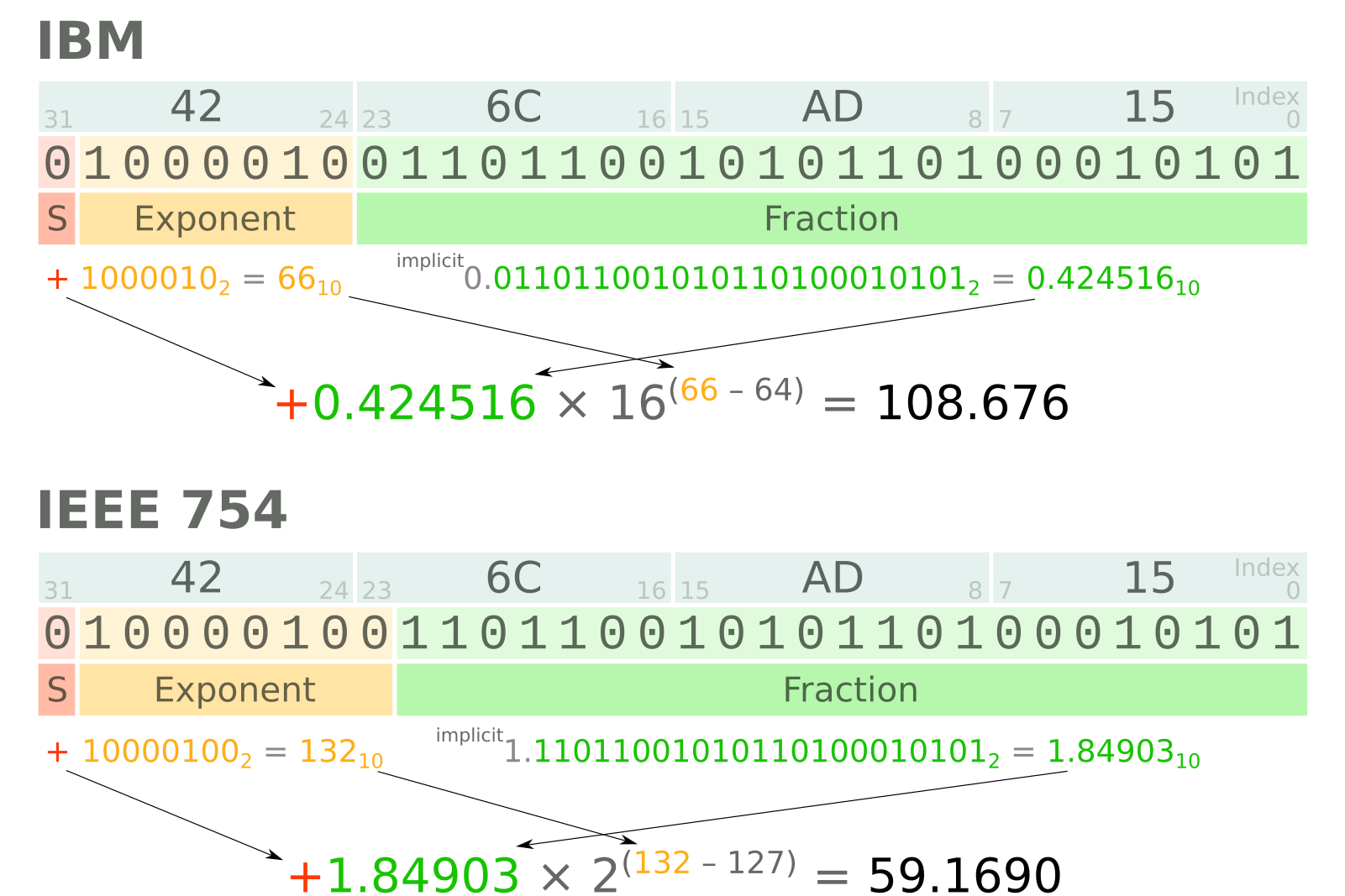
The IBM float and IEEE 754-2008 specifications are just different ways of splitting up the bits in a floating point representation. Single-precision (32-bit) IBM floats differ from single-precision IEEE floats in two ways: they use 7 bits and a base of 16 for the exponent. In contrast, IEEE floats — which are used by essentially all modern computers — use 8 bits and base 2 (usually) for the exponent. The IEEE standard also defines not-a-numbers (NaNs), and positive and negative infinities, among other conveniences for computing.

In double-precision, IBM floats get 56 bits for the fraction of the significand, allowing greater precision. There are still only 7 bits for the exponent, so there's no change in the dynamic range. 64-bit IEEE floats, however, use 11 bits for the exponent, leaving 52 bits for the fraction of the significand. This scheme results in 15–17 sigificant figures in decimal numbers.

The diagram below shows how four bytes (0x42, 0x6C, 0xAD, 0x15) are interpreted under the two schemes. The results are quite different. Notice the extra bit for the exponent in the IEEE representation, and the different bases and biases.

A four-byte word, 426CAD15 (in hexadecimal), interpreted as an IBM float (top) and an IEEE float (bottom). Most scientists would care about this difference!

A four-byte word, 426CAD15 (in hexadecimal), interpreted as an IBM float (top) and an IEEE float (bottom). Most scientists would care about this difference!

IBM, IEEE, and seismic

When SEG-Y was defined in 1975, there were only IBM floats — IEEE floats were not defined until 1985. The SEG allowed the use of IEEE floating-point numbers in Revision 1 (2002), and they are still allowed in the impending Revision 2 specification. This is important because most computers these days use IEEE float representations, so if you want to read or write IBM floats, you're going to need to do some work.

The floating-point format in a particular SEG-Y file should be indicated by a flag in bytes 3225–3226. A value of 0x01 indicates IBM floats, while 0x05 indicates IEEE floats. Then again, you can't believe everything you read in headers. And, unfortunately, you can't tell an IBM float just by looking at it. Meisinger (2004) wrote a nice article in CSEG Recorder about the perils of loading IBM as IEEE and vice versa — illustrated below. You should read it.

From Meisinger, D (2004). SEGY floating point confusion. CSEG Recorder 29(7). Available online.

From Meisinger, D (2004). SEGY floating point confusion. CSEG Recorder 29(7). Available online.

I wrote this post by accident while writing about endianness, the main big change in the new SEG-Y revision. Stay tuned for that post! [Update: here it is!]

Unearthing gold in Toronto

I just got home from Toronto, the mining capital of the world, after an awesome weekend hacking with Diego Castañeda, a recent PhD grad in astrophysics that is working with us) and Anneya Golob (another astrophysicist and Diego's partner). Given how much I bang on about hackathons, it might surprise you to know that this was the first hackathon I have properly participated in, without having to order tacos or run out for more beer every couple of hours.

PArticipants being briefed by one of the problem sponsors on the first evening.

PArticipants being briefed by one of the problem sponsors on the first evening.

What on earth is Unearthed?

The event (read about it) was part of a global series of hackathons organized by Unearthed Solutions, a deservedly well-funded non-profit based in Australia that is seeking to disrupt every single thing in the natural resources sector. This was their fourteenth event, but their first in Canada. Remarkably, they got 60 or 70 hackers together for the event, which I know from my experience organizing events takes a substantial amount of work. Avid readers might remember us mentioning them before, especially in a guest post by Jelena Markov and Tom Horrocks in 2014.

A key part of Unearthed's strategy is to engage operating companies in the events. Going far beyond mere sponsorship, Barrick Gold sent several mentors to the event, the Chief Innovation Officer Michelle Ash, as well as two judges, Ed Humphries (head of digital transformation) and Iain Allen (head of digital mining). Barrick provided the chellenge themes, as well as data and vivid descriptions of operational challenges. The company was incredibly candid with the participants, and should be applauded for its support of what must have felt like a pretty wild idea. 

Team Auger Effect: Diego and Anneya hacking away on Day 2.

Team Auger Effect: Diego and Anneya hacking away on Day 2.

What went down?

It's hard to describe a hackathon to someone who hasn't been to one. It's like trying to describe the Grand Canyon, ice climbing, or a 1985 Viña Tondonia Rioja. It's always fun to see and hear the reactions of the judges and other observers that come for the demos in the last hours of the event: disbelief at what small groups of humans can do in a weekend, for little tangible reward. It flies in the face of everything you think you know about creativity, productivity, motivation, and collaboration. Not to mention intellectual property.

As the fifteen (!) teams made their final 5-minute pitches, it was clear that every single one of them had created something unique and useful. The judges seemed genuinely blown away by the level of accomplishment. It's hard to capture the variety, but I'll have a go with a non-comprehensive list. First, there was a challenge around learning from geoscience data:

  • BGC Engineering, one of the few pro teams and First Place winner, produced an impressive set of tools for scraping and analysing public geoscience data. I think it was a suite of desktop tools rather than a web application.
  • Mango (winners of the Young Innovators award), Smart Miner (second place overall), Crater Crew, Aureka, and Notifyer and others presented map-based browsers for public mining data, with assistance from varying degrees of machine intelligence.
  • Auger Effect (me, Diego, and Anneya) built a three-component system consisting of a browser plugin, an AI pipeline, and a social web app, for gathering, geolocating, and organizing data sources from people as they research.

The other challenge was around predictive maintenance:

  • Tyrelyze, recognizing that two people a year are killed by tyre failures, created a concept for laser scanning haul truck tyres during operations. These guys build laser scanners for core, and definitely knew what they were doing.
  • Decelerator (winners of the People's Choice award) created a concept for monitoring haul truck driving behaviour, to flag potentially expensive driving habits.
  • Snapfix.io looked at inventory management for mine equipment maintenance shops.
  • Arcana, Leo & Zhao, and others looked at various other ways of capturing maintenance and performace data from mining equipment, and used various strategies to try to predict 

I will try to write some more about the thing we built... and maybe try to get it working again! The event was immensely fun, and I'm so glad we went. We learned a huge amount about mining too, which was eye-opening. Massive thanks to Unearthed and to Barrick on all fronts. We'll be back!

Brad BEchtold of Cisco (left) presenting the Young Innovator award for under-25s to Team Mango.

The winners of the People's Choice Award, Team Decelerate.

The winners of the contest component of the event, BGC Engineering, with Ed Humphries of Barrick (left).


UPDATE  View all the results and submissions from the event.


Wish there was a hackathon just for geoscientists and subsurface engineers?
You're in luck! Join us in Paris for the Subsurface Hackathon — sponsored by Dell EMC, Total E&P, NVIDIA, Teradata, and Sandstone. The theme is machine learning, and registration is open. There's even a bootcamp for anyone who'd like to pick up some skills before the hack.

Strategies for a revolution

This must be a record. It has taken me several months to get around to recording the talk I gave last year at EAGE in Vienna — Strategies for a revolution. Rather a gradiose title, sorry about that, especially over-the-top given that I was preaching to the converted: the workshop on open source. I did, at least, blog aobut the goings on in the workshop itself at the time. I even followed it up with a slightly cheeky analysis of the discussion at the event. But I never posted my own talk, so here it is:

Too long didn't watch? No worries, my main points were:

  1. It's not just about open source code. We must write open access content, put our data online, and push the whole culture towards openness and reproducibility. 
  2. We, as researchers, professionals, and authors, need to take responsibility for being more open in our practices. It has to come from within the community.
  3. Our conferences need more tutorials, bootcamps, , hackathons and sprints. These events build skills and networks much faster than (just) lectures and courses.
  4. We need something like an Open Geoscience Foundation to help streamline funding channels for open source projects and community events.

If you depend on open source software, or care about seeing more of it in our field, I'd love to hear your thoughts about how we might achieve the goal of having greater (scientific, professional, societal) impact with technology. Please leave a comment.


x lines of Python: AVO plot

Amplitude vs offset (or, more properly, angle) analysis is a core component of quantitative interpretation. The AVO method is based on the fact that the reflectivity of a geological interface does not depend only on the acoustic rock properties (velocity and density) on both sides of the interface, but also on the angle of the incident ray. Happily, this angular reflectivity encodes elastic rock property information. Long story short: AVO is awesome.

As you may know, I'm a big fan of forward modeling — predicting the seismic response of an earth model. So let's model the response the interface between a very simple model of only two rock layers. And we'll do it in only a few lines of Python. The workflow is straightforward:

  1. Define the properties of a model shale; this will be the upper layer.
  2. Define a model sandstone with brine in its pores; this will be the lower layer.
  3. Define a gas-saturated sand for comparison with the wet sand. 
  4. Define a range of angles to calculate the response at.
  5. Calculate the brine sand's response at the interface, given the rock properties and the angle range.
  6. For comparison, calculate the gas sand's response with the same parameters.
  7. Plot the brine case.
  8. Plot the gas case.
  9. Add a legend to the plot.

That's it — nine lines! Here's the result:


Once we have rock properties, the key bit is in the middle:

    θ = range(0, 31)
    shuey = bruges.reflection.shuey2(vp0, vs0, ρ0, vp1, vs1, ρ1, θ)

shuey2 is one of the many functions in bruges — here it provides the two-term Shuey approximation, but it contains lots of other useful equations. Virtually everything else in our AVO plotting routine is just accounting and plotting.


As in all these posts, you can follow along with the code in the Jupyter Notebook. You can view this on GitHub, or run it yourself in the increasingly flaky MyBinder (which is down at the time of writing... I'm working on an alternative).

What would you like to see in x lines of Python? Requests welcome!

x lines of Python: web scraping and web APIs

The Web is obviously an incredible source of information, and sometimes we'd like access to that information from within our code. Indeed, if the information keeps changing — like the price of natural gas, say — then we really have no alternative.

Fortunately, Python provides tools to make it easy to access the web from within a program. In this installment of x lines of Python, I look at getting information from Wikipedia and requesting natural gas prices from Yahoo Finance. All that in 10 lines of Python — total.

As before, there's a completely interactive, live notebook version of this post for you to run, right in your browser. Quick tip: Just keep hitting Shift+Enter to run the cells. There's also a static repo if you want to run it locally.

Geological ages from Wikipedia

Instead of writing the sentences that describe the code, I'll just show you the code. Here's how we can get the duration of the Jurassic period fresh from Wikipedia:

url = "http://en.wikipedia.org/wiki/Jurassic"
r = requests.get(url).text
start, end = re.search(r'<i>([\.0-9]+)–([\.0-9]+)&#160;million</i>', r.text).groups()
duration = float(start) - float(end)
print("According to Wikipedia, the Jurassic lasted {:.2f} Ma.".format(duration))

The output:

According to Wikipedia, the Jurassic lasted 56.30 Ma.

There's the opportunity for you to try writing a little function to get the age of any period from Wikipedia. I've given you a spot of help, and you can even complete it right in your browser — just click here to launch your own copy of the notebook.

Gas price from Yahoo Finance

url = "http://download.finance.yahoo.com/d/quotes.csv"
params = {'s': 'HHG17.NYM', 'f': 'l1'}
r = requests.get(url, params=params)
price = float(r.text)
print("Henry Hub price for Feb 2017: ${:.2f}".format(price))

Again, the output is fast, and pleasingly up-to-the-minute:

Henry Hub price for Feb 2017: $2.86

I've added another little challenge in the notebook. Give it a try... maybe you can even adapt it to find other live financial information, such as stock prices or interest rates.

What would you like to see in x lines of Python? Requests welcome!

Welly to the wescue

I apologize for the widiculous title.

Last week I described some headaches I was having with well data, and I introduced welly, an open source Python tool that we've built to help cure the migraine. The first versions of welly were built — along with the first versions of striplog — for the Nova Scotia Department of Energy, to help with their various data wrangling efforts.

Aside — all software projects funded by government should in principle be open source.

Today we're using welly to get data out of LAS files and into so-called feature vectors for a machine learning project we're doing for Canstrat (kudos to Canstrat for their support for open source software!). In our case, the features are wireline log measurements. The workflow looks something like this:

  1. Read LAS files into a welly 'project', which contains all the wells. This bit depends on lasio.
  2. Check what curves we have with the project table I showed you on Thursday.
  3. Check curve quality by passing a test suite to the project, and making a quality table (see below).
  4. Fix problems with curves with whatever tricks you like. I'm not sure how to automate this.
  5. Export as the X matrix, all ready for the machine learning task.

Let's look at these key steps as Python code.

1. Read LAS files

 
from welly import Project
p = Project.from_las('data/*.las')

2. Check what curves we have

Now we have a project full of wells and can easily make the table we saw last week. This time we'll use aliases to simplify things a bit — this trick allows us to refer to all GR curves as 'Gamma', so for a given well, welly will take the first curve it finds in the list of alternatives we give it. We'll also pass a list of the curves (called keys here) we are interested in:

The project table. The name of the curve selected for each alias is selected. The mean and units of each curve are shown as a quick QC. A couple of those RHOB curves definitely look dodgy, and they turned out to be DRHO correction curves.

The project table. The name of the curve selected for each alias is selected. The mean and units of each curve are shown as a quick QC. A couple of those RHOB curves definitely look dodgy, and they turned out to be DRHO correction curves.

3. Check curve quality

Now we have to define a suite of tests. Lists of test to run on each curve are held in a Python data structure called a dictionary. As well as tests for specific curves, there are two special test lists: Each and All, which are run on each curve encountered, and on all curves together, respectively. (The latter is required to, for example, compare the curves to each other to look for duplicates). The welly module quality contains some predefined tests, but you can also define your own test functions — these functions take a curve as input, and return either True (for a test pass) for False.

 
import welly.quality as qty
tests = {
    'All': [qty.no_similarities],
    'Each': [qty.no_monotonic],
    'Gamma': [
        qty.all_positive,
        qty.mean_between(10, 100),
    ],
    'Density': [qty.mean_between(1000,3000)],
    'Sonic': [qty.mean_between(180, 400)],
    }

html = p.curve_table_html(keys=keys, alias=alias, tests=tests)
HTML(html)
the green dot means that all tests passed for that curve. Orange means some tests failed. If all tests fail, the dot is red. The quality score shows a normalized score for all the tests on that well. In this case, RHOB and DT are failing the 'mean_b…

the green dot means that all tests passed for that curve. Orange means some tests failed. If all tests fail, the dot is red. The quality score shows a normalized score for all the tests on that well. In this case, RHOB and DT are failing the 'mean_between' test because they have Imperial units.

4. Fix problems

Now we can fix any problems. This part is not yet automated, so it's a fairly hands-on process. Here's a very high-level example of how I fix one issue, just as an example:

 
def fix_negs(c):
    c[c < 0] = np.nan
    return c

# Glossing over some details, we give a mnemonic, a test
# to apply, and the function to apply if the test fails.
fix_curve_if_bad('GAM', qty.all_positive, fix_negs)

What I like about this workflow is that the code itself is the documentation. Everything is fully reproducible: load the data, apply some tests, fix some problems, and export or process the data. There's no need for intermediate files called things like DT_MATT_EDIT or RHOB_DESPIKE_FINAL_DELETEME. The workflow is completely self-contained.

5. Export

The data can now be exported as a matrix, specifying a depth step that all data will be interpolated to:

 
X, _ = p.data_as_matrix(X_keys=keys, step=0.1, alias=alias)

That's it. We end up with a 2D array of log values that will go straight into, say, scikit-learn*. I've omitted here the process of loading the Canstrat data and exporting that, because it's a bit more involved. I will try to look at that part in a future post. For now, I hope this is useful to someone. If you'd like to collaborate on this project in the future — you know where to find us.

* For more on scikit-learn, don't miss Brendon Hall's tutorial in October's Leading Edge.


I'm happy to let you know that agilegeoscience.com and agilelibre.com are now served over HTTPS — so connections are private and secure by default. This is just a matter of principle for the Web, and we go to great pains to ensure our web apps modelr.io and pickthis.io are served over HTTPS. Find out more about SSL from DigiCert, the provider of Squarespace's (and Agile's) certs, which are implemented with the help of the non-profit Let's Encrypt, who we use and support with dollars.