Helpful horizons

Ah, the smell of a new seismic interpretation project. All those traces, all that geology — perhaps unseen by humans or indeed any multicellular organism at all since the Triassic. The temptation is to Just Start Interpreting, why, you could have a map by lunchtime tomorrow! But wait. There are some things to do first.

Once I've made sure all is present and correct (see How to QC a seismic volume), I spend a bit of time making some helpful horizons... 

  • The surface. One of the fundamental horizons, the seafloor or ground surface is a must-have. You may have received it from the processor (did you ask for it?) or it may be hidden in the SEG-Y headers — ask whoever received or loaded the data. If not, ground elevation is usually easy enough to get from your friendly GIS guru. If you have to interpret the seafloor, at least it should autotrack quite well.
  • Seafloor multiple model. In marine data, I always make a seafloor multiple model — just multiply the seafloor pick by 2. This will help you make sense of any anomalous reflectors or amplitudes at that two-way time. Maybe make a 3× version too if things look really bad. Remember, the 2× multiple will be reverse polarity.
  • Other multiples. You can model the surface multiple of any strong reflectors with the same arithmetic — but the chances are that any residual multiple energy is quite subtle. You may want to seek help modeling them properly, once you have a 3D velocity model.

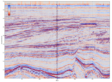
A 2D seismic dataset with some of the suggested helpful horizons. Please see the footnote about this dataset. Click the image to enlarge.

  • Water depth markers. I like to make flat horizons* at important water depths, eg shelf edge (usually about 100–200 m), plus 1000 m, 2000 m, etc. This mainly helps to keep track of where you are, and also to think about prospectivity, accessibility, well cost, etc. You only want these to exist in the water, so delete them anywhere they are deeper than the seafloor horizon. Your software should have an easy way to implement a simple model for time t in ms, given depth d in m and velocity** V in m/s, e.g.

$$ t = \frac{2000 d}{V} \approx \frac{2000 d}{1490} \qquad \qquad \mathrm{e.g.}\ \frac{2000 \times 1000}{1490} = 1342\ \mathrm{ms} $$

  • Hydrate stability zone. In marine data and in the Arctic you may want to model the bottom of the gas hydrate stability zone (GHSZ) to help interpret bottom-simulating reflectors, or BSRs. I usually do this by scanning the literature for reports of BSRs in the area, or data on hydrate encounters in wells. In the figure above, I just used the seafloor plus 400 ms. If you want to try for more precision, Bale et al. (2014) provided several models for computing the position of the GHSZ — thank you to Murray Hoggett at Birmingham for that tip.
  • Fold. It's very useful to be able to see seismic fold on a map along with your data, so I like to load fold maps at some strategic depths or, better yet, load the entire fold volume. That way you can check that anomalies (especially semblance) don't have a simple, non-geological explanation. 
  • Gravity and magnetics. These datasets are often readily available. You will have to shift and scale them to some sensible numbers, either at the top or the bottom of your sections. Gravity can be especially useful for interpreting rifted margins. 
  • Important boundaries. Your software may display these for you, but if not, you can fake it. Simply make a horizon that only exists within the polygon — a lease boundary perhaps — by interpolating within a polygon. Make this horizon flat and deep (deeper than the seismic), then merge it with a horizon that is flat and shallow (–1 ms, or anything shallower than the seismic). You should end up with almost-vertical lines at the edges of the feature.
  • Section headings. I like to organize horizons into groups — stratigraphy, attributes, models, markers, etc. I make empty horizons to act only as headings so I can see at a glance what's going on. Whether you need do this, and how you achieve it, depends on your software.

Most of these horizons don't take long to make, and I promise you'll find uses for them throughout the interpretation project. 

If you have other helpful horizon hacks, I'd love to hear about them — put your favourites in the comments. 


Footnotes

* It's not always obvious how to make a flat horizon. A quick way is to take some ubiquitous horizon — the seafloor maybe — and multiply it by zero.

** The velocity of sound in seawater is not a simple subject. If you want to be precise about it, you can try this online calculator, or implement the equations yourself.

The 2D seismic dataset shown is from the Laurentian Basin, offshore Newfoundland. The dataset is copyright of Natural Resources Canada, and subject to the Open Government License – Canada. You can download it from the OpendTect Open Seismic Repository. The cultural boundary and gravity data is fictitious — I made them up for the purposes of illustration.

References

Bale, Sean, Tiago M. Alves, Gregory F. Moore (2014). Distribution of gas hydrates on continental margins by means of a mathematical envelope: A method applied to the interpretation of 3D seismic data. Geochem. Geophys. Geosyst. 15, 52–68, doi:10.1002/2013GC004938. Note: the equations are in the Supporting Information.

Toolbox wishlist

Earlier this week, the conversation on Software Underground* turned to well-tie software.

Someone was complaining that, despite having several well-tie tools at their disposal, none of them was quite right. I've written about this phenomenon before. We, as a discipline, do not know how to tie wells. I don't mean that you don't know, I know you know, but I bet if you compared the workflows of ten geoscientists, they would all be different. That's why every legacy well in every project has thirty time-depth tables, including at least three endearingly hopeful ones called final, and the one everyone uses, called test.

As a result of all this, the topic of "what tools do people need?" came up. Leo Uieda, a researcher in Brazil, asked:

I just about remembered that I had put up this very question on Tricider some time ago. Tricider is not a website about apple-based beverages, but a site for sharing and voting on ideas. You can start with a few ideas, get votes and comments on them, and even get new ideas. Here's the top idea as of right now: an open-source petrophysics tool.

Do check out the list, and vote or comment if you like. It might help someone find a project to work on, or spark an idea for a new app or even a new company.

Another result of the well-tie software conversation was, "What are the features of the one well-tie app to rule them all?" I'll leave you to stew on that one for a while. Meanwhile, please share your thoughts in the comments.


* Software Underground is an open Slack team. In essence, it's a chat room for geocomputing geeks: software, underground, geddit? It's completely free and open to anyone — pop along to http://swung.rocks/ to sign up.

It even has its own radio station!

Tools for drawing geoscientific figures

This is a response to Boyan Vakarelov's useful post on LinkedIn about tools for creating geological figures. I especially liked his SketchUp tip.

It's a while since we wrote about our toolset, so I thought I'd document what we're currently using for making figures. You won't be surprised to hear that they're mostly open source. 

Our figure creation toolbox

  • QGIS — if it's a map, you should make it in a GIS, it's as simple as that.
  • Inkscape — for most drawing and figure creation tasks. It's just as good as Illustrator.
  • GIMP — for raster editing tasks. Rasters are no good for editable figures or line art though.
  • TimeScale Creator — a little-known tool for making editable chronostratigraphic columns. Here's an example from way back on this very blog. The best thing: you can export SVG files, then edit them in Inkscape.
  • Python, R, etc. — the best way to make reproducible scientific figures is not to draw them at all. Instead, create data visualizations programmatically.

To really appreciate how fantastic the programmatic approach is, check out Sergey Fomel's treasure trove of reproducible documents, in which every figure is really just the output of a little program that anyone can run. Here's one of my own, adapted from a previous post and a sneak peek of an upcoming Leading Edge tutorial:

Different sample interpolation styles give different amplitudes for inter-sample positions, as shown at the red 'horizon' time pick. From upcoming tutorial in the April edition of The Leading Edge

Everything you wanted to know about images

Screenshots often form part of a figure, because they're so much easier than trying to figure out how to export an image, or trying to wrangle the data from scratch. If you find yourself grabbing a screenshot, and any time you're providing an image for someone else — especially if it's destined for print — you need to know all about image resolution. Read my post Save the samples for my advice. 

If you still save your images as JPEG, you also need to read my post about How to choose an image format. One day you might need the fidelity you are throwing away! Here's the short version: save everything as a PNG.

Last thing: know the difference between vector and raster graphics. Make vectors when you can.

Stop using PowerPoint!

The only bit of Boyan's post I didn't like was the bit about PowerPoint. I admit, fifteen years ago I was a bit of a slave to PowerPoint. I'd have preferred to use Illustrator at the time, but it was well beyond corporate IT's ken, and I hadn't yet discovered Inkscape. But I'm over it now — and just as well because it's a horrible drawing tool. The main limitation is not having layers, which is a show-stopper for me, but there's also the generic typography, simplistic spline editing, the inability to handle standard formats like SVG, and no scripting or plug-ins.

Getting good

If you want to learn about making effective scientific figures, I strongly recommend reading anything you can by Edward Tufte, Robert Kosara, Alberto Cairo, and Mike Bostock. For some quick inspiration check out the #dataviz hashtag on Twitter, or feast your eyes on this amazing collection of graphics, or Mike Bostock's interactive examples, or... there are too many resources to choose from.

How about you? Share your favourite tools in the comments or on Boyan's post.

New open data and a competition

First, a quick announcement. EMC, the data storage and cloud computing company, has stepped up to sponsor the Subsurface Hackathon in Vienna in a few weeks. Their generous help will ensure a fun event with some awesome prizes — so get signed up and start planning your project!


New open data

A correspondent got in touch last week about an exciting new open seismic dataset. In the late summer and early autumn of 2015, the WesternGeco-acquired a large new 2D seismic survey in the Rockall Basin and the Mid North Sea High for the UK Government. The survey cost about £20 million and consists of 20,000 km of new broadband PreSTM data. At the end of March, the dataset will be released to the public for free download, along with about 20,000 km of legacy 2D data, 40,000 km of new gravity and magnetic data, and wells.

© Crown Copyright — Used under fair use provision.

If you are interested in downloading the data, the government is asking that you fill out this form — it will help them figure out what to make available, and how much infrastructure to provision. Excitingly, they are asking about angle stacks, PSTM gathers, not just the full stack. It sounds like being an important resource for our community.

They are even asking about interest in the field data — all 60TB of it. There will almost certainly be a fee associated with the larger datasets, by the way. I asked about this and it sounds like it will likely be on the order of several thousand pounds to handle the full SEGD data, because of course it will be on physical media. But the government is open to suggestions if the geophysical community would like to find another way to distribute the data — do let me know if you'd like to talk about this.

New seed funding

Along with the data package, the government has announced an exciting new competition for 'seed funding':

The £500,000 competition has been designed to encourage geoscientists and engineers to develop innovative interpretations and products potentially using [this new open data]...

The motivation for the competition is clear:

It is hoped the competition will not only significantly increase the understanding of these frontier areas in respect of the 29th Seaward Licensing Round later in the year, but also retain talent in the oil and gas community which has been affected by the oil and gas industry downturn.

The parameters of the competition are spelled out in the Word document on this tender notice. It sounds like almost anything goes: data analysis, product development, even exploration activity. So get creative — and pitch the coolest thing you can think of!

You'll have to get cracking though, because applications to take part must be in by 1 April. If selected, the project must be delivered on 11 November.

A European geo-gaming hackathon

I'm convinced that hackathons are the best way to get geoscientists and engineers inventing and collaborating in new ways. They are better for learning than courses. They are better for networking than parties. And they nearly always have tacos! 

If you are unsure what a hackathon is, or why I'm so enthusiastic about them, you can read my November article in the Recorder (Hall 2015, CSEG Recorder, vol 40, no 9).

The next hackathon will be 28 and 29 May in Vienna, Austria — right before the EAGE Conference and Exhibition. You can sign up right now! Please get it in your calendar and pass it along.

Throwing down the gauntlet

Colorado School of Mines has dominated the student showing at the last 2 autumn hackathons. I know there are plenty more creative research groups out there. Come out and show the world your awesomeness — in teams of up to 4 people — and spend a weekend learning and coding. Also: there will be beer.

To everyone else: this is not a student event, it's for everyone. Most of the participants in the past have been professionals, but the more diverse it is, the more we all get out of it. So don't ask yourself if you'll fit in — you will. 

A word about the fee

Our previous hackathons have been free, but this one has a small fee. It's an experiment. Like most free events, no-shows are a challenge; I'm hoping the fee reduces the problem. If the fee makes it difficult for you to join us, please get in touch — I do not want it to be a barrier.

Just to be clear: these events do not make money. Previous events have been generously sponsored — and that's the only way they can happen. We need support for this one too: if you're a champion of creativity in science and want to support this event, you can find me at matt@agilegeoscience.com, or you can read more about sponsorship here.

Details

The dates are 28 and 29 May. The event will run 8 till 6 (or so) on both the Saturday and the Sunday. We don't have a venue finalized yet. Ideas and contributions of any kind are welcome — this is a community event.

The theme this year will be Games. If you have ideas, share them in the comments! Here are some random project ideas to get you going...

  • Acquisition optimizer: lay out the best geometry to image the geology.
  • Human inversion: add geological layers to match a seismic trace.
  • Drill wells on a budget to make the optimal map of an unseen surface.
  • Which geological section matches the (noisy) seismic section?
  • Top Trumps for global 3D seismic surveys, with data scraped from press releases.
  • Set up the best processing flow based for a modeled, noisy shot gather.

It's going to be fun! If you're traveling to EAGE this year, I hope we see you there!


Photo of Vienna by Nic Piégsa, CC-BY. Photo of bridge by Dragan Brankovic, CC-BY.

Images as data

I was at the Atlantic Geoscience Society's annual meeting on Friday and Saturday, held this year in a cold and windy Truro, Nova Scotia. The AGS is a fairly small meeting — maybe a couple of hundred geoscientists make the trip — but usually good value, especially if you're working in the area. 

A few talks and posters caught my attention, as they were all around a similar theme: getting data from images. Not in an interpretive way, though — these papers were about treating images fairly literally. More like extracting impedance from seismic than, say, making a horizon map.

Drone to stereonet

Amazing 3D images generated from a large number of 2D images of outcrop. LEft: the natural colour image. Middle: all facets generated by point cloud analysis. Right: the final set of human-filtered facets. © Joseph Cormier 2016

Amazing 3D images generated from a large number of 2D images of outcrop. LEft: the natural colour image. Middle: all facets generated by point cloud analysis. Right: the final set of human-filtered facets. © Joseph Cormier 2016

Probably the most eye-catching poster was that of Joseph Cormier (UNB), who is experimenting with computer-assisted structural interpretation. Using dozens of high-res photographs collected by a UAV, Joseph combines them to create reconstruct the 3D scene of the outcrop — just from photographs, no lidar or other ranging technology. The resulting point cloud reveals the orientations of the outcrop's faces, as well as fractures, exposed faults, and so on. A human interpreter can then apply her judgment to filter these facets to groups of tectonically significant sets, at which point they can be plotted on a stereonet. Beats crawling around with a Brunton or Suunto for days!

Hyperspectral imaging

There was another interesting poster by a local mining firm that I can't find in the abstract volume. They had some fine images from CoreScan, a hyperspectral imaging and analysis company operating in the mining industry. The technology, which can discern dozens of rock-forming minerals from their near infrared and shortwave infrared absorption characteristics, seems especially well-suited to mining, where mineralogical composition is usually more important than texture and sedimentological interpretation. 

Isabel Chavez (SMU) didn't need a commercial imaging service. To help correlate Laurasian shales on either side of the Atlantic, she presented results from using a handheld Konica-Minolta spectrophotometer on core. She found that CIE L* and a* colour parameters correlated with certain element ratios from ICP-MS analysis. Like many of the students at AGS, Isabel was presenting her undergraduate thesis — a real achievement.

Interesting aside: one of the chief applications of colour meters is measuring the colour of chips. Fascinating.

The hacker spirit is alive and well

The full spectrum (top), and the CCD responses with IR filter, Red filter, green filter, and blue filter (bottom). All of the filters admitted some infrared light, causing problems for calibration. © Robert McEwan 2016.

The full spectrum (top), and the CCD responses with IR filter, Red filter, green filter, and blue filter (bottom). All of the filters admitted some infrared light, causing problems for calibration. © Robert McEwan 2016.

After seeing those images, and wishing I had a hyperspectral imaging camera, Rob McEwan (Dalhousie) showed how to build one! In a wonderfully hackerish talk, he showed how he's building a $100 mineralogical analysis tool. He started by removing the IR filter from a second-hand Nikon D90, then — using a home-made grating spectrometer — measured the CCD's responses in the red, green, blue, and IR bands. After correcting the responses, Rob will use the USGS spectral library (Clark et al. 2007) to predict the contributions of various minerals to the image. He hopes to analyse field and lab photos at many scales. 

Once you have all this data, you also have to be able to process it. Joshua Wright (UNB) showed how he has built a suite of VisualBasic Macros to segment photomicrographs into regions representing grains using FIJI, then post-process the image data as giant arrays in an Excel spreadsheet (really!). I can see how a workflow like this might initially be more accessible to someone new to computer programming, but I felt like he may have passed Excel's sweetspot. The workflow would be much smoother in Python with scikit-image, or MATLAB with the Image Processing Toolbox. Maybe that's where he's heading. You can check out his impressive piece of work in a series of videos; here's the first:

Looking forward to 2016

All in all, the meeting was a good kick off to the geoscience year — a chance to catch up with some local geoscientists, and meet some new ones. I also had the chance to update the group on striplog, which generated a bit of interest. Now I'm back in Mahone Bay, enjoying the latest winter storm, enjoying the feeling of having something positive to blog about!

Please be aware that, unlike the images I usually include in posts, the images in this post are not open access and remain the copyright of their respective authors.


References

Isabel Chavez, David Piper, Georgia Pe-Piper, Yuanyuan Zhang, St Mary's University (2016). Black shale Selli Level recorded in Cretaceous Naskapi Member cores in the Scotian Basin. Oral presentation, AGS Colloquium, Truro NS, Canada.

Clark, R.N., Swayze, G.A., Wise, R., Livo, E., Hoefen, T., Kokaly, R., Sutley, S.J., 2007, USGS digital spectral library splib06a: U.S. Geological Survey, Digital Data Series 231

Joseph Cormier, Stefan Cruse, Tony Gilman, University of New Brunswick (2016). An optimized method of unmanned aerial vehicle surveying for rock slope analysis, 3D modeling, and structural feature extraction. Poster, AGS Colloquium, Truro NS, Canada.

Robert McEwan, Dalhousie University (2016). Detecting compositional variation in granites – a method for remotely sensed platform. Oral presentation, AGS Colloquium, Truro NS, Canada.

Joshua Wright, University of New Brunswick (2016). Using macros and advanced functions in Microsoft ExcelTM to work effectively and accurately with large data sets: An example using sulfide ore characterizatio. Oral presentation, AGS Colloquium, Truro NS, Canada.

Is subsurface software too pricey?

Amy Fox of Enlighten Geoscience in Calgary wrote a LinkedIn post about software pricing a couple of weeks ago. I started typing a comment... and it turned into a blog post.


I have no idea if software is 'too' expensive. Some of it probably is. But I know one thing for sure: we subsurface professionals are the only ones who can do anything about the technology culture in our industry.

Certainly most technical software is expensive. As someone who makes software, I can see why it got that way: good software is really hard to make. The market is small, compared to consumer apps, games, etc. Good software takes awesome developers (who can name their price these days), and it takes testers, scientists, managers.

But all is not lost. There are alternatives to the expensive software. We — practitioners in industry — just do not fully explore them. OpendTect is a great seismic interpretation tool, but many people don't take it seriously because it's free. QGIS is an awesome GIS application, arguably better than ArcGIS and definitely easier to use.

Sure, there are open source tools we have embraced, like Linux and MediaWiki. But on balance I think this community is overly skeptical of open source software. As evidence of this, how many oil and gas companies donate money to open source projects they use? There's just no culture for supporting Linux, MediaWiki, Apache, Python, etc. Why is that?

If we want awesome tools, someone, somewhere, has to pay the people who made them, somehow.

price.png

So why is software expensive and what can we do about it?

I used to sell Landmark's GeoProbe software in Calgary. At the time, it was USD140k per seat, plus 18% annual maintenance. A lot, in other words. It was hard to sell. It needed a sales team, dinners, and golf.  A sale of a few seats might take a year. There was a lot of overhead just managing licenses and test installations. Of course it was expensive!

In response, on the customer side, the corporate immune system kicked in, spawning machine lockdowns, software spending freezes, and software selection committees. These were (well, are) secret organizations of non-users that did (do) difficult and/or pointless things like workflow mapping and software feature comparisons. They have to be secret because there's a bazillion dollars and a 5-year contract on the line.

Catch 22. Even if an ordinary professional would like to try some cheaper and/or better software, there is no process for this. Hands have been tied. Decisions have been made. It's not approved. It can't be done.

Well, it can be done. I call it the 'computational geophysics manoeuver', because that lot have known about it for years. There is an easy way to reclaim your professional right to the tools of the trade, to rediscover the creativity and fun of doing new things:

Bring or buy your own technology, install whatever the heck you want on it, and get on with your work.

If you don't think that's a possibility for you right now, then consider it a medium term goal.

Old skool plot tool

It's not very glamorous, but sometimes you just want to plot a SEG-Y file. That's why we crafted seisplot. OK, that's why we cobbled seisplot together out of various scripts and functions we had lying around, after a couple of years of blog posts and Leading Edge tutorials and the like.

Pupils of the old skool — when everyone knew how to write a bash script, pencil crayons and lead-filled beanbags ruled the desktop, and Carpal Tunnel Syndrome was just the opening act to the Beastie Boys — will enjoy seisplot. For a start, it's command line only: 

    python seisplot.py -R -c config.py ~/segy_files -o ~/plots

Isn't that... reassuring? In this age of iOS and Android and Oculus Rift... there's still the command line interface.

Features galore

So what sort of features can you look forward to? Other than all the usual things you've come to expect of subsurface software, like a complete lack of support or documentation. (LOL, I'm kidding.) Only these awesome selling points:

  • Make wiggle traces or variable density plots... or don't choose — do both!
  • If you want, the script will descend into subdirectories and make plots for every SEG-Y file it finds.
  • There are plenty of colourmaps to choose from, or if you're insane you can make your own.
  • You can make PNGs, JPGs, SVGs or PDFs. But not CGM, sorry about that.

Well, I say 'selling points', but the tool is 100% free. We think this is a fair price. It's also open source of course, so please — seriously, please — improve the source code, then share it with the world! The code is in GitHub, natch.

Never go full throwback

There is one more feature: you can go full throwback and add scribbles and coffee stains. Here's one for your wall:


The 2D seismic line in this post is from the USGS NPRA Seismic Data Archive, and are in the public domain. This is line number 31-81-PR (links directly to SEG-Y file).

White magic: calibrating seismic attributes

This post is part of a series on seismic attributes; the previous posts were...

  1. An attribute analysis primer
  2. Attribute analysis and statistics

Last time, I hinted that there might be a often-overlooked step in attribute analysis:

Calibration is a gaping void in many published workflows. How can we move past "that red blob looks like a point bar so I drew a line around it in PowerPoint" to "there's a 70% chance of finding reservoir quality sand at that location"?

Why is this step such a 'gaping void'? A few reasons:

  • It's fun playing with attributes, and you can make hundreds without a second thought. Some of them look pretty interesting, geological even. "That looks geological" is, however, not an attribute calibration technique. You have to prove it.
  • Nobody will be around when we find out the answer. There's a good chance that well will never be drilled, but when it is, you'll be on a different project, in a different company, or have left the industry altogether and be running a kayak rental business in Belize.
  • The bar is rather low. The fact that many published examples of attribute analysis include no proof at all, just a lot of maps with convincing-looking polygons on them, and claims of 'better reservoir quality over here'. 

This is getting discouraging. Let's look at an example. Now, it's hard to present this without seeming over-critical, but I know these gentlemen can handle it, and this was only a magazine article, so we needn't make too much of it. But it illustrates the sort of thing I'm talking about, so here goes.

Quoting from Chopra & Marfurt (AAPG Explorer, April 2014), edited slightly for brevity:

While coherence shows the edges of the channel, it gives little indication of the heterogeneity or uniformity of the channel fill. Notice the clear definition of this channel on the [texture attribute — homogeneity].
We interpret [the] low homogeneity feature [...] to be a point bar in the middle of the incised valley (green arrow). This internal architecture was not delineated by coherence.

A nice story, making two claims:

  1. The attribute incompletely represents the internal architecture of the channel.
  2. The labeled feature on the texture attribute is a point bar.

I know explorers have to be optimists, and geoscience is all about interpretation, but as scientists we must be skeptical optimists. Claims like this are nice hypotheses, but you have to take the cue: go off and prove them. Remember confirmation bias, and Feynman's words:

The first principle is that you must not fool yourself — and you are the easiest person to fool.

The twin powers

Making geological predictions with seismic attribute analysis requires two related workflows:

  1. Forward modeling — the best way to tune your intuition is to make a cartoonish model of the earth (2D, isotropic, homogeneous lithologies) and perform a simplified seismic experiment on it (convolutional, primaries only, noise-free). Then you can compare attribute behaviour to the known model.
  2. Calibration — you are looking for an explicit, quantitative relationship between a physical property you care about (porosity, lithology, fluid type, or whatever) and a seismic attribute. A common way to show this is with a cross-plot of the seismic amplitude against the physical property.

When these foundations are not there, we can be sure that one or more bad things will happen:

  • The relationship produces a lot of type I errors (false positives).
  • It produces a lot of type II error (false negatives).
  • It works at some wells and not at others.
  • You can't reproduce it with a forward model.
  • You can't explain it with physics.

As the industry shrivels and questions — as usual — the need for science and scientists, we have to become more stringent, more skeptical, and more rigorous. Doing anything else feeds the confirmation bias of the non-scientific continent. Because it says, loud and clear: geoscience is black magic.


The image is part of the figure from Chopra, S and K Marfurt (2014). Extracting information from texture attributes. AAPG Explorer, April 2014. It is copyright of the Authors and AAPG.

A coding kitchen in Stavanger

Last week, I travelled to Norway and held a two day session of our Agile Geocomputing Training. We convened at the newly constructed Innovation Dock in Stavanger, and set up shop in an oversized, swanky kitchen. Despite the industry-wide squeeze on spending, the event still drew a modest turnout of seven geoscientists. That's way more traction then we've had in North America lately, so thumbs up to Norway! And, since our training is designed to be very active, a group of seven is plenty comfortable. 

A few of the participants had some prior experience writing code in languages such as Perl, Visual Basic, and C, but the majority showed up without any significant programming experience at all. 

Skills start with syntax and structures 

The first day we covered basic principles or programming, but because Python is awesome, we dive into live coding right from the start. As an instructor, I find that doing live coding has two hidden benefits: it stops me from racing ahead, and making mistakes in the open gives students permission to do the same. 

Using geoscience data right from the start, students learn about key data structures: lists, dicts, tuples, and sets, and for a given job, why they might chose between them. They wrote their own mini-module containing functions and classes for getting stratigraphic tops from a text file. 

Since syntax is rather dry and unsexy, I see the instructor's main role to inspire and motivate through examples that connect to things that learners already know well. The ideal containers for stratigraphic picks is a dictionary. Logs, surfaces, and seismic, are best cast into 1-, 2, and 3-dimensional NumPy arrays, respectively. And so on.

Notebooks inspire learning

We've seen it time and time again. People really like the format of Jupyter Notebooks (formerly IPython Notebooks). It's like there is something fittingly scientific about them: narrative, code, output, repeat. As a learning document, they aren't static — in fact they're meant to be edited. But they aren't so open-ended that learners fail to launch. Professional software developers may not 'get it', but scientists really subscribe do. Start at the start, end at the end, and you've got a complete record of your work. 

You don't get that with the black-box, GUI-heavy software applications we're used to. Maybe, all legitimate work should be reserved for notebooks: self-contained, fully-reproducible, and extensible. Maybe notebooks, in their modularity and granularity, will be the new go-to software for technical work.

Outcomes and feedback

By the end of day two, folks were parsing stratigraphic and petrophysical data from text files, then rendering and stylizing illustrations. A few were even building interactive animations on 3D seismic volumes.  One recommendation was to create a sort of FAQ or cookbook: "How do I read a log?", "How do I read SEGY?", "How do I calculate elastic properties from a well log?". A couple of people of remarked that they would have liked even more coached exercises, maybe even an extra day; a recognition of the virtue of sustained and structured practice.


Want training too?

Head to our courses page for a list of upcoming courses, or more details on how you can train your team


Photographs in this post are courtesy of Alessandro Amato del Monte via aadm on Flickr