Well tie calculus

As Matt wrote in March, he is editing a regular Tutorial column in SEG's The Leading Edge. I contributed the June edition, entitled Well-tie calculus. This is a brief synopsis only; if you have any questions about the workflow, or how to get started in Python, get in touch or come to my course.


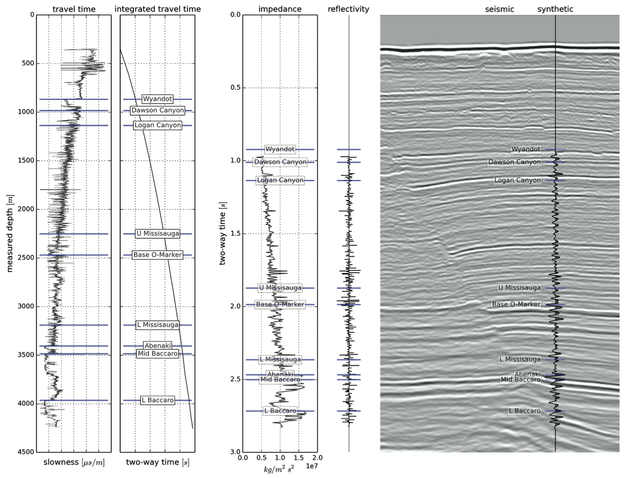
Synthetic seismograms can be created by doing basic calculus on traveltime functions. Integrating slowness (the reciprocal of velocity) yields a time-depth relationship. Differentiating acoustic impedance (velocity times density) yields a reflectivity function along the borehole. In effect, the integral tells us where a rock interface is positioned in the time domain, whereas the derivative tells us how the seismic wavelet will be scaled.

This tutorial starts from nothing more than sonic and density well logs, and some seismic trace data (from the #opendata Penobscot dataset in dGB's awesome Open Seismic Repository). It steps through a simple well-tie workflow, showing every step in an IPython Notebook:

  1. Loading data with the brilliant LASReader
  2. Dealing with incomplete, noisy logs
  3. Computing the time-to-depth relationship
  4. Computing acoustic impedance and reflection coefficients
  5. Converting the logs to 2-way travel time
  6. Creating a Ricker wavelet
  7. Convolving the reflection coefficients with the wavelet to get a synthetic
  8. Making an awesome plot, like so...

Final thoughts

If you find yourself stretching or squeezing a time-depth relationship to make synthetic events align better with seismic events, take the time to compute the implied corrections to the well logs. Differentiate the new time-depth curve. How much have the interval velocities changed? Are the rock properties still reasonable? Synthetic seismograms should adhere to the simple laws of calculus — and not imply unphysical versions of the earth.


Matt is looking for tutorial ideas and offers to write them. Here are the author instructions. If you have an idea for something, please drop him a line.

Saving time with code

A year or so ago I wrote that...

...every team should have a coder. Not to build software, not exactly. But to help build quick, thin solutions to everyday problems — in a smart way. Developers are special people. They are good at solving problems in flexible, reusable, scalable ways.

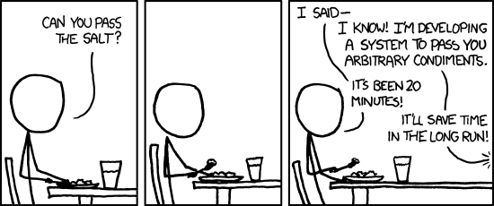
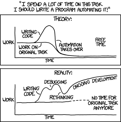
Since writing that, I've written more code than ever. I'm not ready to say that my starry-eyed vision of a perfect world of techs-cum-coders, but now I see that the path to nimble teams is probably paved with long cycle times, and never-ending iterations of fixing bugs and writing documentation.

So potentially we replace the time saved, three times over, with a tool that now needs documenting, maintaining, and enhancing. This may not be a problem if it scales to lots of users with the same problem, but of course having lots of users just adds to the maintaining. And if you want to get paid, you can add 'selling' and 'marketing' to the list. Pfff, it's a wonder anybody ever makes anthing!

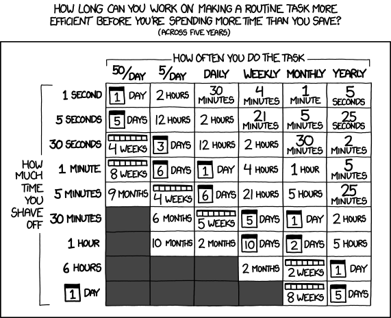
At least xkcd has some advice on how long we should spend on this sort of thing...

All of the comics in this post were drawn by and are copyright of the nonpareil of geek cartoonery, Randall Munroe, aka xkcd. You should subscribe to his comics and his What If series. All his work is licensed under the terms of Creative Commons Attribution Noncommercial.

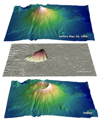
How much rock was erupted from Mt St Helens?

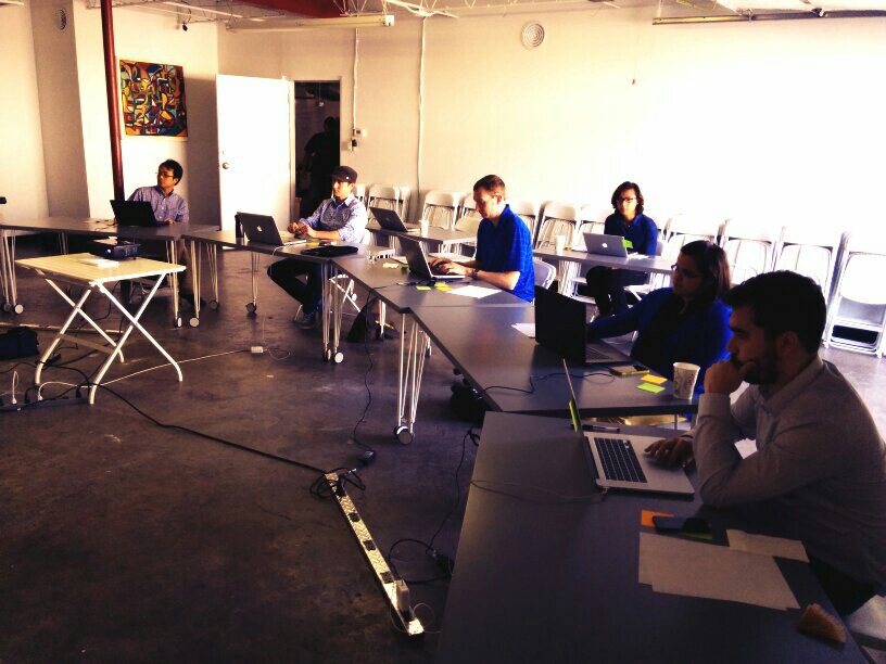
One of the reasons we struggle when learning a new skill is not necessarily because this thing is inherently hard, or that we are dim. We just don't yet have enough context for all the connecting ideas to, well, connect. With this in mind I wrote this introductory demo for my Creative Geocomputing class, and tried it out in the garage attached to START Houston, when we ran the course there a few weeks ago.

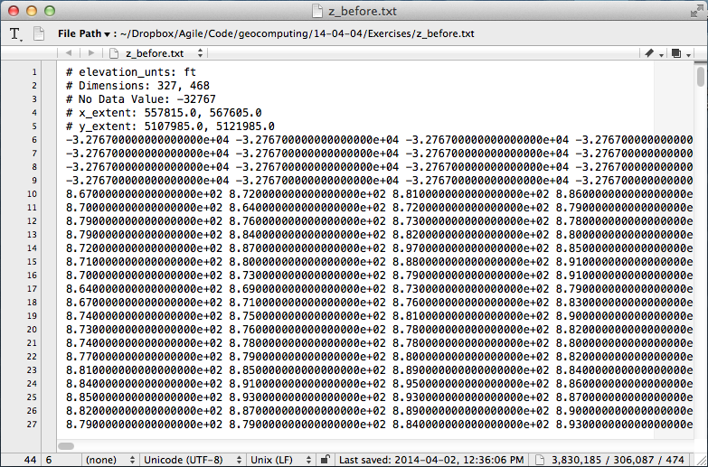
I walked through the process of transforming USGS text files to data graphics. The motivation was to try to answer the question: How much rock was erupted from Mount St Helens?

This gorgeous data set can be reworked to serve a lot of programming and data manipulation practice, and just have fun solving problems. My goal was to maintain a coherent stream of instructions, especially for folks who have never written a line of code before. The challenge, I found, is anticipating when words, phrases, and syntax are being heard like a foriegn language (as indeed they are), and to cope by augmenting with spoken narrative.

Text file to 3D plot

To start, we'll import a code library called NumPy that's great for crunching numbers, and we'll abbreviate it with the nickname np:

>>> import numpy as np

Then we can use one of its functions to load the text file into an array we'll call data:

>>> data = np.loadtxt('z_after.txt')

The variable data is a 2-dimensional array (matrix) of numbers. It has an attribute that we can call upon, called shape, that holds the number of elements it has in each dimension,

>>> data.shape
(1370, 949)

If we want to make a plot of this data, we might want to take a look at the range of the elements in the array, we can call the peak-to-peak method on data,

>>> data.ptp()
41134.0

Whoa, something's not right, there's not a surface on earth that has a min to max elevation that large. Let's dig a little deeper. The highest point on the surface is,

>>> np.amax(data)
8367.0

Which looks to the adequately trained eye like a reasonable elevation value with units of feet. Let's look at the minimum value of the array,

>>> np.amin(data)
-32767.0 

OK, here's the problem. GIS people might recognize this as a null value for elevation data, but since we aren't assuming any knowledge of GIS formats and data standards, we can simply replace the values in the array with not-a-number (NaN), so they won't contaminate our plot.

>>> data[data==-32767.0] = np.nan

To view this surface in 3D we can import the mlab module from Mayavi

>>> from mayavi import mlab

Finally we call the surface function from mlab, and pass the input data, and a colormap keyword to activate a geographically inspired colormap, and a vertical scale coefficient.

>>> mlab.surf(data,
              colormap='gist_earth',
              warp_scale=0.05)

After applying the same procedure to the pre-eruption digits, we're ready to do some calculations and visualize the result to reveal the output and its fascinating characteristics. Read more in the IPython Notebook.

If this 10 minute introduction is compelling and you'd like to learn how to wrangle data like this, sign up for the two-day version of this course next week in Calgary. 

Eventbrite - Agile Geocomputing

How to load SEG-Y data

Yesterday I looked at the anatomy of SEG-Y files. But it's pathology we're really interested in. Three times in the last year, I've heard from frustrated people. In each case, the frustration stemmed from the same problem. The epic email trails led directly to these posts. Next time I can just send a URL!

In a nutshell, the specific problem these people experienced was missing or bad trace location data. Because I've run into this so many times before, I never trust location data in a SEG-Y file. You just don't know where it's been, or what has happened to it along the way — what's the datum? What are the units? And so on. So all you really want to get from the SEG-Y are the trace numbers, which you can then match to a trustworthy source for the geometry.

Easy as 1-2-3, er, 4

This is my standard approach to loading data. Your mileage will vary, depending on your software and your data. 

  1. Find the survey geometry information. For 2D data the geometry is usually in a separate navigation ('nav') file. For 3D you are just looking for cornerpoints, and something indicating how the lines and crosslines are numbered (they might not start at 1, and might not be oriented how you expect). This information may be in the processing report or, less reliably, in the EBCDIC text header of the SEG-Y file.
  2. Now define the survey geometry. You need a location for every trace for a 2D, and the survey's cornerpoints for a 3D. The geometry is a description of where the line goes on the earth, in surface coordinates, and where the starting trace is, how many traces there are, and what the trace spacing is. In other words, the geometry tells you where the traces go. It's variously called 'navigation', 'survey', or some other synonym.
  3. Finally, load the traces into their homes, one vintage (survey and processing cohort) at a time for 2D. The cross-reference between the geometry and the SEG-Y file is the trace or CDP number for a 2D, and the line and crossline numbers for a 3D.
  4. Check everything twice. Does the map look right? Is the survey the right shape and size? Is the line spacing right? Do timeslices look OK?

Where to get the geometry data?

So, where to find cornerpoints, line spacings, and so on? Sadly, the header cannot be trusted, even in newly-processed data. If you have it, the processing report is a better bet. It often helps to talk to someone involved in the acquisition and processing too. If you can corroborate with data from the acqusition planning (line spacings, station intervals, and so on), so much the better — but remember that some acquisition parameters may have changed during the job.

Of vital importance is some independent corroboration— a map, ideally —of the geometry and the shape and orientation of the survey. I can't count the number of back-to-front surveys I've seen. I even saw one upside-down (in the z dimension) once, but that's another story.

Next time, I'll break down the loading process a bit more, with some step-by-step for loading the data somewhere you can see it.

What is SEG-Y?

The confusion starts with the name, but whether you write SEGY, SEG Y, or SEG-Y, it's probably definitely pronounced 'segg why'. So what is this strange substance?

SEG-Y means seismic data. For many of us, it's the only type of seismic file we have much to do with — we might handle others, but for the most part they are closed, proprietary formats that 'just work' in the application they belong to (Landmark's brick files, say, or OpendTect's CBVS files). Processors care about other kinds of data — the SEG has defined formats for field data (SEG-D) and positional data (SEG-P), for example. But SEG-Y is the seismic file for everyone. Kind of.

The open SEG-Y "standard" (those air quotes are an important feature of the standard) was defined by SEG in 1975. The first revision, Rev 1, was published in 2002. The second revision, Rev 2, was announced by the SEG Technical Standards Committee at the SEG Annual Meeting in 2013 and I imagine we'll start to see people using it in 2014. 

What's in a SEG-Y file?

SEG-Y files have lots of parts:

The important bits are the EBCDIC header (green) and the traces (light and dark blue).

The EBCDIC text header is a rich source of accurate information that provides everything you need to load your data without problems. Yay standards!

Oh, wait. The EBCDIC header doesn't say what the coordinate system is. Oh, and the datum is different from the processing report. And the dates look wrong, and the trace length is definitely wrong, and... aargh, standards!

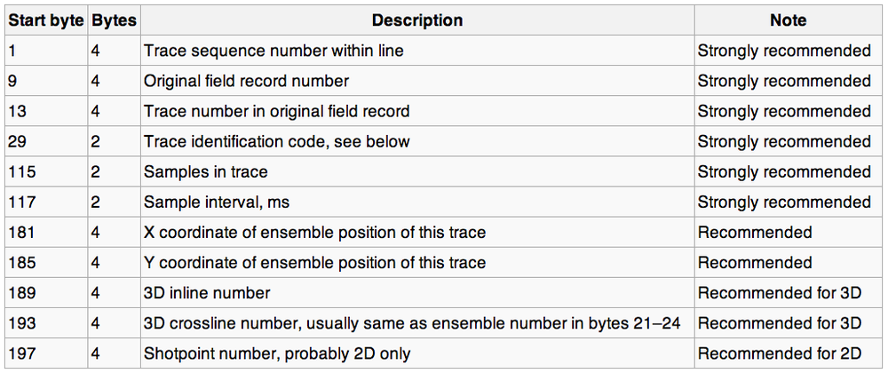
The other important bit — the point of the whole file really — is the traces themselves. They also have two parts: a header (light blue, above) and the actual data (darker blue). The data are stored on the file in (usually) 4-byte 'words'. Each word has its own address, or 'byte location' (a number), and a meaning. The headers map the meaning to the location, e.g. the crossline number is stored in byte 21. Usually. Well, sometimes. OK, it was one time.

According to the standard, here's where the important stuff is supposed to be:

I won't go into the unpleasantness of poking around in SEG-Y files right now — I'll save that for next time. Suffice to say that it's often messy, and if you have access to a data-loading guru, treat them exceptionally well. When they look sad — and they will look sad — give them hugs and hot tea. 

What's so great about Rev 2?

The big news in the seismic standards world is Revision 2. According to this useful presentation by Jill Lewis (Troika International) at the Standards Leadership Council last month, here are the main features:

  • Allow 240 byte trace header extensions.
  • Support up to 231 (that's 2.1 billion!) samples per trace and traces per ensemble.
  • Permit arbitrarily large and small sample intervals.
  • Support 3-byte and 8-byte sample formats.
  • Support microsecond date and time stamps.
  • Provide for additional precision in coordinates, depths, elevations.
  • Synchronize coordinate reference system specification with SEG-D Rev 3.
  • Backward compatible with Rev 1, as long as undefined fields were filled with binary zeros.

Two billion samples at µs intervals is over 30 minutes Clearly, the standard is aimed at <ahem> Big Data, and accommodating the massive amounts of data coming from techniques like variable timing acquisition, permanent 4D monitoring arrays, and microseismic. 

Next time, we'll look at loading one of these things. Not for the squeamish.

The most important thing nobody does

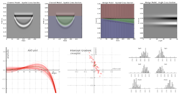
A couple of weeks ago, we told you we were up to something. Today, we're excited to announce modelr.io — a new seismic forward modeling tool for interpreters and the seismically inclined.

Modelr is a web app, so it runs in the browser, on any device. You don't need permission to try it, and there's never anything to install. No licenses, no dongles, no not being able to run it at home, or on the train.

Later this week, we'll look at some of the things Modelr can do. In the meantime, please have a play with it.
Just go to modelr.io and hit Demo, or click on the screenshot below. If you like what you see, then think about signing up — the more support we get, the faster we can make it into the awesome tool we believe it can be. And tell your friends!

If you're intrigued but unconvinced, sign up for occasional news about Modelr:

This will add you to the email list for the modeling tool. We never share user details with anyone. You can unsubscribe any time.

Transforming geology into seismic

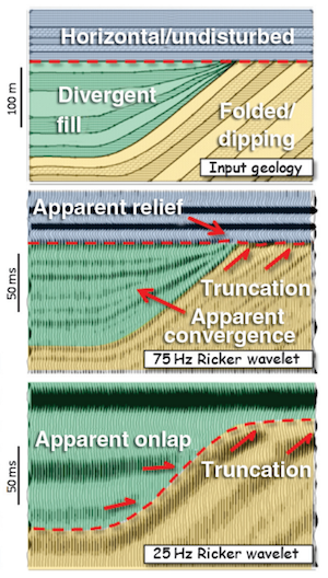
Hart (2013). ©SEG/AAPGForward modeling of seismic data is the most important workflow that nobody does.

Why is it important?

  • Communicate with your team. You know your seismic has a peak frequency of 22 Hz and your target is 15–50 m thick. Modeling can help illustrate the likely resolution limits of your data, and how much better it would be with twice the bandwidth, or half the noise.
  • Calibrate your attributes. Sure, the wells are wet, but what if they had gas in that thick sand? You can predict the effects of changing the lithology, or thickness, or porosity, or anything else, on your seismic data.
  • Calibrate your intuition. Only by predicting the seismic reponse of the geology you think you're dealing with, and comparing this with the response you actually get, can you start to get a feel for what you're really interpreting. Viz Bruce Hart's great review paper we mentioned last year (right).

Why does nobody do it?

Well, not 'nobody'. Most interpreters make 1D forward models — synthetic seismograms — as part of the well tie workflow. Model gathers are common in AVO analysis. But it's very unusual to see other 2D models, and I'm not sure I've ever seen a 3D model outside of an academic environment. Why is this, when there's so much to be gained? I don't know, but I think it has something to do with software.

  • Subsurface software is niche. So vendors are looking at a small group of users for almost any workflow, let alone one that nobody does. So the market isn't very competitive.
  • Modeling workflows aren't rocket surgery, but they are a bit tricky. There's geology, there's signal processing, there's big equations, there's rock physics. Not to mention data wrangling. Who's up for that?
  • Big companies tend to buy one or two licenses of niche software, because it tends to be expensive and there are software committees and gatekeepers to negotiate with. So no-one who needs it has access to it. So you give up and go back to drawing wedges and wavelets in PowerPoint.

Okay, I get it, how is this helping?

We've been busy lately building something we hope will help. We're really, really excited about it. It's on the web, so it runs on any device. It doesn't cost thousands of dollars. And it makes forward models...

That's all I'm saying for now. To be the first to hear when it's out, sign up for news here:

This will add you to the email list for the modeling tool. We never share user details with anyone. You can unsubscribe any time.

Seismic models: Hart, BS (2013). Whither seismic stratigraphy? Interpretation, volume 1 (1). The image is copyright of SEG and AAPG.

Which brittleness index?

A few weeks ago I looked at the concept — or concepts — of brittleness. There turned out to be lots of ways of looking at it. We decided to call it a rock behaviour rather than a property. And we determined to look more closely at some different ways to define it. Here they are...

Some brittleness indices

There are lots of 'definitions' of brittleness in the literature. Several of them capture the relationship between compressive and tensile strength, σC and σT respectively. This is potentially useful, because we measure uniaxial compressive strength in the standard triaxial rig tests that have become routine in shale studies... but we don't usually find the tensile strength, because it's much harder to measure. This is unfortunate, because hydraulic fracturing is initially a tensile failure (though reactivation and other failure modes do occur — see Williams-Stroud et al. 2012).

Altindag (2003) gave the following three examples of different brittleness indices. In turn, they are the strength ratio, a sort of relative strength contrast, and the mean strength (his favourite):

This is just the start, once you start digging, you'll find lots of others. Like Hucka & Das's (1974) round-up I wrote about last time, one thing they have in common is that they capture some characteristic of rock failure. That is, they do not rely on implicit rock properties.

Another point to note. Bažant & Kazemi (1990) gave a way to de-scale empirical brittleness measures to account for sample size — not surprisingly, this sort of 'real world adjustment' starts to make things quite complicated. Not so linear after all.

What not to do

The prevailing view among many interpreters is that brittleness is proportional to Young's modulus and/or Poisson's ratio, and/or a linear combination of these. We've reported a couple of times on what Lev Vernik (Marathon) thinks of the prevailing view: we need to question our assumptions about isotropy and linear strain, and computing shale brittleness from elastic properties is not physically meaningful. For one thing, you'll note that elastic moduli don't have anything to do with rock failure.

The Young–Poisson brittleness myth started with Rickman et al. 2008, SPE 115258, who presented a rather ugly representation of a linear relationship (I gather this is how petrophysicists like to write equations). You can see the tightness of the relationship for yourself in the data.

If I understand  the notation, this is the same as writing B = 7.14E – 200ν + 72.9, where E is (static) Young's modulus and ν is (static) Poisson's ratio. It's an empirical relationship, based on the data shown, and is perhaps useful in the Barnett (or wherever the data are from, we aren't told). But, as with any kind of inversion, the onus is on you to check the quality of the calibration in your rocks. 

What's left?

Here's Altindag (2003) again:

Brittleness, defined differently from author to author, is an important mechanical property of rocks, but there is no universally accepted brittleness concept or measurement method...

This leaves us free to worry less about brittleness, whatever it is, and focus on things we really care about, like organic matter content or frackability (not unrelated). The thing is to collect good data, examine it carefully with proper tools (Spotfire, Tableau, R, Python...) and find relationships you can use, and prove, in your rocks.

References

Altindag, R (2003). Correlation of specific energy with rock brittleness concepts on rock cutting. The Journal of The South African Institute of Mining and Metallurgy. April 2003, p 163ff. Available online.

Hucka V, B Das (1974). Brittleness determination of rocks by different methods. Int J Rock Mech Min Sci Geomech Abstr 10 (11), 389–92. DOI:10.1016/0148-9062(74)91109-7.

Rickman, R, M Mullen, E Petre, B Grieser, and D Kundert (2008). A practical use of shale petrophysics for stimulation design optimization: all shale plays are not clones of the Barnett Shale. SPE 115258, DOI: 10.2118/115258-MS.

Williams-Stroud, S, W Barker, and K Smith (2012). Induced hydraulic fractures or reactivated natural fractures? Modeling the response of natural fracture networks to stimulation treatments. American Rock Mechanics Association 12–667. Available online.

Seismic quality traffic light

We like to think that our data are perfect and limitless, because experiments are expensive and scarce. Only then can our interpretations hope to stand up to even our own scrutiny. It would be great if seismic data was a direct representation of geology, but it never is. Poor data doesn't necessarily mean poor acquisition or processing. Sometimes geology is complex!

In his book First Steps in Seismic Interpretation, Don Herron describes a QC technique of picking a pseudo horizon at three different elevations to correspond to poor, fair, and good data regions. I suppose that will do in a pinch, but I reckon it would take a long time, and it is rather subjective. Surely we can do better?

Computing seismic quality

Conceptually speaking, the ease of interpretation depends on things we can measure (and display), like coherency, bandwidth, amplitude strength, signal-to-noise, and so on. There is no magic combination of filters that will work for all data, but I am convinced that for every seismic dataset there is a weighted function of attributes that can be concocted to serve as a visual indicator of the data complexity:

So one of the first things we do with new data at Agile is a semi-quantitative assessment of the likely ease and reliability of interpretation.

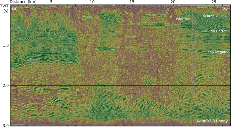
This traffic light display of seismic data quality, corendered here with amplitude, is not only a precursor to interpretation. It should accompany the interpretation, just like an experiment reporting its data with errors. The idea is to show, honestly and objectively, where we can trust eventual interpretations, and where they not well constrained. A common practice is to cherry pick specific segments or orientations that support our arguments, and quietly suppress those that don't. The traffic light display helps us be more honest about what we know and what we don't — where the evidence for our model is clear, and where we are relying more heavily on skill and experience to navigate a model through an area where the data is unclear or unconvincing.

Capturing uncertainty and communicating it in our data displays is not only a scientific endeavour, it is an ethical one. Does it change the way we look at geology if we display our confidence level alongside? 

Reference

Herron, D (2012). First Steps in Seismic Interpretation. Geophysical Monograph Series 16. Society of Exploration Geophysicists, Tulsa, OK.

The seismic profile shown in the figure is from the Kennetcook Basin, Nova Scotia. This work was part of a Geological Survey of Canada study, available in this Open File report.

Colouring maps

Over the last fortnight, I've shared five things, and then five more things, about colour. Some of the main points:

  • Our non-linear, heuristic-soaked brains are easily fooled by colour.
  • Lots of the most common colour bars (linear ramps, bright spectrums) are not good choices.
  • You can learn a lot by reading Robert Simmon, Matteo Niccoli, and others.

Last time I finished on two questions:

  1. How many attributes can a seismic interpreter show with colour in a single display?
  2. On thickness maps should the thicks be blue or red?

One attribute, two attributes

The answer to the first question may be a matter of personal preference. Doubtless we could show lots and lots, but the meaning would be lost. Combined red-green-blue displays are a nice way to cram more into a map, but they work best on very closely related attributes, such as seismic amplitude of three particular frequencies

Here's some seismic reflection data — the open F3 dataset, offshore Netherlands, in OpendTect

A horizon — just below the prominent clinoforms — is displayed (below, left) and coloured according to elevation, using one of Matteo's perceptual colour bars (now included in OpendTect!). A colour scale like this varies monotonically in hue and luminance.

Some of the luminance channel (sometimes called brightness or value) is showing elevation, and a little is being used up by the 3D shading on the surface, but not much. I think the brain processes this automatically because the 3D illusion is quite good, especially when the scene is moving. Elevation and shape are sort of the same thing, so we've still only really got one attribute. Adding contours is quite nice (above, middle), and only uses a narrow slice of the luminance channel... but again, it's the same data. Much better to add new data. Similarity (a member of the family that includes coherence, semblance, and so on) is a natural fit: it emphasizes a particular aspect of the shape of the surface, but which was measured independently of the interpretaion, directly from the data itself. And it looks awesome (above, right).

Three attributes, four

OK, we have elevation and/or shape, and similarity. What else can we add? Another intuitive attribute of seismic is amplitude (below, left) — closely related to the strength of the reflected energy. Two things: we don't trust amplitudes in areas with low fold — so we can mask those (below, middle). And we're only really interested in bright spots, so we can edit the opacity profile of the attribute and make low values transparent (below, right). Two more attributes — amplitude (with a cut-off that reflects my opinion of what's interesting — is that an attribute?) and fold.

Since we have only used one hue for the amplitude, and it was not in Matteo's colour bar, we can layer it on the original map without clobbering anything. Unfortunately, there's no easy way for the low fold mask to modulate amplitude without interfering with elevation, because the elevation map needs to be almost completely opaque. What I need is a way to modulate a surface's opacity with an attribute it is not displaying with hue...

Thickness maps

The second question — what to colour thicks — is easy. Thicks should be towards the red end of the spectrum, sometimes not-necessarily-intuitively called 'warm' colours. (As I mentioned before in the comments, a quick Google image poll suggests that about 75% of people agree). If you colour your map otherwise, perhaps because you like the way it suggests palaeobathymetry in some depositional settings, be careful to make this very clear with labels and legends (which you always do anyway, right?). And think about just making a 'palaeobathymetry' map, not a thickness map.

I suspect there are lots of quite personal opinions out there. Like grammar, I do think much of this is a matter of taste. The only real test is clarity. Do you agree? Is there a right and wrong here?