
Rock physics cheatsheet
/Today, I introduce to you the rock physics cheatsheet. It contains useful information for people working on problems in seismic rock physics, inversion, and the mechanical properties of rocks. Admittedly, there are several equations, but I hope they are laid out in a simple and systematic way. This cheatsheet is the third instalment, following up from the geophysics cheatsheet and basic cheatsheet we posted earlier.
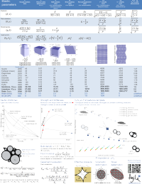
To me, rock physics is the crucial link between earth science and engineering applications, and between reservoir properties and seismic signals. Rocks are, in fact, a lot like springs. Their intrinsic elastic parameters are what control the extrinsic seismic attributes that we collect using seismic waves. With this cheatsheet in hand you will be able to model fluid depletion in a time-lapse sense, and be able to explain to somebody that Young's modulus and brittleness are not the same thing.
So now with 3 cheatsheets at your fingertips, and only two spaces on the inside covers of you notebooks, you've got some rearranging to do! It's impossible to fit the world of seismic rock physics on a single page, so if you feel something is missing or want to discuss anything on this sheet, please leave a comment.
← Click to download the PDF (1.5MB)
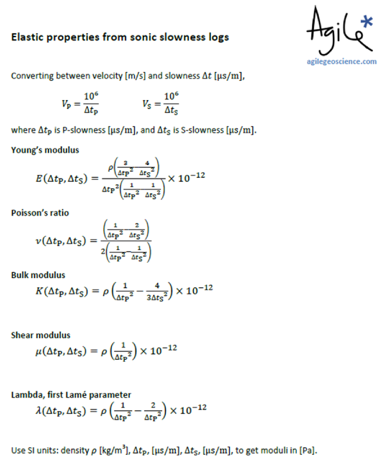
Shortly after posting the rock physics cheatsheet, I got a request to quote the equations for the elastic parameters as a function of P-wave slowness, and S-wave slowness; typically acquired from a dipole sonic logging tool. These logs are commonly called "delta-t" (DTP and DTS) and have units of or
. Slowness is the inverse of velocity.
Cast in this form, the equations are not as compact, and therefore wouldn't fit very easily on the cheatsheet. But you will find these useful if wish to compute elastic properties directly from dipole sonic logs.
Click to download the PDF (230KB) →
I have posted a new version of the rock physics cheatsheet. Click on the image of the cheatsheet above to download version 2, or go to the Download page.
What's new? I corrected a few typos, and tidied up some of the typography. There was a typo in the first Hashin–Shtrikman equation, and there was a typo in the formula for VP as a function of Young's modulus and Poisson's ratio (first row of the elastic properties table). Finally, we made some minor improvements to the layout.


 Except where noted, this content is licensed