Not getting hacked

This kind of password is horrible for lots of reasons. The real solution to password madness is a password manager.

This kind of password is horrible for lots of reasons. The real solution to password madness is a password manager.

The end of the year is a great time to look around at your life and sort stuff out. One of the things you almost certainly need to sort out is your online security. Because if you haven't been hacked already (you probably have), you're just about to be.

Just look at some recent stories from the world of data security:

There are plenty of others; Wired has been keeping track of them — read more here. Or check out Wikipedia's list.

Despite all this, I see hardly anyone using a password manager, and anecdotally I hear that hardly anyone uses two-factor authentication either. This tells me that at least 80% of smart people, inlcuding lots of my friends and relatives, are in daily peril. Oh no!

After reading this post, I hope you do two things:

  • Start using a password manager. If you only do one thing, do this.
  • Turn on two-factor authentication for your most vulnerable accounts.

Start using a password manager

Please, right now, download and install LastPass on every device and in every browser you use. It's awesome:

  • It stores all your passwords! This way, they can all be different, and each one can be highly secure.
  • It generates secure, random passwords for new accounts you create. 
  • It scores you on the security level of your passwords, and lets you easily change insecure ones.
  • The free version is awesome, and the premium version is only $2/month.

There are other password managers, of course, but I've used this one for years and it's excellent. Once you're set up, you can start changing passwords that are insecure, or re-used on multiple sites... or which are at Uber, Yahoo, or Equifax.

One surprise from using LastPass is being able to count the number of accounts I have created around the web over the years. I have 473 accounts stored in LastPass! That's 473 places to get hacked... how many places are you exposed?

The one catch: you need a bulletproof key for your password manager. Best advice: use a long pass-phrase instead.

The obligatory password cartoon, by xkcd and licensed CC-BY-NC

The obligatory password cartoon, by xkcd and licensed CC-BY-NC

authenticator.png

Two-factor authentication

Sure, it's belt and braces — but you don't want your security trousers to fall down, right? 

Er, anyway, the point is that even with a secure password, your password can still be stolen and your account compromised. But it's much, much harder if you use two-factor authentication, aka 2FA. This requires you to enter a code — from a hardware key or an app, or received via SMS — as well as your password. If you use an app, it introduces still another layer of security, because your phone should be locked.

I use Google's Authenticator app, and I like it. There's a little bit of hassle the first time you set it up, but after that it's plain sailing. I have 2FA turned on for all my 'high risk' accounts: Google, Twitter, Facebook, Apple, AWS, my credit card processor, my accounting software, my bank, my domain name provider, GitHub, and of course LastPass. Indeed, LastPass even lets me specify that logins must originate in Canada. 

What else can you do?

There are some other easy things you can do to make yourself less hackable:

  • Install updates on your phones, tablets, and other computers. Keep browsers and operating systems up to date.
  • Be on high alert for phishing attempts. Don't follow links to sites like your bank or social media sites — type them into your browser if possible. Be very suspicious of anyone contacting you, especially banks.
  • Don't use USB sticks. The cloud is much safer — I use Dropbox myself, it's awesome.

For more tips, check out this excellent article from Motherboard on not getting hacked.

x lines of Python: load curves from LAS

Welcome to the latest x lines of Python post, in which we have a crack at some fundamental subsurface workflows... in as few lines of code as possible. Ideally, x < 10.

We've met curves once before in the series — in the machine learning edition, in which we cheated by loading the data from a CSV file. Today, we're going to get it from an LAS file — the popular standard for wireline log data.

Just as we previously used the pandas library to load CSVs, we're going to save ourselves a lot of bother by using an existing library — lasio by Kent Inverarity. Indeed, we'll go even further by also using Agile's library welly, which uses lasio behind the scenes.

The actual data loading is only 1 line of Python, so we have plenty of extra lines to try something more ambitious. Here's what I go over in the Jupyter notebook that goes with this post:

  1. Load an LAS file with lasio.
  2. Look at its header.
  3. Look at its curve data.
  4. Inspect the curves as a pandas DataFrame.
  5. Load the LAS file with welly.
  6. Look at welly's Curve objects.
  7. Plot part of a curve.
  8. Smooth a curve.
  9. Export a set of curves as a matrix.
  10. BONUS: fix some broken things in the file header.

Each one of those steps is a single line of Python. Together, I think they cover many of the things we'd like to do with well data once we get our hands on it. Have a play with the notebook and explore what you can do.

Next time we'll take things a step further and dive into some seismic petrophysics.

x lines of Python: read and write CSV

A couple of weeks ago, in Murphy's Law for Excel, I wrote about the dominance of spreadsheets in applied analysis, and how they may be getting out of hand. Then in Organizing spreadsheets I wrote about how — if you are going to store data in spreadsheets — to organize your data so that you do the least amount of damage. The general goal being to make your data machine-readable. Or, to put it another way, to allow you to save your data as comma-separated values or CSV files.

CSV is the de facto standard way to store data in text files. They are human-readable, easy to parse with multiple tools, and they compress easily. So you need to know how to read and write them in your analysis tool of choice. In our case, this is the Python language. So today I present a few different ways to get at data stored in CSV files.

How many ways can I read thee?

In the accompanying Jupyter Notebook, we read a CSV file into Python in six different ways:

  1. Using the pandas data analysis library. It's the easiest way to read CSV and XLS data into your Python environment...
  2. ...and can happily consume a file on the web too. Another nice thing about pandas. It also writes CSV files very easily.
  3. Using the built-in csv package. There are a couple of standard ways to do this — csv.reader...
  4. ...and csv.DictReader. This library is handy for when you don't have (or don't want) pandas.
  5. Using numpy, the numeric library for Python. If you just have a CSV full of numbers and you want an array in the end, you can skip pandas.
  6. OK, it's not really a CSV file, but for the finale we read a spreadsheet directly from Google Sheets.

I usually count my lines diligently in these posts, but not this time. With pandas you're looking at a one-liner to read your data:

df = pd.read_csv("myfile.csv")

and a one-liner to write it out again. With csv.DictReader you're looking at 3 lines to get a list of dicts (but watch out: your numbers will be strings). Reading a Google Doc is a little more involved, not least because you'll need to set up an app and get an API key to handle authentication.

That's all there is to CSV files. Go forth and wield data like a pro! 

Next time in the xlines of Python series we'll look at reading seismic station data from the web, and doing a bit of time-series analysis on it. No more stuff about spreadsheets and CSV files, I promise :)


The thumbnail image is based on the possibly apocryphal banksy image of an armed panda, and one of texturepalace.com's CC-BY textures.

Organizing spreadsheets

A couple of weeks ago I alluded to ill-formed spreadsheets in my post Murphy's Law for Excel. Spreadsheets are clearly indispensable, and are definitely great for storing data and checking CSV files. But some spreadsheets need to die a horrible death. I'm talking about spreadsheets that look like this (click here for the entire sheet):

Bad_spreadsheet_3.png

This spreadsheet has several problems. Among them:

  • The position of a piece of data changes how I interpret it. E.g. a blank row means 'new sheet' or 'new well'.
  • The cells contain a mixture of information (e.g. 'Site' and the actual data) and appear in varying units.
  • Some information is encoded by styles (e.g. using red to denote a mineral species). If you store your sheet as a CSV (which you should), this information will be lost.
  • Columns are hidden, there are footnotes, it's just a bit gross.

Using this spreadsheet to make plots, or reading it with software, with be a horrible experience. I will probably swear at my computer, suffer a repetitive strain injury, and go home early with a headache, cursing the muppet that made the spreadsheet in the first place. (Admittedly, I am the muppet that made this spreadsheet in this case, but I promise I did not invent these pathologies. I have seen them all.)

Let's make the world a better place

Consider making separate sheets for the following:

  • Raw data. This is important. See below.
  • Computed columns. There may be good reasons to keep these with the data.
  • Charts.
  • 'Tabulated' data, like my bad spreadsheet above, with tables meant for summarization or printing.
  • Some metadata, either in the file properties or a separate sheet. Explain the purpose of the dataset, any major sources, important assumptions, and your contact details.
  • A rich description of each column, with its caveats and assumptions.

The all-important data sheet has its own special requirements. Here's my guide for a pain-free experience:

  • No computed fields or plots in the data sheet.
  • No hidden columns.
  • No semantic meaning in formatting (e.g. highlighting cells or bolding values).
  • Headers in the first row, only data in all the other rows.
  • The column headers should contain only a unique name and [units], e.g. Depth [m], Porosity [v/v].
  • Only one type of data per column: text OR numbers, discrete categories OR continuous scalars.
  • No units in numeric data cells, only quantities. Record depth as 500, not 500 m.
  • Avoid keys or abbreviations: use Sandstone, Limestone, Shale, not Ss, Ls, Sh.
  • Zero means zero, empty cell means no data.
  • Only one unit per column. (You only use SI units right?)
  • Attribution! Include a citation or citations for every record.
  • If you have two distinct types or sources of data, e.g. grain size from sieve analysis and grain size from photomicrographs, then use two different columns.
  • Personally, I like the data sheet to be the first sheet in the file, but maybe that's just me.
  • Check that it turns into a valid CSV so you can use this awesome format.

      After all that, here's what we have (click here for the entire sheet):

    The same data as the first image, but improved. The long strings in columns 3 and 4 are troublesome, but we can tolerate them. Click to enlarge.

    Maybe the 'clean' analysis-friendly sheet looks boring to you, but to me it looks awesome. Above all, it's easy to use for SCIENCE! And I won't have to go home with a headache.


    The data in this post came from this Cretaceous shale dataset [XLS file] from the government of Manitoba. Their spreadsheet is pretty good and only breaks a couple of my golden rules. Here's my version with the broken and fixed spreadsheets shown here. Let me know if you spot something else that should be fixed!

    Murphy's Law for Excel

    Where would scientists and engineers be without Excel? Far, far behind where they are now, I reckon. Whether it's a quick calculation, or making charts for a thesis, or building elaborate numerical models, Microsoft Excel is there for you. And it has been there for 32 years, since Douglas Klunder — now a lawyer at ACLU — gave it to us (well, some of us: the first version was Mac only!).

    We can speculate about reasons for its popularity:

    • It's relatively easy to use, and most people started long enough ago that they don't have to think too hard about it.
    • You have access to it, and you know that your collaborators (boss, colleagues, future self) have access to it.
    • It's flexible enough that it can do almost anything.
    Figure 1 from 'Predicting bed thickness with cepstral decomposition'.

    Figure 1 from 'Predicting bed thickness with cepstral decomposition'.

    For instance, all the computation and graphics for my two 2006 articles on signal processing were done in Excel (plus the FFT add-on). I've seen reservoir simulators, complete with elaborate user interfaces, in Excel. An infinity of business-critical documents are stored in Excel (I just filled out a vendor registration form for a gigantic multinational in an Excel spreadsheet). John Nelson at ESRI made a heatmap in Excel. You can even play Pac Man.

    Maybe it's gone too far:


    So what's wrong with Excel?

    Nothing is wrong with it, but it's not the best tool for every number-crunching task. Why?

    • Excel files are just that — files. Sometimes you want to do analysis across datasets, and a pool of data (a database) becomes more useful. And sometimes you wish nine different people didn't have nine different versions of your spreadsheet, each emailing their version to nine other people...
    • The charts are rather clunky and static. They don't do well with large datasets, or in data you'd like to filter or slice dynamically.
    • In large datasets, scrolling around a spreadsheet gets old pretty quickly.
    • The tool is so flexible that people get carried away with pretty tables, annotating their sheets in ways that make the printed page look nice, but analysis impossible.

    What are the alternatives?

    Excel is a wonder-tool, but it's not the only tool. There are alternatives, and you should at least know about them.

    For everyday spreadsheeting needs, I now use Google Sheets. Collaboration is built-in. Being able to view and edit a sheet at the same time as someone else is a must-have (probably Office 365 does this now too, so if you're stuck with Excel I urge you to check). Version control — another thing I'm not sure I can live without — is built in. For real nerds, there's even a complete API. I also really like the native 'webbiness' of Google Docs, for example being able to use web API calls natively, for example getting the current CAD–USD exchange rate with GoogleFinance("CURRENCY:CADUSD").

    If it's graphical analysis you want, try Tableau or Spotfire. I'm especially looking at you, reservoir engineers — you are seriously missing out if you're stuck in Excel, especially if you have a lot of columns of different types (time series, categories and continuous variables for example). The good news is that the fastest way to get data into Spotfire is... Excel. So it's easy to get started.

    If you're gathering information from people, like registering the financial details of vendors for instance, then a web form is your best bet. You can set one up in Google Forms in minutes, and there are lots of similar services. If you want to use your own servers, no problem: any dev worth their wages can throw one together in a few hours.

    If you're doing geoscience in Excel, like my 2006 self — filtering logs, or generating synthetics, or computing spectrums — your mind will be blown by spending a few hours learning a programming language. Your first day in Python (or Julia or Octave or R) will change your quantitative life forever.

    Excel is great at some things, but for most things, there's a better way. Take some time to explore them the next time you have some slack in your schedule.

    References

    Hall, M (2006). Resolution and uncertainty in spectral decomposition. First Break 24, December 2006, p 43–47.

    Hall, M (2006). Predicting stratigraphy with cepstral decomposition. The Leading Edge 25 (2, Special Issue on Spectral Decomposition). doi:10.1190/1.2172313


    UPDATE

    As a follow-up example, I couldn't resist sharing this recent story about an artist that draws anime characters in Excel.

    Machine learning meets seismic interpretation

    Agile has been reverberating inside the machine learning echo chamber this past week at EAGE. The hackathon's theme was machine learning, Monday's workshop was all about machine learning. And Matt was also supposed to be co-chairing the session on Applications of machine learning for seismic interpretation with Victor Aare of Schlumberger, but thanks to a power-cut and subsequent rescheduling, he found himself double-booked so, lucky me, he invited me to sit in his stead. Here are my highlights, from the best seat in the house.

    Before I begin, I must mention the ambivalence I feel towards the fact that 5 of the 7 talks featured the open-access F3 dataset. A round of applause is certainly due to dGB Earth Sciences for their long time stewardship of open data. On the other hand, in the sardonic words of my co-chair Victor Aarre, it would have been quite valid if the session was renamed The F3 machine learning session. Is it really the only quality attribute research dataset our industry can muster? Let's do better.

    Using seismic texture attributes for salt classification

    Ghassan AlRegib ruled the stage throughout the session with not one, not two, but three great talks on behalf of himself and his grad students at Georgia Institute of Technology (rather than being a show of bravado, this was a result of problems with visas). He showed some exciting developments in shallow learning methods for predicting facies in seismic data. In addition to GLCM attributes, he also introduced a couple of new (to me anyway) attributes for salt classification. Namely, textural gradient and a thing he called seismic saliency, a metric modeled after the human visual system describing the 'reaction' between relative objects in a 3D scene. 

    Twelve Seismic attributes used for multi-attribute salt-boundary classification. (a) is RMS Amplitude, (B) to (M) are TEXTURAL attributes. See abstract for details. This figure is copyright of Ghassan AlRegib and licensed CC-BY-SA by virtue of being generated from the F3 dataset of dGB and TNO.

    Ghassan also won the speakers' lottery, in a way. Due to the previous day's power outage and subsequent reshuffle, the next speaker in the schedule was a no-show. As a result, Ghassan had an extra 20 minutes to answer questions. Now for most speakers that would be a public-speaking nightmare, but Ghassan hosted the onslaught of inquiring minds beautifully. If we hadn't had to move on to the next next talk, I'm sure he could have entertained questions all afternoon. I find it fascinating how unpredictable events like power outages can actually create the conditions for really effective engagement. 

    Salt classification without using attributes (using deep learning)

    Matt reported on Anders Waldeland's work a year ago, and it was interesting to see how his research has progressed, as he nears the completion of his thesis. 

    Anders successfully demonstrated how convolutional neural networks (CNNs) can classify salt bodies in seismic datasets. So, is this a big deal? I think it is. Indeed, Anders's work seems like a breakthough in seismic interpretation, at least of salt bodies. To be clear, I don't think this means that it is time for seismic interpreters to pack up and go home. But maybe we can start looking forward to spending our time doing less tedious things than picking complex salt bodies.  

    One slice of a 3d seismic volume with two CLASS LABELS: Salt (red) and Not SALT (GREEN). This is the training data. On the right: Extracted 3D salt body in the same dataset,&nbsp;coloured by elevation. Copyright of A Waldeland, used with permission.

    One slice of a 3d seismic volume with two CLASS LABELS: Salt (red) and Not SALT (GREEN). This is the training data. On the right: Extracted 3D salt body in the same dataset, coloured by elevation. Copyright of A Waldeland, used with permission.

    He trained a CNN on one manually labeled slice of a 3D cube and used the network to automatically classify the full 3D salt body (on the right in the figure). Conventional algorithms for salt picking, such as that used by AlRegib (see above), typically rely on seismic attributes to define a feature space. This requires professional insight and judgment, and is prone to error and bias. Nicolas Audebert mentioned the same shortcoming in his talk in the workshop Matt wrote about last week. In contrast, the CNN algorithm works directly on the seismic data, learning the most discriminative filters on its own, no attributes needed

    Intuition training

    Machine learning isn't just useful for computing in the inverse direction such as with inversion, seismic interpretation, and so on. Johannes Amtmann showed us how machine learning can be useful for ranking the performance of different clustering methods using forward models. It was exciting to see: we need to get back into the habit of forward modeling, each and every one of us. Interpreters build synthetics to hone their seismic intuition. It's time to get insanely good at building forward models for machines, to help them hone theirs. 

    There were so many fascinating problems being worked on in this session. It was one of the best half-day sessions of technical content I've ever witnessed at a subsurface conference. Thanks and well done to everyone who presented.


    Unweaving the rainbow

    Last week at the Canada GeoConvention in Calgary I gave a slightly silly talk on colourmaps with Matteo Niccoli. It was the longest, funnest, and least fruitful piece of research I think I've ever embarked upon. And that's saying something.

    Freeing data from figures

    It all started at the Unsession we ran at the GeoConvention in 2013. We asked a roomful of geoscientists, 'What are the biggest unsolved problems in petroleum geoscience?'. The list we generated was topped by Free the data, and that one topic alone has inspired several projects, including this one. 

    Our goal: recover digital data from any pseudocoloured scientific image, without prior knowledge of the colourmap.

    I subsequently proferred this challenge at the 2015 Geophysics Hackathon in New Orleans, and a team from Colorado School of Mines took it on. Their first step was to plot a pseudocoloured image in (red, green blue) space, which reveals the colourmap and brings you tantalizingly close to retrieving the data. Or so it seems...

    Here's our talk:

    x lines of Python: machine learning

    You might have noticed that our web address has changed to agilescientific.com, reflecting our continuing journey as a company. Links and emails to agilegeoscience.com will redirect for the foreseeable future, but if you have bookmarks or other links, you might want to change them. If you find anything that's broken, we'd love it if you could let us know.


    Artificial intelligence in 10 lines of Python? Is this really the world we live in? Yes. Yes it is.

    After reminding you about the SEG machine learning contest just before Christmas, I thought I could show you how you train a model in a supervised learning problem, then use it to make predictions on unseen data. So we'll just break a simple contest entry down into ten easy steps (note that you could do this on anything, doesn't have to be this problem). 

    A machine learning primer

    Before we start, let's review quickly what a machine learning problem looks like, and introduct a bit of jargon. To begin, we have a dataset (e.g. the 'Old' well in the diagram below). This consists of records, called instances. In this problem, each instance is a depth location. Each instance is a feature vector: a row vector comprising attributes or features, which in our case are wireline log values for GR, ILD, and so on. Each feature vector is a row in a matrix we conventionally call \(X\). Associated with each instance is some target label — the thing we want to predict — which is a continuous quantity in a regression problem, discrete in a classification problem. The vector of labels is usually called \(y\). In the problem below, the labels are integers representing 9 different facies.

    You can read much more about the dataset I'm using in Brendon Hall's tutorial (The Leading Edge, October 2016).

    The ten steps to glory

    Well, maybe not glory, but something. A prediction of facies at two wells, based on measurements made at 10 other wells. You can follow along in the notebook, but all the highlights are included here. We start by loading the data into a 'dataframe', which you can think of like a spreadsheet:

    Now we specify the features we want to use, and make the matrix \(X\) and label vector \(y\):

      features = ['GR', 'ILD_log10', 'DeltaPHI', 'PHIND', 'PE']
      X = df[features].values
      y = df.Facies.values

    Since this dataset is all we have, we'd like to set aside some data to test our model on. The library we're using, scikit-learn, has functions to do this sort of thing; by default, it'll split \(X\) and \(y\) into train and test datasets, with 25% of the data going into the test part:

      X_train, X_test, y_train, y_test = train_test_split(X, y)

    Now we're ready to choose a model, instantiate it (with some parameters if we want), and train the model (i.e. 'fit' the data). I am calling the trained model augur, because I like that word.

      from sklearn.ensemble import ExtraTreesClassifier
      model = ExtraTreesClassifier()
      augur = model.fit(X_train, y_train)

    Now we're ready to take the part of the dataset we reserved for validation, X_test, and predict its labels. Then we can compare those with the known labels, y_test, to see how well we did:

      y_pred = augur.predict(X_test)

    We can get a quick idea of the quality of prediction with sklearn.metrics.accuracy_score(y_test, y_pred), but it's more interesting to look at the classification report, which shows us the precision and recall for each class, along with their harmonic mean, the F1 score:

      from sklearn.metrics import classification_report
      print(classification_report(y_test, y_pred))
    classification_report.png

    Each row is a facies (facies 1, facies 2, etc.). The support is the number of instances representing that label. The key number here is 0.63 — we can regard this as an expression of the accuracy of our prediction. If that sounds low to you, I encourage you to enter the machine learning contest! If it sounds high, that's because it is — it's much too high. In fact, the instances of our dataset are not independent: they are spatially correlated (in depth). It would be smarter not to remove some random samples for validation, but to reserve entire wells. After all, this is how we typically collect subsurface data: one well at a time.

    But now we're getting into the weeds of data science. I'll let you venture in there on your own...

    Burning the surface onto the subsurface

    Previously, I described a few of the reasons why we don't get a clean ground surface event on land seismic data like we do the water-bottom in marine seismic. In land data, the worst part of the image is right at the surface. But ground level is not just tricky to see, it's impossible to see. Since the vibe truck is on the ground, there's no reflection from that surface. Even if there was some kind of event there, processors apply a magic eraser to the top of the section — the mute — to erase the early arrivals. So it's not possible to see the ground in land data, and you can't pick what isn't there.  

    But I still want to know where the ground is. Why can't we slap a ground-level seismic 'reflection' event on the section? 

    What you need

    We need the ground level, which is in depth of course, in the time domain of the seismic section. To compute this, let's call it \(t_\mathrm{G}\), we need three pieces of information at every trace location: the ground elevation \(G\), the seismic reference datum (SRD) which I'll call \(D\), and the replacement velocity \(V_\mathrm{r}\). 

    $$ t_\mathrm{G} = \frac{2 (G - D)}{V_\mathrm{r}} $$

    Ground elevation.  If you're lucky, you'll be able to find the ground elevation corresponding to each trace stored in the trace headers. Ground elevation might be located in bytes 41-44 or 45-48 of the trace header, which correspond to the receiver group elevation and the surface elevation of the source, respectively. These should be the same for a stacked trace, but as with any meta-data to do with SEGY, this info could be hiding somewhere else, or missing altogether. And if you're that unlucky, you might have to comb through processing reports for the missing information. If you are even more unlucky (as I was in this example), you won't have any kind of processing report to fall back on and you'll have to concoct something else. In the accompanying Jupyter notebook, I resorted to interpolating a digitized elevation profile from a JPEG plot of the seismic line. So if you're all out of options, you might find refuge in those legacy plots! 

    This profile is particularly wonky, because the seismic reference datum (red) is not the same across the profile

    This profile is particularly wonky, because the seismic reference datum (red) is not the same across the profile

    Seismic reference datum. And to make life yet more complicated, the seismic reference datum is not flat across the profile. It goes downhill and then flattens out (red line below). Don't ask me what the advantages are of processing data to a variable datum, but whatever they are, I hope they offset the disadvantages of all-to-easily mistaking the datum to be flat.

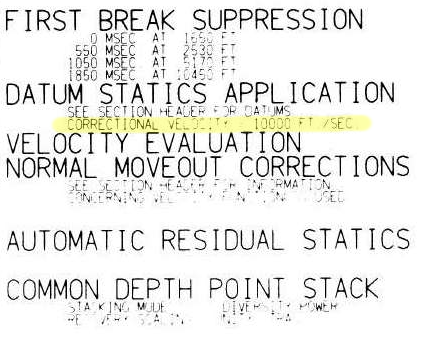
    The replacement velocity is given in the sidelabel of the raster image online (shown right). It's 10 000 ft/sec, or 3048 m/s. 

    Byte locations 53-56 and 57-60 are the standard trace header placeholders reserved for holding the datum elevation at the receiver group and the datum elevation at source. Again, for a stacked trace, these should be the same value. If these fields are zeros, then check the fields of the Trace Header Extension. If they turn up empty, and if the datum is horizontal, it might be listed in the file's text header. 

    Convert elevation to time

    By definition, the seismic reference datum is horizontal in the time-domain (red line below). Notice how the ground elevation – in the time domain – plots mostly as negative values (before) time zero. In other words, most of the ground is being cut-off by the top of the section. So, if we want to see it, we need to shift everything down into the field of view. Conceptually, this means adjusting the seismic reference datum so it floats entirely above the ground-level. Computationally, we can achieve this easily enough by padding the top of the data with zeros.

    A time-domain representation of the ground-level along the seismic profile. The surface of the earth extends above the start of the seismic data for most of the locations along the profile.&nbsp;

    A time-domain representation of the ground-level along the seismic profile. The surface of the earth extends above the start of the seismic data for most of the locations along the profile. 

    Make the ground a pickable event

    As a final bit of post-processing, we could actually burn the ground-level into the data as a sort of synthetic seismic event. The reason I like this concept is that it alleviates the need to dig up old-processing reports, puzzle over missing header data, or worse, maintain and munge external text files containing elevation information. I say, let's make it self-contained. Let's put it directly into the data so that it can be treated like any other seismic reflection. Why would I do this?

    • You can see where there might be fold, velocity or other issues related to topography.
    • You can immediately see the polarity of the data. 
    • You could use the bandwidth of the data to make the pseudo-reflector, giving a visual hint to the interpreter.
    • Keeping track of amplitude adjustments and phase rotations would be self-documenting and reversible.
    • you could autotrack it to get a topographic map (or just get this from the processor).
    • It looks cool!
    Seismic profile with ground level SYNTHETICALLY SLAPPED ON TOP. &nbsp;Bandlimited, of course, so you can Autotrack till your hearts content!

    Seismic profile with ground level SYNTHETICALLY SLAPPED ON TOP.  Bandlimited, of course, so you can Autotrack till your hearts content!

    I've deliberately constructed a band-limited reflection, opposed to placing a sharp spike at ground-level. The problem with a spike is that it has infinite bandwidth. It contains higher frequencies than the image, so as Carl Reine commented on that last post, that might not play nice with seismic attributes. Also, there's the problem of selecting an amplitude value to assign to the spike: we don't want to introduce amplitudes that are ridiculously out of range of the existing data.  

    The whole image

    I hereby propose that this synthetic ground level trick adopted as the new standard for any land seismic processing and interpretation. The great thing is, it can be done just as easily by interpreters and seismic data technologists, as by the processing companies that create the rest of the image. I realize we're adding stuff to the data that isn't actually signal. We do non-real things to signals all the time. The question is, do the benefits outweigh the artificiality?

    Here's the view of the entire section:

    The whole section, ground level included.

    The whole section, ground level included.

    The details of this exercise can be found in the this Jupyter Notebook.

    References

    The seismic is line 36_77_PR from the USGS data repository.

    SEG Y rev 2 Data Exchange Format. SEG Technical Standards Committee. Draft 2.0, January, 2015. 

    Where is the ground?

    This is the upper portion of a land seismic profile in Alaska. Can you pick a horizon where the ground surface is? Have a go at pickthis.io.

    Pick the Ground surface at the top of the seismic section at pickthis.io.

    Pick the Ground surface at the top of the seismic section at pickthis.io.

    Picking the ground surface on land-based seismic data is not straightforward. Picking the seafloor reflection on marine data, on the other hand, is usually a piece of cake, a warm-up pick. You can often auto-track the whole thing with a few seeds.

    Seafloor reflection on Penobscot 3D survey, offshore Nova Scotia. from Matt's tutorial in the April 2016 The Leading Edge, The function of interpolation.

    Seafloor reflection on Penobscot 3D survey, offshore Nova Scotia. from Matt's tutorial in the April 2016 The Leading Edge, The function of interpolation.

    Why aren't interpreters more nervous that we don't know exactly where the surface of the earth is? I'm sure I'm not the only one that would like to have this information while interpreting. Wouldn't it be great if land seismic were more like marine?

    Treacherously Jagged TopographY or Near-Surface processing ArtifactS?

    Treacherously Jagged TopographY or Near-Surface processing ArtifactS?

    If you're new to land-based seismic data, you might notice that there isn't a nice pickable event across the top of the section like we find in marine seismic data. Shot noise at the surface has been muted (deleted) in processing, and the low fold produces an unclean, jagged look at the top of the section. Additionally, the top of the section, time-zero — the seismic reference datum — usually floats somewhere above the land surface — and we can't know where that is unless it can be found in the file header, or looked up in the processing report.

    The seismic reference datum, at a two-way time of zero seconds on seismic data,&nbsp;is typically set at mean sea level for offshore data. For land data, it is usually chosen to 'float' above the land surface.

    The seismic reference datum, at a two-way time of zero seconds on seismic data, is typically set at mean sea level for offshore data. For land data, it is usually chosen to 'float' above the land surface.

    Reframing the question

    This challenge is a bit of a trick question. It begs the viewer to recognize that the seemingly simple task of mapping the ground level on a land seismic section is actually a rudimentary velocity modeling or depth conversion exercise in itself. Wouldn't it be nice to have the ground surface expressed as pickable seismic event? Shouldn't we have it always in our images? Baked into our data, so to speak, such that we've always got an unambiguous pick? In the next post, I'll illustrate what I mean and show what's involved in putting it in. 

    In the meantime, I challenge you to pick where you think the (currently absent) ground surface is on this profile, so in the next post we can see how well you did.