The hackathon is coming to Calgary

Before you stop reading and surf away thinking hackathons are not for you, stop. They are most definitely for you. If you still read this blog after me wittering on about Minecraft, anisotropy, and Python practically every week — then I'm convinced you'll have fun at a hackathon. And we're doing an new event this year for newbies.

For its fourth edition, the hackathon is coming to Calgary. The city is home to thousands of highly motivated and very creative geoscience nuts, so it should be just as epic as the last edition in Denver. The hackathon will be the weekend before the GeoConvention — 2 and 3 May. The location is the Global Business Centre, which is part of the Telus Convention Centre on 8th Avenue. The space is large and bright; it should be perfect, once it smells of coffee...

Now's the time to carpe diem and go sign up. You won't regret it. 

On the Friday before the hackathon, 1 May, we're trying something new. We'll be running a one-day bootcamp. you can sign up for the bootcamp here on the site. It's an easy, low-key way to experience the technology and goings-on of a hackathon. We'll be doing some gentle introductions to scientific computing for those who want it, and for the more seasoned hackers, we'll be looking at some previous projects, useful libraries, and tips and tricks for building a software tool in less than 2 days.

The event would definitely not be possible without the help of progressive people who want to see more creativity and invention in our industry and our science. These companies and the people that work there deserve your attention. 

Last quick thing: if you know a geeky geoscientist in Calgary, I'd love it if you forwarded this post to them right now. 


UPDATE
Great new: Ikon Science are joining our existing sponsors, dGB Earth Sciences and OpenGeoSolutions — both long-time supporters of the hackathon events — to help make something awesome happen. We're grateful for the support!


UPDATE
More good news: Geomodeling have joined the event as a sponsor. Thank you for being awesome! Wouldn't a geomodel hackathon be fun? Hmm...

February linkfest

The linkfest is back! All the best bits from the news feed. Tips? Get in touch.

The latest QGIS — the free and open-source GIS we use — dropped last week. QGIS v2.8 'Wien' has lots of new features like expressions in property fields, better legends, and colour palettes.

On the subject of new open-source software, I've mentioned Wayne Mogg's OpendTect plug-ins before. This time he's outdone himself, with an epic new plug-in providing an easy way to write OpendTect attributes in Python. This means we can write seismic attribute algorithms in Python, using OpendTect for I/O,project management, visualization, and interpretation. 

It's not open source, but Google Earth Pro is now free! The free version was pretty great, but Pro has a few nice features, like better measuring tools, higher resolution screen-grabs, movies, and ESRI shapefile import. Great for scoping field areas.

Speaking of fieldwork, is this the most amazing outcrop you've ever seen? Those are house-sized blocks floating around in a mass-transport deposit. If you want to know more, you're in luck, because Zane Jobe blogged about it recently.  (You do follow his blog, right?)

By the way, if sedimentology is your thing, for some laboratory eye-candy, follow SedimentExp on Twitter. (Zane's on Twitter too!)

If you like to look after your figures, Rougier et al. recently offered 10 simple rules for making them better. Not only is the article open access (more amazing: it's public domain), the authors provide Python code for all their figures. Inspiring.

Open, even interactive, code will — it's clear — be de rigueur before the decade is out. Even Nature is at it. (Well, I shouldn't say 'even', because Nature is a progressive publishing hose, at the same time as being part of 'the establishment'.) Take a few minutes to play with it... it's pretty cool. We have published lots of static notebooks, as has SEG; interactivity is coming!

A question came up recently on the Earth Science Stack Exchange that made me stop and think: why do geophysicists use \(V_\mathrm{P}/V_\mathrm{S}\) ratio, and not \(V_\mathrm{S}/V_\mathrm{P}\) ratio, which is naturally bounded. (Or is it? Are there any materials for which \(V_\mathrm{S} > V_\mathrm{P}\)?) I think it's tradition, but maybe you have a better answer?

On the subject of geophysics, I think this is the best paper title I've seen for a while: A current look at geophysical detection of illicit tunnels (Steve Sloan in The Leading Edge, February 2015). Rather topical just now too.

At the SEG Annual Meeting in Denver, I recorded an interview with SEG's Isaac Farley about wikis and knowledge sharing...

OK, well if this is just going to turn into blatant self-promotion, I might as well ask you to check out Pick This, now with over 600 interpretations! Please be patient with it, we have a lot of optimization to do...

Rock property catalog

RPC.png

One of the first things I do on a new play is to start building a Big Giant Spreadsheet. What goes in the big giant spreadsheet? Everything — XRD results, petrography, geochemistry, curve values, elastic parameters, core photo attributes (e.g. RGB triples), and so on. If you're working in the Athabasca or the Eagle Ford then one thing you have is heaps of wells. So the spreadsheet is Big. And Giant. 

But other people's spreadsheets are hard to use. There's no documentation, no references. And how to share them? Email just generates obsolete duplicates and data chaos. And while XLS files are not hard to put on the intranet or Internet,  it's hard to do it in a way that doesn't involve asking people to download the entire spreadsheet — duplicates again. So spreadsheets are not the best choice for collaboration or open science. But wikis might be...

The wiki as database

Regular readers will know that I'm a big fan of MediaWiki. One of the most interesting extensions for the software is Semantic MediaWiki (SMW), which essentially turns a wiki into a database — I've written about it before. Of course we can read any wiki page over the web, but you can query an SMW-powered wiki, which means you can, for example, ask for the elastic properties of a rock, such as this Mesaverde sandstone from Thomsen (1986). And the wiki will send you this JSON string:

{u'exists': True,
 u'fulltext': u'Mesaverde immature sandstone 3 (Kelly 1983)',
 u'fullurl': u'http://subsurfwiki.org/wiki/Mesaverde_immature_sandstone_3_(Kelly_1983)',
 u'namespace': 0,
 u'printouts': {
    u'Lithology': [{u'exists': True,
      u'fulltext': u'Sandstone',
      u'fullurl': u'http://www.subsurfwiki.org/wiki/Sandstone',
      u'namespace': 0}],
    u'Delta': [0.148],
    u'Epsilon': [0.091],
    u'Rho': [{u'unit': u'kg/m\xb3', u'value': 2460}],
    u'Vp': [{u'unit': u'm/s', u'value': 4349}],
    u'Vs': [{u'unit': u'm/s', u'value': 2571}]
  }
}

This might look horrendous at first, or even at last, but it's actually perfectly legible to Python. A little bit of data wrangling and we end up with data we can easily plot. It takes no more than a few lines of code to read the wiki's data, and construct this plot of \(V_\text{P}\) vs \(V_\text{S}\) for all the rocks I have so far put in the wiki — grouped by gross lithology:

A page from the Rock Property Catalog in Subsurfwiki.org. Very much an experiment, rocks contain only a few key properties today.

A page from the Rock Property Catalog in Subsurfwiki.org. Very much an experiment, rocks contain only a few key properties today.

If you're interested in seeing how to make these queries, have a look at this IPython Notebook. It takes you through reading the data from my embryonic catalogue on Subsurfwiki, processing the JSON response from the wiki, and making the plot. Once you see how easy it is, I hope you can imagine a day when people are publishing open data on the web, and sharing tools to query and visualize it.

Imagine it, then figure out how you can help build it!


References

Thomsen, L (1986). Weak elastic anisotropy. Geophysics 51 (10), 1954–1966. DOI 10.1190/1.1442051.

Pick This! Social interpretation

PIck This is a new web app for social image interpretation. Sort of Stack Exchange or Quora (both awesome Q&A sites) meets Flickr. You look for an interesting image and offer your interpretation with a quick drawing. Interpretations earn reputation points. Once you have enough rep, you can upload images and invite others to interpret them. Find out how others would outline that subtle brain tumour on the MRI, or pick that bifurcated fault...

A section from the Penobscot 3D, offshore Nova Scotia, Canada. Overlain on the seismic image is a heatmap of interpretations of the main fault by 26 different interpreters. The distribution of interpretations prompts questions about what is 'the' an…

A section from the Penobscot 3D, offshore Nova Scotia, Canada. Overlain on the seismic image is a heatmap of interpretations of the main fault by 26 different interpreters. The distribution of interpretations prompts questions about what is 'the' answer. Pick this image yourself at pickthis.io.

The app was born at the Geophysics Hackathon in Denver last year. The original team consisted of Ben Bougher, a UBC student and long-time Agile collaborator, Jacob Foshee, a co-founder of Durwella, Chris Chalcraft, a geoscientist at OpenGeoSolutions, Agile's own Evan Bianco of course, and me ordering pizzas and googling domain names. By demo time on Sunday afternoon, we had a rough prototype, good enough for the audience to provide the first seismic interpretations.

Getting from prototype to release

After the hackathon, we were very excited about Pick This, with lots of ideas for new features. We wanted it to be easy to upload an image, being clear about its provenance, and extremely easy to make an interpretation, right in the browser. After some great progress, we ran into trouble bending the drawing library, Raphael.js, to our will. The app languished until Steve Purves, an affable geoscientist–programmer who lives on a volcano in the middle of the Atlantic, came to the rescue a few days ago. Now we have something you can use, and it's fun! For example, how would you pick this unconformity

This data is proprietary to MultiKlient Invest AS. Licensed CC-BY-SA. 

This data is proprietary to MultiKlient Invest AS. Licensed CC-BY-SA. 

This beautiful section is part of this month's Tutorial in SEG's The Leading Edge magazine, and was the original inspiration for the app. The open access essay is by Don Herron, the creator of Interpreter Sam, and describes his approach to interpreting unconformities, using this image as the partially worked example. We wanted a way for readers to try the interpretation themselves, without having to download anything — it's always good to have a use case before building something new. 

What's next for Pick This?

I'm really excited about the possibilities ahead. Apart from the fun of interpreting other people's data, I'm especially excited about what we could learn from the tool — how long do people spend interpreting? How many edits do they make before submitting? And we'd love to add other modes to the tool, like choosing between two image enhancement results, or picking multiple features. And these possibilities only multiply when you think about applications outside earth science, in medical imaging, remote sensing, or astronomy. So much to do, so little time! 

We trust your opinion. Maybe you can help us:

  • Is Pick This at all interesting or fun or useful to you? Is there a use case that occurs to you? 
  • Making the app better will take time and therefore money. If your organization is interested in image enhancement, subjectivity in interpretation, or machine learning, then maybe we can work together. Get in touch!

Whatever you do, please have a look at Pick This and let us know what you think.

Minecraft for geoscience

The Isle of Wight, complete with geology. ©Crown copyright. 

The Isle of Wight, complete with geology. ©Crown copyright. 

You might have heard of Minecraft. If you live with any children, then you definitely have. It's a computer game, but it's a little unusual — there isn't really a score, and the gameplay has no particular goal or narrative, leaving everything to the player or players. It's more like playing with Lego than, say, playing chess or tennis or paintball. The game was created by Swede Markus Persson and then marketed by his company Mojang. Microsoft bought Mojang in September last year for $2.5 billion. 

What does this have to do with geoscience?

Apart from being played by 100 million people, the game has attracted a lot of attention from geospatial nerds over the last 12–18 months. Or rather, the Minecraft environment has. The game chiefly consists of fabricating, placing and breaking 1-m-cubed blocks of various materials. Even in normal use, people create remarkable structures, and I don't just mean 'big' or 'cool', I mean truly remarkable. So the attention from the British Geological Survey and the Danish Geodata Agency. If you've spent any time building geocellular models, then the process of constructing elaborate digital models is familiar to you. And perhaps it's not too big a leap to see how the virtual world of Minecraft could be an interesting way to model the subsurface. 

Still I was surprised when, chatting to Thomas Rapstine at the Geophysics Hackathon in Denver, he mentioned Joe Capriotti and Yaoguo Li, fellow researchers at Colorado School of Mines. Faced with the problem of building 3D earth models for simulating geophysical experiments — a problem we've faced with modelr.io — they hit on the idea of adapting Minecraft models. This is not just a gimmick, because Minecraft is specifically designed for simulating and manipulating landscapes.

The Minecraft model (left) and synthetic gravity data (right). Image ©2014 SEG and Capriotti & Li. Used in acordance with SEG's permissions. 

The Minecraft model (left) and synthetic gravity data (right). Image ©2014 SEG and Capriotti & Li. Used in acordance with SEG's permissions

If you'd like to dabble in geospatial Minecraft yourself, the FME software from Safe now has a standardized way to get Minecraft data into and out of the environment. Essentially they treat the blocks as point clouds (e.g. as you might get from Lidar or a laser scan), so they can do conventional operations, such as differences or filtering, with the software. They recorded a webinar on the subject yesterday.

Minecraft is here to stay

There are two other important angles to Minecraft, both good reasons why it will probably be around for a while, and probably both something to do with why Microsoft bought Mojang...

  1. It is a programming gateway drug. Like web coding, and image processing, Minecraft might be another way to get people, especially young people, interested in computing. The tiny Linux machine Raspberry Pi comes with a version of the game with a full Python API, so you can control the game programmatically.  
  2. Its potential beyond programming as a STEM teaching aid and engagement tool. Here's another example. Indeed, the United Nations is involved in Block By Block, an effort around collaborative public space design echoing the Blockholm project, an early attempt to explore social city planning in the tool.

All of which is enough to make me more curious about the crazy-sounding world my kids have built, with its Houston-like city planning: house, school, house, Home Sense, house, rocket launch pad...

References

Capriotti, J and Yaoguo Li (2014) Gravity and gravity gradient data: Understanding their information content through joint inversions. SEG Technical Program Expanded Abstracts 2014: pp. 1329-1333. DOI 10.1190/segam2014-1581.1 

The thumbnail image is from an image by Terry Madeley.

UPDATE: Thank you to Andy for pointing out that Yaoguo Li is a prof, not a student.

It goes in the bin

The cells of a digital image sensor. CC-BY-SA Natural Philo.

The cells of a digital image sensor. CC-BY-SA Natural Philo.

Inlines and crosslines of a 3D seismic volume are like the rows and columns of the cells in your digital camera's image sensor. Seismic bins are directly analogous to pixels — tile-like containers for digital information. The smaller the tiles, the higher the maximum realisable spatial resolution. A square survey with 4 million bins (or 4 megapixels) gives us 2000 inlines and 2000 crosslines to interpret, after processing the data of course. Small bins can mean high resolution, but just as with cameras, bin size is only one aspect of image quality.

Unlike your digital camera however, seismic surveys don't come with a preset number of megapixels. There aren't any bins until you form them. They are an abstraction.

Making bins

This post picks up where Laying out a seismic survey left off. Follow the link to refresh your memory; I'll wait here. 

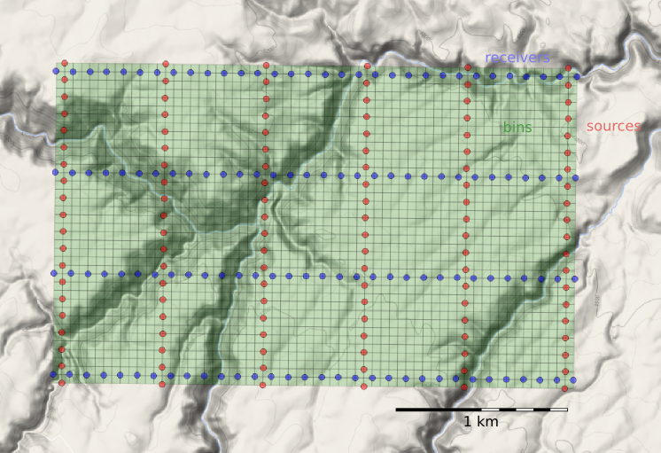
At the end of that post, we had a network of sources and receivers, and the Notebook showed how I computed the midpoints of the source–receiver pairs. At the end, we had a plot of the midpoints. Next we'd like to collect those midpoints into bins. We'll use the so-called natural bins of this orthogonal survey — squares with sides half the source and receiver spacing.

Just as we represented the midpoints as a GeoSeries of Point objects, we will represent  the bins with a GeoSeries of Polygons. GeoPandas provides the GeoSeries; Shapely provides the geometries; take a look at the IPython Notebook for the code. This green mesh is the result, and will hold the stacked traces after processing.

bins_physical.png

Fetching the traces within each bin

To create a CMP gather like the one we modelled at the start, we need to grab all the traces that have midpoints within a particular bin. And we'll want to create gathers for every bin, so it is a huge number of comparisons to make, even for a small example such as this: 128 receivers and 120 sources make 15 320 midpoints. In a purely GIS environment, we could perform a spatial join operation between the midpoint and bin GeoDataFrames, but instead we can use Shapely's contains method inside nested loops. Because of the loops, this code block takes a long time to run.

# Make a copy because I'm going to drop points as I
# assign them to polys, to speed up subsequent search.
midpts = midpoints.copy()

offsets, azimuths = [], [] # To hold complete list.

# Loop over bin polygons with index i.
for i, bin_i in bins.iterrows():
    
    o, a = [], [] # To hold list for this bin only.
    
    # Now loop over all midpoints with index j.
    for j, midpt_j in midpts.iterrows():
        if bin_i.geometry.contains(midpt_j.geometry):
            # Then it's a hit! Add it to the lists,
            # and drop it so we have less hunting.
            o.append(midpt_j.offset)
            a.append(midpt_j.azimuth)
            midpts = midpts.drop([j])
            
    # Add the bin_i lists to the master list
    # and go around the outer loop again.
    offsets.append(o)
    azimuths.append(a)
    
# Add everything to the dataframe.    
bins['offsets'] = gpd.GeoSeries(offsets)
bins['azimuths'] = gpd.GeoSeries(azimuths)

After we've assigned traces to their respective bins, we can make displays of the bin statistics. Three common views we can look at are:

  1. A spider plot to illustrate the offset and azimuth distribution.
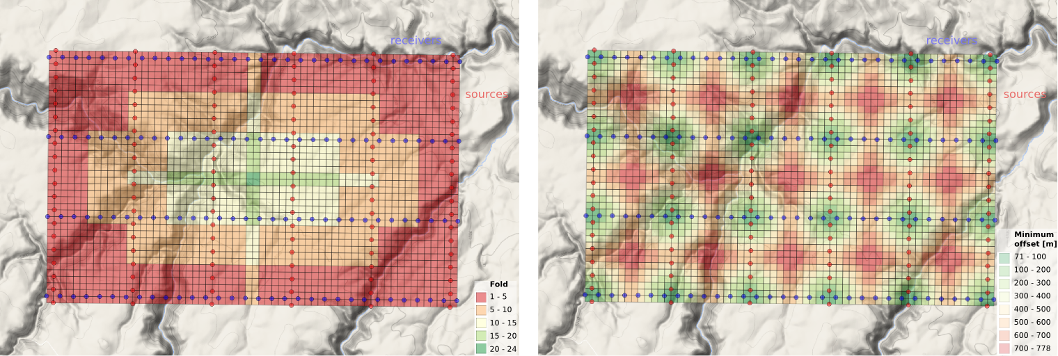
  2. A heat map of the number of traces contributing to each bin, usually called fold.
  3. A heat map of the minimum offset that is servicing each bin. 

The spider plot is easily achieved with Matplotlib's quiver plot:

spider_bubble_zoom.png

And the arrays representing our data are also quite easy to display as heatmaps of fold (left) and minimum offset (right): 

fold_and_xmin_physical.png

In the next and final post of this seismic survey mini-series, we'll analyze the impact of data quality when there are gaps and shifts in the source and receiver stations from these idealized locations.

Last thought: if the bins of a seismic survey are like a digital camera's image sensor, then what is the apparatus that acts like a lens? 

Geocomputing: Call for papers

52 Things .+? Geocomputing is in the works.

For previous books, we've reached out to people we know and trust. This felt like the right way to start our micropublishing project, because we had zero credibility as publishers, and were asking a lot from people to believe anything would come of it.

Now we know we can do it, but personal invitation means writing to a lot of people. We only hear back from about 50% of everyone we write to, and only about 50% of those ever submit anything. So each book takes about 160 invitations.

This time, I'd like to try something different, and see if we can truly crowdsource these books. If you would like to write a short contribution for this book on geoscience and computing, please have a look at the author guidelines. In a nutshell, we need about 600 words before the end of March. A figure or two is OK, and code is very much encouraged. Publication date: fall 2015.

We would also like to find some reviewers. If you would be available to read at least 5 essays, and provide feedback to us and the authors, please let me know

In keeping with past practice, we will be donating money from sales of the book to scientific Python community projects via the non-profit NumFOCUS Foundation.

What the cover might look like. If you'd like to write for us, please read the author guidelines.

What the cover might look like. If you'd like to write for us, please read the author guidelines.

The new open geophysics tools

The hackathon in Denver was more than 6 weeks ago. I kept thinking, "Oh, I must post a review of what went down" (beyond the quick wrap-up I did at the time), but while I'm a firm believer in procrastination six weeks seems unreasonable... Maybe it's taken this long to scrub down to the lasting lessons. Before those, I want to tell you who the teams were, what they did, and where you can find their (100% open source!) stuff. Enjoy!

Geophys Wiz

Andrew Pethick, Josh Poirier, Colton Kohnke, Katerina Gonzales, and Elijah Thomas — GitHub repo

This team had no trouble coming up with ideas — perhaps a reflection of their composition, which was more heterogeneous than the other teams. Josh is at NEOS, the consulting and software firm, and Andrew is a postdoc at Curtin in Perth, Australia, while the other 3 are students at Mines. The team eventually settled on building MT Black Box, a magnetotellurics modeling web application. 

Last thing: Don't miss Andrew Pethick's write-up of the event. 

Seemingly Concerned Neighbours

Elias Arias, Brent Putman, Thomas Rapstine, and Gabriel Martinez — Github repo

These four young geophysicists from the Colorado School of Mines impressed everyone with their work ethic. Their tight-knit team came in with a plan, and proceeded to scribble up the coolest-looking whiteboard of the weekend. After learning some Android development skills 'earlier this week', they pulled together a great little app for forward modeling magnetotelluric responses. 

Hackathon_well_tie_guys.jpg

Well tie guys

Michaël Montouchet, Graham Dawes, Mark Roberts

It was terrific to have pro coders Graham and Michaël with us — they flew from the UK to be with us, thanks to their employer and generous sponsor ffA GeoTeric. They hooked up with Mark, a Denver geophysicist and developer, and hacked on a well-tie web application, rightly identifying a gap in the open source market, so to speak (there is precious little out there for well-based workflows). They may have bitten off more than they could chew in just 2 days, so I hope we can get together with them again to finish it off. Who's up for a European hackathon? 

These two characters from UBC didn't get going till Sunday morning, but in just five hours they built a sweet web app for forward modeling the DC resistivity response of a buried disk. They weren't starting from scratch, because Rowan and others have spent months honing SimPEG, a rich open-source geophysical library, but minds were nonetheless blown.

Key takeaway: interactivity beyond sliders for the win.

Pick This!

Ben Bougher, Jacob Foshee, Evan Bianco, and an immiscible mixture of Chris Chalcraft and me — GitHub repo

Wouldn't you sometimes like to know how other people would interpret the section you're working on? This team, a reprise of the dream team from Houston in 2013, built a simple way to share images and invite others to interpret them. When someone has completed their interpretation, only then do they get to see the ensemble — everyone else's interpretations — in a heatmap. Not only did this team demo live software at pickthis.io, but the audience provided the first crowdsourced picks in real time. 

We'll be blogging more about Pick This soon. We're actively seeking ideas, images, interpreters, and financial support. Keep an eye out.

What I learned at this hackathon

  • Potential fields are an actual thing! OK, kidding, but three out of five teams built potential field modeling tools. I wasn't expecting that, and I think the judges were impressed at the breadth. 
  • 30 hours is easily enough time to build something pretty cool. Heck, 5 hours is enough if you're made of the right stuff. 
  • Students can happily build prototypes alongside professional developers, and even teach them a thing or two. And vice versa. Are hackathons a leveller of playing fields?
  • We need to remove the road blocks to more people enjoying this event. To help with this, next time there will be a 1-day bootcamp before the hackathon.
  • After virtually doubling in size from 2013 to 2014, it's clear that the 2015 Hackathon in New Orleans is going to be awesome! Mark your calendar: 17 and 18 October 2015.

Thank you!

Thank you to the creative, energetic geophysicists that came. It was a privilege to meet and hack with you!

Thank you to the judges who gave up their Sunday teatime to watch the demos and give precious feedback to the teams: Steve Adcock, Jamie Allison, Maitri Erwin, Dennis Cooke, Chris Krohn, Shannon Bjarnason, David Holmes, and Tracy Stark. Amazing people, one and all.

A final Thank You to our sponsors — dGB Earth Sciences, ffA GeoTeric, and OpenGeoSolutions. You guys are totally awesome! Seriously.

sponsors_white_noagile.png

All the time freaks

SEG 2014Thursday was our last day at the SEG Annual Meeting. Evan and I took in the Recent developments in time-frequency analysis workshop, organized by Mirko van der Baan, Sergey Fomel, and Jean-Baptiste Tary (Vienna). The workshop came out of an excellent paper I reviewed this summer, which was published online a couple of weeks ago:

Tary, JB, RH Herrera, J Han, and M van der Baan (2014), Spectral estimation—What is new? What is next?, Rev. Geophys. 52. doi:10.1002/2014RG000461.

The paper compares the results of several time–frequency transforms on a suite of 'benchmark' signals. The idea of the workshop was to invite further investigation or other transforms. The organizers did a nice job of inviting contributors with diverse interests and backgrounds. The following people gave talks, several of them sharing their code (*):

  • John Castagna (Lumina) with a review of the applications of spectral decomposition for seismic analysis.
  • Steven Lin (NCU, Taiwan) on empirical methods and the Hilbert–Huang transform.
  • Hau-Tieng Wu (Toronto) on the application of transforms to monitoring respiratory patterns in animals.*
  • Marcílio Matos (SISMO) gave an entertaining, talk about various aspects of the problem.
  • Haizhou Yang (Standford) on synchrosqueezing transforms applied to problems in anatomy.*
  • Sergey Fomel (UT Austin) on Prony's method... and how things don't always work out.*
  • Me, talking about the fidelity of time–frequency transforms, and some 'unsolved problems' (for me).*
  • Mirko van der Baan (Alberta) on the results from the Tary et al. paper.

Some interesting discussion came up in the two or three unstructured parts of the session, organized as mini-panel discussions with groups of authors. Indeed, it felt like the session could have lasted longer, because I don't think we got very close to resolving anything. Some of the points I took away from the discussion:

  • My observation: there is no existing survey of the performance of spectral decomposition (or AVO) — these would be great risking tools.
  • Castagna's assertion: there is no model that predicts the low-frequency 'shadow' effect (confusingly it's a bright thing, not a shadow).
  • There is no agreement on whether the so-called 'Gabor limit' of time–frequency localization is a lower-bound on spectral decomposition. I will write more about this in the coming weeks.
  • Should we even be attempting to use reassignment, or other 'sharpening' tools, on broadband signals? To put it another way: does instantaneous frequency mean anything in seismic signals?
  • What statistical measures might help us understand the amount of reassignment, or the precision of time–frequency decompositions in general?

The fidelity of time–frequency transforms

My own talk was one of the hardest I've ever done, mainly because I don't think about these problems very often. I'm not much of a mathematician, so when I do think about them, I tend to have more questions than insights, so I made my talk into a series of questions for the audience. I'm not sure I got much closer to any answers, but I have a better idea of my questions now... which is a kind of progress I suppose.

Here's my talk (latest slidesGitHub repo). Comments and feedback are, as always, welcome.


Why don't people use viz rooms?

Matteo Niccoli asked me why I thought the use of immersive viz rooms had declined. Certainly, most big companies were building them in about 1998 to 2002, but it's rare to see them today. My stock answer was always "Linux workstations", but of course there's more to it than that.

What exactly is a viz room?

I am not talking about 'collaboration rooms', which are really just meeting rooms with a workstation and a video conference phone, a lot of wires, and wireless mice with low batteries. These were one of the collaboration technologies that replaced viz rooms, and they seem to be ubiquitous (and also under-used).

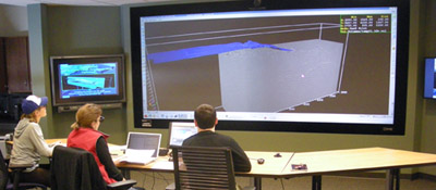
The Viz Lab at Wisconsin–Madison. Thanks to Harold Tobin for permission.A 'viz room', for our purposes here, is a dark room with a large screen, at least 3 m wide, probably projected from behind. There's a Crestron controller with greasy fingerprints on it. There's a week-old coffee cup because not even the cleaners go in there anymore. There's probably a weird-looking 3D mouse and some clunky stereo glasses. There might be some dusty haptic equipment that would work if you still had an SGI.

Why did people stop using them?

OK, let's be honest... why didn't most people use them in the first place?

  1. The rise of the inexpensive Linux workstation. The Sun UltraSPARC workstations of the late 1990s couldn't render 3D graphics quickly enough for spinning views or volume-rendered displays, so viz rooms were needed for volume interpretation and well-planning. But fast machines with up to 16GB of RAM and high-end nVidia or AMD graphics cards came along in about 2002. A full dual-headed set-up cost 'only' about $20k, compared to about 50 times that for an SGI with similar capabilities (for practical purposes). By about 2005, everyone had power and pixels on the desktop, so why bother with a viz room?
  2. People never liked the active stereo glasses. They were certainly clunky and ugly, and some people complained of headaches. It took some skill to drive the software, and to avoid nauseating spinning around, so the experience was generally poor. But the real problem was that nobody cared much for the immersive experience, preferring the illusion of 3D that comes from motion. You can interactively spin a view on a fast Linux PC, and this provides just enough immersion for most purposes. (As soon as the motion stops, the illusion is lost, and this is why 3D views are so poor for print reproduction.)
  3. They were expensive. Early adoption was throttled by expense  (as with most new technology). The room renovation might cost $250k, the SGI Onyx double that, and the projectors were $100k each. But  even if the capex was affordable, everyone forgot to include operating costs — all this gear was hard to maintain. The pre-DLP cathode-ray-tube projectors needed daily calibration, and even DLP bulbs cost thousands. All this came at a time when companies were letting techs go and curtailing IT functions, so lots of people had a bad experience with machines crashing, or equipment failing.
  4. Intimidation and inconvenience. The rooms, and the volume interpretation workflow generally, had an aura of 'advanced'. People tended to think their project wasn't 'worth' the viz room. It didn't help that lots of companies made the rooms almost completely inaccessible, with a locked door and onerous booking system, perhaps with a gatekeeper admin deciding who got to use it.
  5. Our culture of PowerPoint. Most of the 'collaboration' action these rooms saw was PowerPoint, because presenting with live data in interpretation tools is a scary prospect and takes practice.
  6. Volume interpretation is hard and mostly a solitary activity. When it comes down to it, most interpreters want to interpret on their own, so you might as well be at your desk. But you can interpret on your own in a viz room too. I remember Richard Beare, then at Landmark, sitting in the viz room at Statoil, music blaring, EarthCube buzzing. I carried on this tradition when I was at Landmark as I prepared demos for people, and spent many happy hours at ConocoPhillips interpreting 3D seismic on the largest display in Canada.  

What are viz rooms good for?

Don't get me wrong. Viz rooms are awesome. I think they are indispensable for some workflows: 

  • Well planning. If you haven't experienced planning wells with geoscientists, drillers, and reservoir engineers, all looking at an integrated subsurface dataset, you've been missing out. It's always worth the effort, and I'm convinced these sessions will always plan a better well than passing plans around by email. 
  • Team brainstorming. Cracking open a new 3D with your colleagues, reviewing a well program, or planning the next year's research projects, are great ways to spend a day in a viz room. The broader the audience, as long as it's no more than about a dozen people, the better. 
  • Presentations. Despite my dislike of PowerPoint, I admit that viz rooms are awesome for presentations. You will blow people away with a bit of live data. My top tip: make PowerPoint slides with an aspect ratio to fit the entire screen: even PowerPoint haters will enjoy 10-metre-wide slides.

What do you think? Are there still viz rooms where you work? Are there 'collaboration rooms'? Do people use them? Do you?