x lines of Python: Stereonets

Difficulty rating: Intermediate

A few years back I needed to plot some fracture data without specialist software, so I created an Excel spreadsheet with a polar plot and interactive widgets. But thanks to Joe Kington and his awesome mplstereonet library those days are over. Today I want to share with you how to plot two fracture sets on an equal area Schmidt plot with mplstereonet.

Here's what we're going to do — and in only 10 lines of Python:

  1. Load the data from a CSV file.
  2. Create a stereonet with grid lines.
  3. Loop over fracture sets and plot each in a different colour.
  4. Add some statistics for each set.

For data we'll use Irene Wallis's fantastic open-source project fractoolbox repo, which includes some data — as well as some notebooks that go beyond what we will do here.

This results in the plot shown here, where each fracture is plotted as a point representing the pole of the fracture plane.

We see that not counting the imports, we can make this simple plot with as a few as 10 lines of code while still retaining some flexibility to refactor this code. The accompanying notebook also shows how to use ipywidgets to make the plot interactive.

stereonet_example.jpg

That’s it! There’s more in the Notebook — check out the links below. If you get some beautiful plots out of your data, share them in the Software Underground or on Twitter. Have fun!

GitHub    See the Notebook on GitHub

Binder    Run the Notebook in MyBinder

The deep time clock

Check out this video by a Finnish Lego engineer on the Brick Experiment Channel (BEC):

This brilliant, absurd machine — which fits easily on a coffee table — made me think about geological time.

Representing deep time is a classic teaching problem in geoscience. Most of them are variants of “Imagine the earth’s history compressed into 24 hours” and use a linear scale. It’s amazing how even the Cretaceous is only 25 minutes long, and humans arrived a few seconds ago. These memorable and effective demos have been blowing people’s minds for years.

Clocks with v e r y s l o w hands

I think an even nicer metaphor is the clock. Although non-linear, it’s instantly familiar, even if its inner workings of cogs and gears are not. We all understand how the hands move with different periods (especially if you’ve ever had a dull job). So this image (right) from the video is, I think, a nice lead-in to what ends up being a mind-exploding depiction of deep time, beyond anything you can do with a linear analogy.

Indeed, if the googol-gear-machine viking minifigure rotation was a day, the Cretaceous essentially doesn’t exist. Nothing does, it’s just 24 hours of protons decaying.

Screenshot from 2020-05-19 12-21-53.png

After a couple of giant gears, the engineer adds this chain of gears (below). Once attached to the rest of the machine, these things — the first 10 of them anyway — are essentially the hands on a geological clock.

geological_time_cogs.png

The first hand on this clock, so to speak, turns once every 4999 years. This is not a bad unit of measure if you’re looking at earth surface processes. Then each new gear multiplies by a factor of 40/8, so the next one is 25 ka, and the next 125 ka — around the domain of Milankovich cycles. Then things start getting really geological. The 5th clock hand does one rotation every 3.1 million years, then the 6th is 15.6 Ma. Unfortunately it quickly gets out of hand: the 10th has only turned once since the start of the universe, and after that they are all basically useless for thinking about anything but cosmological timelines. The last one here turns once every 95 petayears.

Remarkably, the BEC machine is still just getting started here. 95 Pa is nothing compared to the last wheel, which would require more energy than exists in the universe to turn. Think about that.

I want one of these

Apparently the BEC machine was inspired by a Daniel de Bruin creation:

Each wheel here is a 100:10 reduction. You’d only need the first 20 of them to have the last one do one single revolution since the birth of the solar system!

If someone would like to build such a geological clock for me, I’ll pay a sub-googol amount of money for it. Bonus points if it fits in a wristwatch.

The evolution of the Software Underground

swung_shadow_web.png

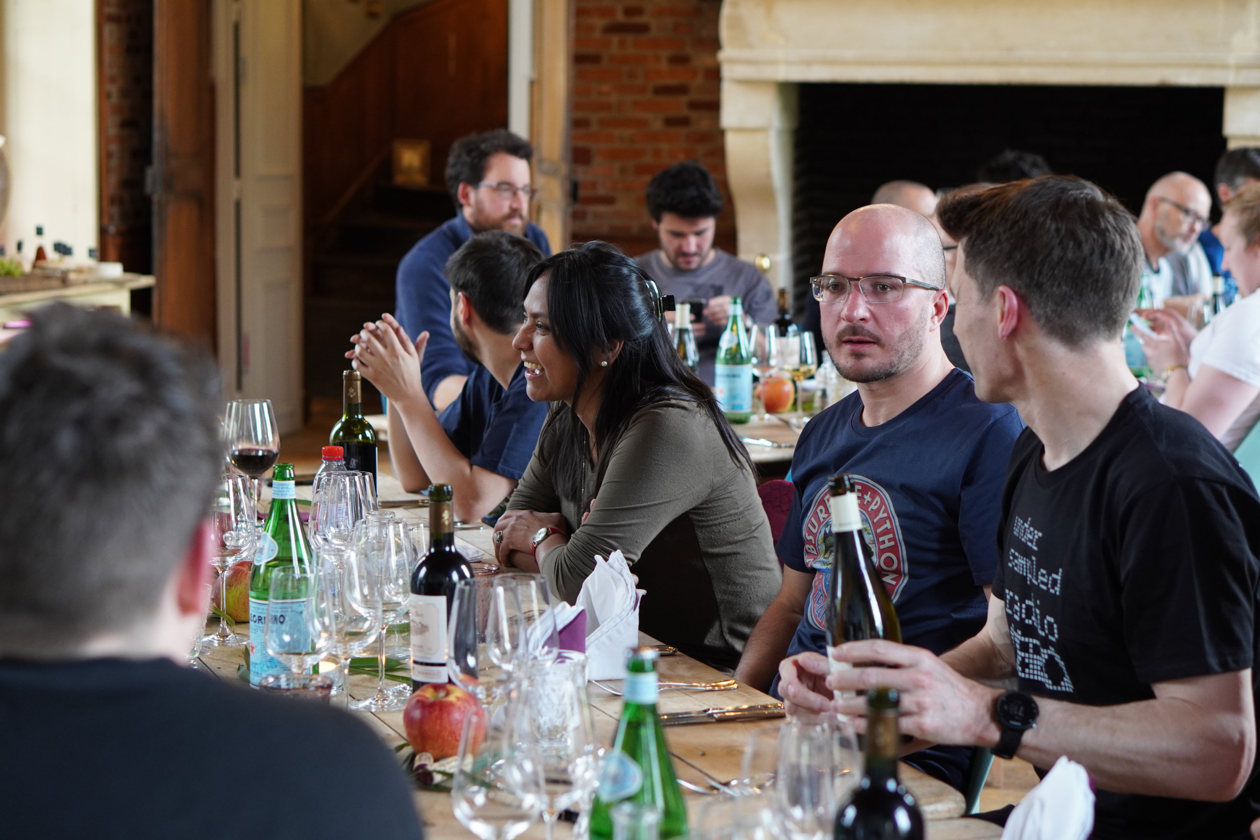
The Software Underground started as a mailing list in 2014 with maybe twenty participants, in the wake of the first geoscience hackathons. There are now more than 2,160 “rocks + computers” enthusiasts in the Underground, with about 20 currently joining every week. It’s the fastest growing digital subsurface water-cooler in the world! And the only one.

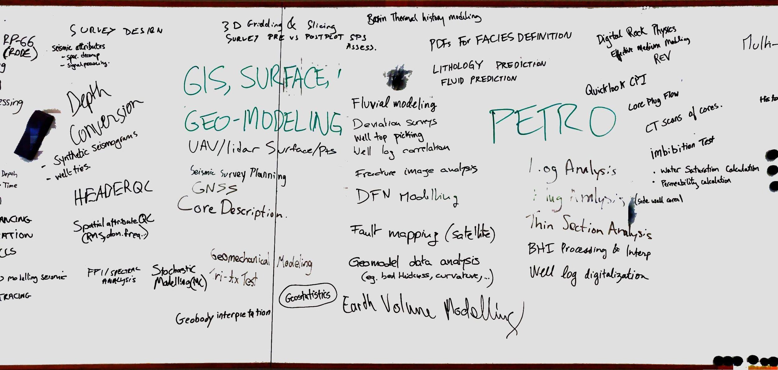
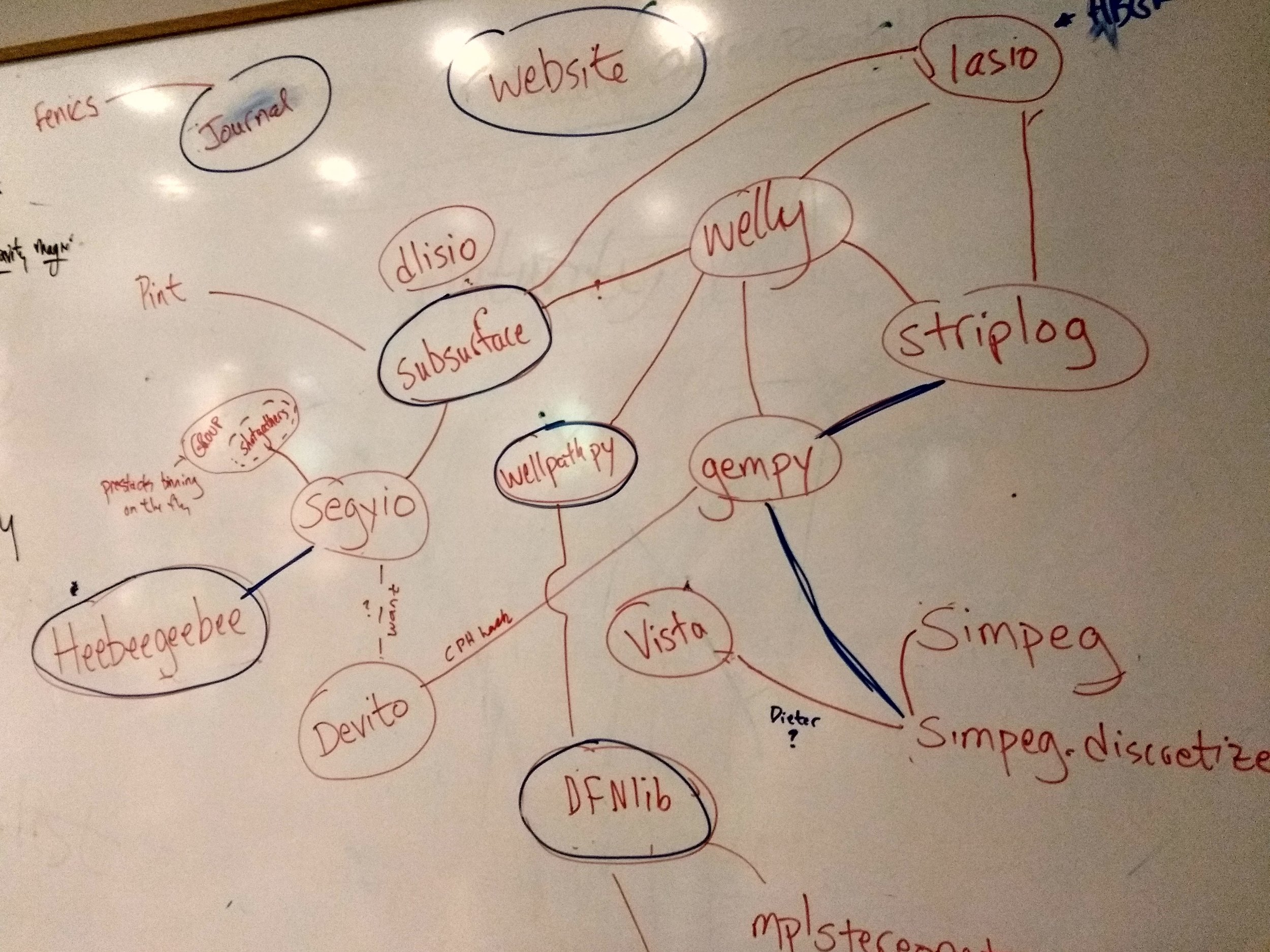
The beating heart of the Software Underground is its free, open Slack chat room. Accessible to anyone, it brings this amazing community right to your mobile device or computer desktop. When it comes to the digital subsurface, it has a far higher signal:noise ratio than LinkedIn, Twitter, or Facebook. Here are some of the topics under discussion this week:

  • The role of coding challenges in job interviews.

  • Handling null values in 2D grids such as airborne gamma-ray.

  • How to load an open seismic dataset into OpendTect.

  • A new series of tutorials for the GeoStats.jl Julia package.

  • Plenty of discussion about how to interpret negative oil prices!

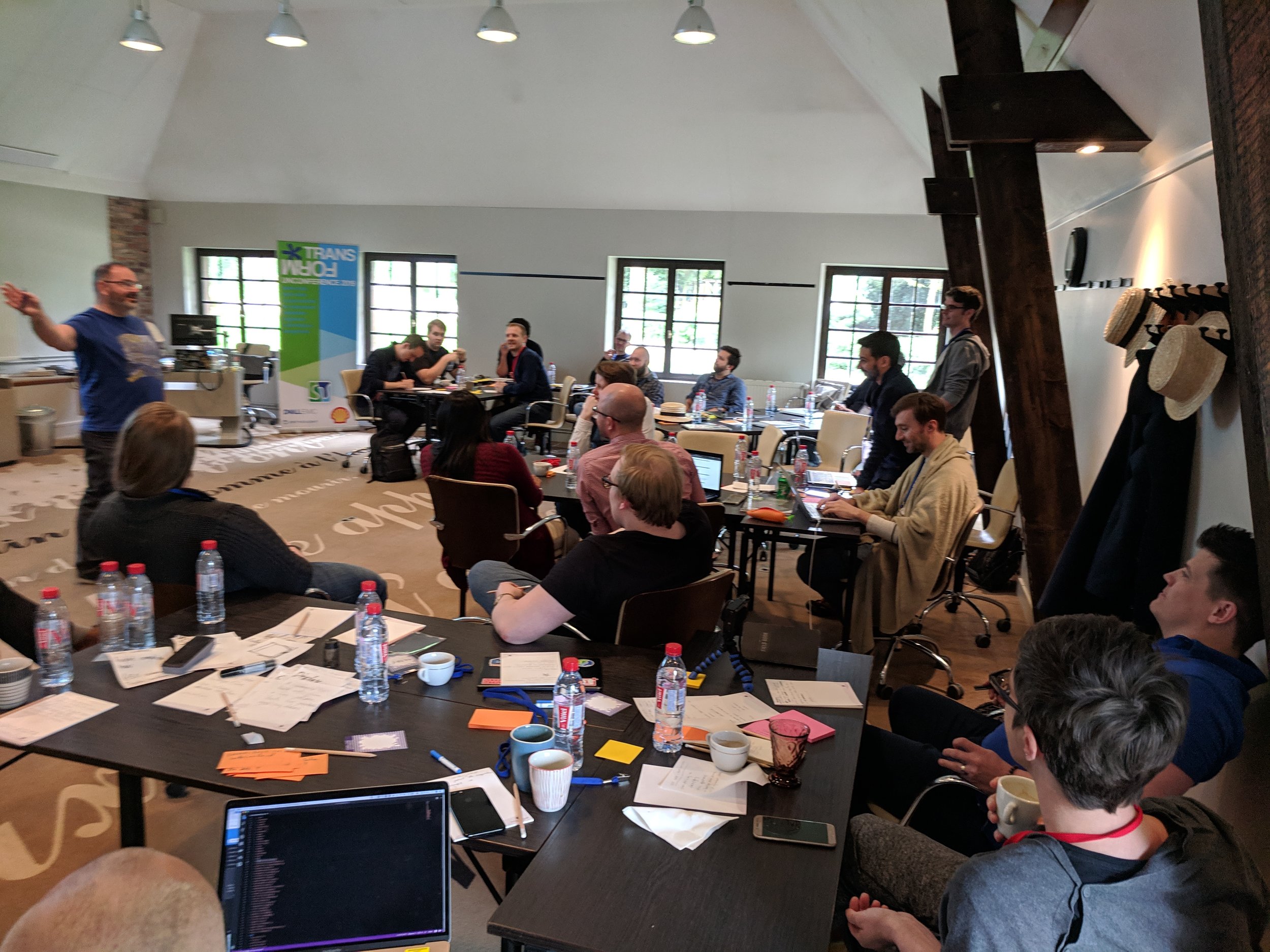
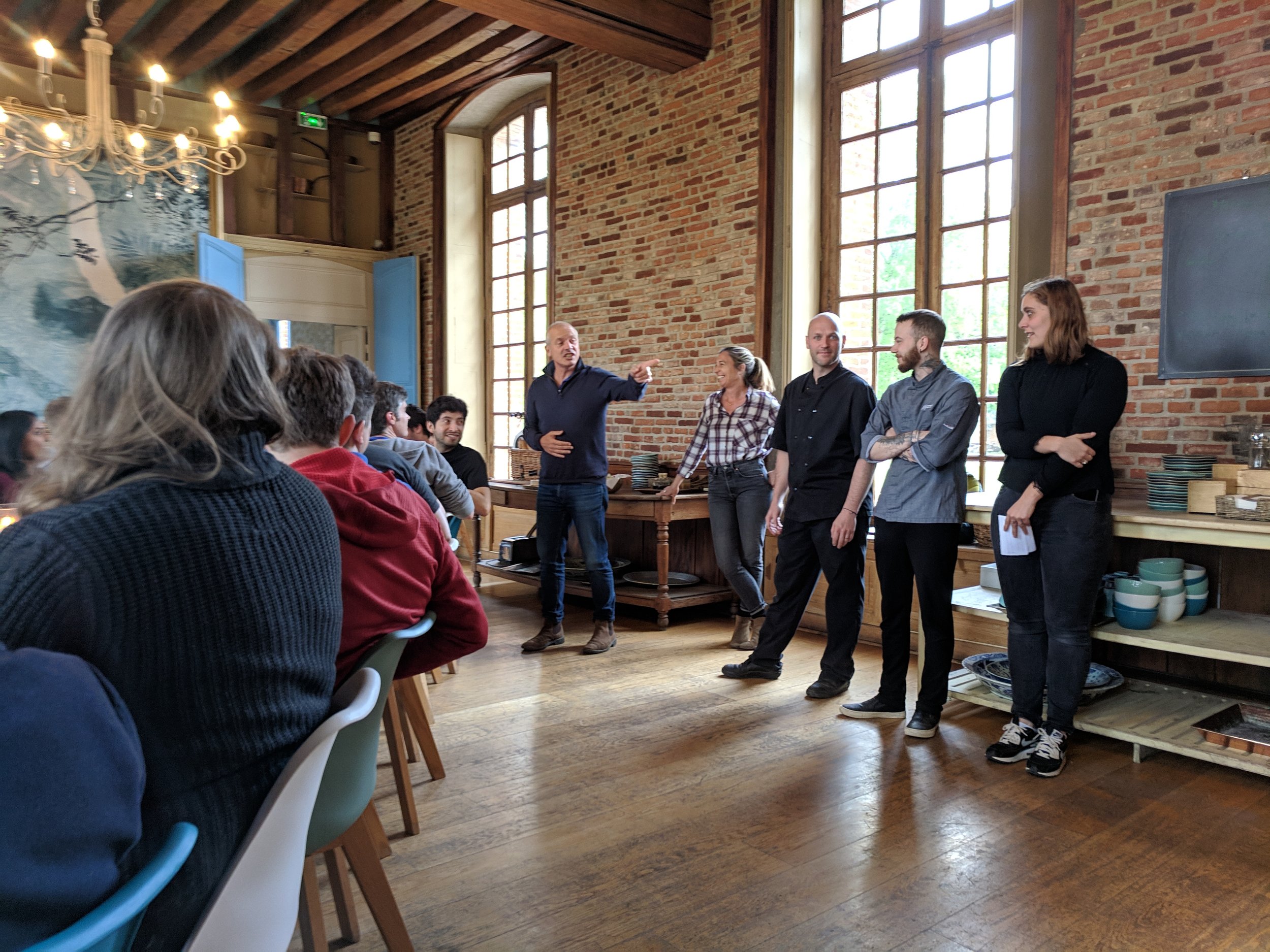
But the Software Underground — or Swung as its population affectionately call it — is more than just a chatroom. It organizes events. It compiles awesome documents. And it has great ambitions.

Evolution

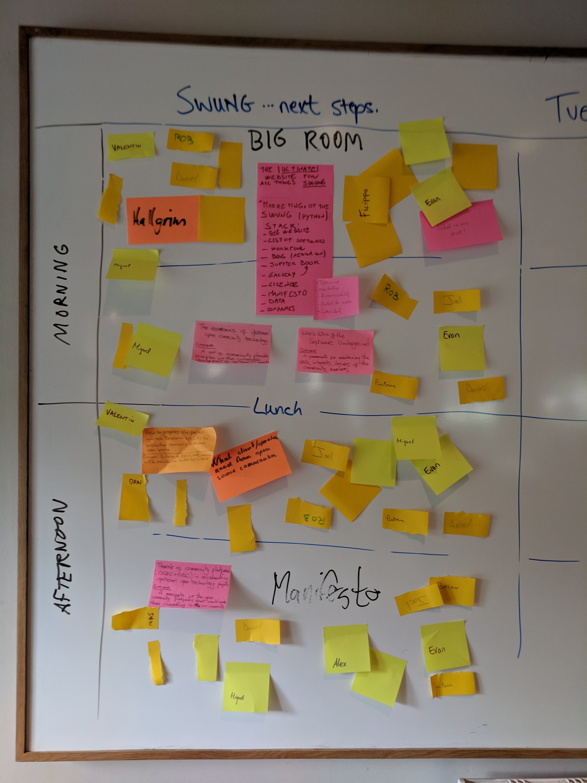
To better explore those ambitions, the Underground is evolving.

Until now, it’s had a slightly murky existence, or non-existence, operating in mysterious ways and without visible means of support. When we tried to get a ‘non-profit’ booth at a conference last year, we couldn’t because the Software Underground isn’t just a non-profit, it’s a non-entity. It doesn’t legally exist.

Most of the time, this nonexistence is a luxury. No committees! No accounts! No lawyers!

But sometimes it’s a problem. Like when you want to accept donations in a transparent way. Or take sponsorship from a corporation. Or pay for an event venue. Or have some accountability for what goes on in the community. Or make a decision without waiting for Matt to read his email. Sometimes it matters.

A small band of supporters and evangelists have decided the time has come for the Software Underground to stand up and be counted! We’re going legal. We’re going to exist.

What will change?

As little as possible! And everything!

The Slack will remain the same. Free for everyone. The digital subsurface water-cooler (or public house, if you prefer).

We’re taking on our biggest event yet in June — a fully online conference called TRANSFORM 2020. Check it out.

Soon we will exist legally, as we move to incorporate in Canada as a non-profit. Later, we can think about how membership and administration will work. For now, there will be some ‘interim’ directors, whose sole job is to establish the terms of the organization’s existence and get it to its first Annual General Meeting, sometime in 2021.

The goal is to make new things possible, with a new kind of society.

And you’re invited.

LONDON2019_mk2.png

x lines of Python: Physical units

Difficulty rating: Intermediate

Have you ever wished you could carry units around with your quantities — and have the computer figure out the best units and multipliers to use?

pint is a nice, compact library for doing just this, handling all your dimensional analysis needs. It can also detect units from strings. We can define our own units, it knows about multipliers (kilo, mega, etc), and it even works with numpy and pandas.

To use it in its typical mode, we import the library then instantiate a UnitRegistry object. The registry contains lots of physical units:

 
import pint
units = pint.UnitRegistry()
thickness = 68 * units.m

Now thickness is a Quantity object with the value <Quantity(68, 'meter')>, but in Jupyter we see a nice 68 meter (as far as I know, you're stuck with US spelling).

Let's make another quantity and multiply the two:

 
area = 60 * units.km**2
volume = thickness * area

This results in volume having the value <Quantity(4080, 'kilometer ** 2 * meter')>, which pint can convert to any units you like, as long as they are compatible:

 
>>> volume.to('pint')
8622575788969.967 pint

More conveniently still, you can ask for 'compact' units. For example, volume.to_compact('pint') returns 8.622575788969966 terapint. (I guess that's why we don't use pints for field volumes!)

There are lots and lots of other things you can do with pint; some of them — dealing with specialist units, NumPy arrays, and Pandas dataframes — are demonstrated in the Notebook accompanying this post. You can use one of these links to run this right now in your browser if you like:

Binder   Run the accompanying notebook in MyBinder

Open In Colab   Run the notebook in Google Colaboratory (note the install cell at the beginning)

That's it for pint. I hope you enjoy using it in your scientific computing projects. If you have your own tips for handling units in Python, let us know in the comments!


There are some other options for handling units in Python:

  • quantities, which handles uncertainties without also needing the uncertainties package.
  • astropy.units, part of the large astropy project, is popular among physicists.

Impact structures in seismic

I saw this lovely tweet from PGS yesterday:

Kudos to them for sharing this. It’s always great to see seismic data and interpretations on Twitter — especially of weird things. And impact structures are just cool. I’ve interpreted them in seismic myself. Then uninterpreted them.

I wish PGS were able to post a little more here, like a vertical profile, maybe a timeslice. I’m sure there would be tons of debate if we could see more. But not all things are possible when it comes to commercial seismic data.

It’s crazy to say more about it without more data (one-line interpretation, yada yada). So here’s what I think.


Impact craters are rare

There are at least two important things to think about when considering an interpretation:

  1. How well does this match the model? (In this case, how much does it look like an impact structure?)

  2. How likely are we to see an instance of this model in this dataset? (What’s the base rate of impact structures here?)

Interpreters often forget about the second part. (There’s another part too: How reliable are my interpretations? Let’s leave that for another day, but you can read Bond et al. 2007 as homework if you like.)

The problem is that impact structures, or astroblemes, are pretty rare on Earth. The atmosphere takes care of most would-be meteorites, and then there’s the oceans, weather, tectonics and so on. The result is that the earth’s record of surface events is quite irregular compared to, say, the moon’s. But they certainly exist, and occasionally pop up in seismic data.

In my 2011 post Reliable predictions of unlikely geology, I described how skeptical we have to be when predicting rare things (‘wotsits’). Bayes’ theorem tells us that we must modify our assigned probability (let’s say I’m 80% sure it’s a wotsit) with the prior probability (let’s pretend a 1% a priori chance of there being a wotsit in my dataset). Here’s the maths:

\( \ \ \ P = \frac{0.8 \times 0.01}{0.8 \times 0.01\ +\ 0.2 \times 0.99} = 0.0388 \)

In other words, the conditional probability of the feature being a rare wotsit, given my 80%-sure interpretation, is 0.0388 or just under 4%.

As cool as it would be to find a rare wotsit, I probably need a back-up hypothesis. Now, what’s that base rate for astroblemes? (Spoiler: it’s much less than 1%.)

Just how rare are astroblemes?

First things first. If you’re interpreting circular structures in seismic, you need to read Simon Stewart’s paper on the subject (Stewart 1999), and his follow-up impact crater paper (Stewart 2003), which expands on the topic. Notwithstanding Stewart’s disputed interpretation of the Silverpit not-a-crater structure in the North Sea, these two papers are two of my favourites.

According to Stewart, the probability P of encountering r craters of diameter d or more in an area A over a time period t years is given by:

\( \ \ \ P(r) = \mathrm{e}^{-\lambda A}\frac{(\lambda A)^r}{r!} \)

where

\( \ \ \ \lambda = t n \)

and

\( \ \ \ \log n = - (11.67 \pm 0.21) - (2.01 \pm 0.13) \log d \)

Astrobleme_prob.png

We can use these equations to compute the probability plot on the right. It shows the probability of encountering an astrobleme of a given diameter on a 2400 km² seismic survey spanning the Phanerozoic. (This doesn’t take into account anything to do with preservation or detection.) I’ve estimated that survey size from PGS’s tweet, and I’ve highlighted the 7.5 km diameter they mentioned. The probability is very small: about 0.00025. So Bayes tells us that an 80%-confident interpretation has a conditional probability of about 0.001. One in a thousand.

Here’s the Jupyter notebook I used to make that chart using Python.

So what?

My point here isn’t to claim that this structure is not an astrobleme. I haven’t seen the data, I’ve no idea. The PGS team mentioned that they considered the possiblity of influence by salt or shale, and fluid escape, and rejected these based on the evidence.

My point is to remind interpreters that when your conclusion is that something is rare, you need commensurately more and better evidence to support the claim. And it’s even more important than usual to have multiple working hypotheses.

Last thing: if I were PGS and this was my data (i.e. not a client’s), I’d release a little cube (anonymized, time-shifted, bit-reduced, whatever) to the community and enjoy the engagement and publicity. With a proper license, obviously.


References

Hughes, D, 1998, The mass distribution of the crater-producing bodies. In Meteorites: Flux with time and impact effects, Geological Society of London Special Publication 140, 31–42.

Davis, J, 1986, Statistics and data analysis in geology, John Wiley & Sons, New York.

Stewart, SA (1999). Seismic interpretation of circular geological structures. Petroleum Geoscience 5, p 273–285.

Stewart, SA (2003). How will we recognize buried impact craters in terrestrial sedimentary basins? Geology 31 (11), p 929–932.


TRANSFORM happened!

transform_sticker.jpg

How do you describe the indescribable?

Last week, Agile hosted the TRANSFORM unconference in Normandy, France. We were there to talk about the open suburface stack — the collection of open-source Python tools for earth scientists. We also spent time on the state of the Software Underground, a global community of practice for digital subsurface scientists and engineers. In effect, this was the first annual Software Underground conference. This was SwungCon 1.

The space

I knew the Château de Rosay was going to be nice. I hoped it was going to be very nice. But it wasn’t either of those things. It exceeded expectations by such a large margin, it seemed a little… indulgent, Excessive even. And yet it was cheaper than a Hilton, and you couldn’t imagine a more perfect place to think and talk about the future of open source geoscience, or a more productive environment in which to write code with new friends and colleagues.

It turns out that a 400-year-old château set in 8 acres of parkland in the heart of Normandy is a great place to create new things. I expect Gustave Flaubert and Guy de Maupassant thought the same when they stayed there 150 years ago. The forty-two bedrooms house exactly the right number of people for a purposeful scientific meeting.

This is frustrating, I’m not doing the place justice at all.

The work

This was most people’s first experience of an unconference. It was undeniably weird walking into a week-long meeting with no schedule of events. But, despite being inexpertly facilitated by me, the 26 participants enthusiastically collaborated to create the agenda on the first morning. With time, we appreciated the possibilities of the open space — it lets the group talk about exactly what it needs to talk about, exactly when it needs to talk about it.

The topics ranged from the governance and future of the Software Underground, to the possibility of a new open access journal, interesting new events in the Software Underground calendar, new libraries for geoscience, a new ‘core’ library for wells and seismic, and — of course — machine learning. I’ll be writing more about all of these topics in the coming weeks, and there’s already lots of chatter about them on the Software Underground Slack (which hit 1500 members yesterday!).

The food

I can’t help it. I have to talk about the food.

…but I’m not sure where to start. The full potential of food — to satisfy, to delight, to start conversations, to impress, to inspire — was realized. The food was central to the experience, but somehow not even the most wonderful thing about the experience of eating at the chateau. Meals were prefaced by a presentation by the professionals in the kitchen. No dish was repeated… indeed, no seating arrangement was repeated. The cheese was — if you are into cheese — off the charts.

There was a professionalism and thoughtfulness to the dining that can perhaps only be found in France.

Sorry everyone. This was one of those occasions when you had to be there. If you weren’t there, you missed out. I wish you’d been there. You would have loved it.

The good news is that it will happen again. Stay tuned.

The order of stratigraphic sequences

Much of stratigraphic interpretation depends on a simple idea:

Depositional environments that are adjacent in a geographic sense (like the shoreface and the beach, or a tidal channel and tidal mudflats) are adjacent in a stratigraphic sense, unless separated by an unconformity.

Usually, geologists are faced with only the stratigraphic picture, and are challenged with reconstructing the geographic picture.

One interpretation strategy might be to look at which rocks tend to occur together in the stratigraphy. The idea is that rock types tend to be associated with geographic environments — maybe fine sand on the shoreface, coarse sand on the beach; massive silt in the tidal channel, rhythmically laminated mud in the mud-flats. Since if two rocks tend to occur together, their environments were probably adjacent, we can start to understand associations between the rock types, and thus piece together the geographic picture.

So which rock types tend to occur together, and which juxtapositions are spurious — perhaps the result of allocyclic mechanisms like changes in relative sea-level, or sediment supply? To get at this question, some stratigraphers turn to Markov chain analysis.

What is a Markov chain?

Markov chains are sequences of events, or states, resulting from a Markov process. Here’s how Wikipedia describes a Markov process:

A stochastic process that satisfies the Markov property (sometimes characterized as “memorylessness”). Roughly speaking, a process satisfies the Markov property if one can make predictions for the future of the process based solely on its present state just as well as one could knowing the process’s full history, hence independently from such history; i.e., conditional on the present state of the system, its future and past states are independent.

So if we believe that a stratigraphic sequence (I’m using ‘sequence’ here in the most general sense) can be modeled by a process like this — i.e. that its next state depends substantially on its present state — then perhaps we can model it as a Markov chain.

For example, we might have a hunch that we can model a shallow marine system as a sequence like:

offshore mudstone > lower shoreface siltstone > upper shoreface sandstone > foreshore sandstone

Then we might expect to see these transitions occur more often than other, non-successive transitions. In other words — if we compare the transition frequencies we observe to the transition frquencies we would expect from a random sequence of the same beds in the same proportions, then autocyclic or genetic transitions might happen unusually frequently.

The Powers & Easterling method

Several workers have gone down this path. The standard approach seems to be that of Powers & Easterling (1982). Here are the steps they describe:

  • Count the upwards transitions for each rock type. This results in a matrix of counts. Here’s the transition frequency matrix for the example used in the Powers & Easterling paper, in turn taken from Gingerich (1969):

 
data = [[ 0, 37,  3,  2],
        [21,  0, 41, 14],
        [20, 25,  0,  0],
        [ 1, 14,  1,  0]]
  • Compute the expected counts by an iterative process, which usually converges in a few steps. The expected counts represent what Goodman (1968) called a ‘quasi-independence’ model — a random sequence:

 
array([[ 0. , 31.3,  8.2,  2.6],
       [31.3,  0. , 34.1, 10.7],
       [ 8.2, 34. ,  0. ,  2.8],
       [ 2.6, 10.7,  2.8,  0. ]])
  • Now we can compare our observed frequencies with the expected ones in two ways. First, we can inspect the \(\chi^2\) statistic, and compare it with the \(\chi^2\) distribution, given the degrees of freedom (5 in this case). In this example, it’s 35.7, which is beyond the 99.999th percentile of the chi-squared distribution. This rejects the hypothesis of quasi-independence. In other words: the succession appears to be organized. Phew!

  • Secondly, we can compute a matrix of so-called normalized differences. This lets us compare the observed and expected data. By calculating Z-scores, which are approximately normally distributed; since 95% of the distribution falls between −2 and +2, any value greater in magnitude than 2 is ‘fairly unusual’, in the words of Powers & Easterling. In the example, we can see that the large number of transitions from C (third row) to A (first column) is anomalous:


array([[ 0. ,  1. , -1.8, -0.3],
       [-1.8,  0. ,  1.2,  1. ],
       [ 4.1, -1.6,  0. , -1.7],
       [-1. ,  1. , -1.1,  0. ]])
powers_easterling_normdiff.png
  • The normalized difference matrix can also be interpreted as a directed graph, indicating the ‘strengths’ of the connections (edges) between rock types (nodes):

powers_easterling_graph.png

It would be all too easy to over-interpret this graph — B and D seem to go together, as do A and C, and C tends to pass into A, which tends to pass into a B/D system before passing back into C — and one could get carried away. But as a complement to sedimentological interpretation, knowledge of processes and the succession in hand, perhaps inspecting Markov chains can help understand the stratigraphic story.

One last thing… there is another use for Markov chains. We can also use the model to produce stochastic realizations of stratigraphy. These will share the same statistics as the original data, but are otherwise quite random. Here are 20 random beds generated from our model:

 
'ABABCBABABCABDABABCA'

The code to build your own Markov chains is all in this notebook. It’s very much a work in progress. Eventually I hope to merge it into the striplog library, but for now it’s a ‘minimum viable product’. Stay tuned for more on striplog.

Open In Colab   ⇐   Launch the notebook right here in your browser!


References

Gingerich, PD (1969). Markov analysis of cyclic alluvial sediments. Journal of Sedimentary Petrology, 39, p. 330-332. https://doi.org/10.1306/74D71C4E-2B21-11D7-8648000102C1865D

Goodman, LA (1968), The analysis of cross-classified data: independence, quasi-independence, and interactions in contingency tables with or without missing entries. Journal of American Statistical Association 63, p. 1091-1131. https://doi.org/10.2307/2285873

Powers, DW and RG Easterling (1982). Improved methodology for using embedded Markov chains to describe cyclical sediments. Journal of Sedimentary Petrology 52 (3), p. 0913-0923. https://doi.org/10.1306/212F808F-2B24-11D7-8648000102C1865D

The next thing

Over the last several years, Agile has been testing some of the new ways of collaborating, centered on digital connections:

2010-2019-timeline.png
  • It all started with this blog, which started in 2010 with my move from Calgary to Nova Scotia. It’s become a central part of my professional life, but we’re all about collaboration and blogs are almost entirely one-way, so…

  • In 2011 we launched SubSurfWiki. It didn’t really catch on, although it was a good basis for some other experiments and I still use it sometimes. Still, we realized we had to do more to connect the community, so…

  • In 2012 we launched our 52 Things collaborative, open access book series. There are well over 5000 of these out in the wild now, but it made us crave a real-life, face-to-face collaboration, so…

  • In 2013 we held the first ‘unsession’, a mini-unconference, at the Canada GeoConvention. Over 50 people came to chat about unsolved problems. We realized we needed a way to actually work on problems, so…

  • Later that year, we followed up with the first geoscience hackathon. Around 15 or so of us gathered in Houston for a weekend of coding and tacos. We realized that the community needed more coding skills, so…

  • In 2014 we started teaching a one-day Python course aimed squarely at geoscientists. We only teach with subsurface data and algorithms, and the course is now 5 days long. We now needed a way to connect all these new hackers and coders, so…

  • In 2014, together with Duncan Child, we also launched Software Underground, a chat room for discussing topics related to the earth and computers. Initially it was a Google Group but in 2015 we relaunched it as an open Slack team. We wanted to double down on scientific computing, so…

  • In 2015 and 2016 we launched a new web app, Pick This (returning soon!), and grew our bruges and welly open source Python projects. We also started building more machine learning projects, and getting really good at it.

Growing and honing

We have spent the recent years growing and honing these projects. The blog gets about 10,000 readers a month. The sixth 52 Things book is on its way. We held two public unsessions this year. The hackathons have now grown to 60 or so hackers, and have had about 400 participants in total, and five of them this year already (plus three to come!). We have also taught Python to 400 geoscientists, including 250 this year alone. And the Software Underground has over 1000 members.

In short, geoscience has gone digital, and we at Agile are grateful and excited to be part of it. At no point in my career have I been more optimistic and energized than I am right now.

So it’s time for the next thing.

The next thing is starting with a new kind of event. The first one is 5 to 11 May 2019, and it’s happening in France. I’ll tell you all about it tomorrow.

Reproducibility Zoo

repro-zoo-main-banner.png

The Repro Zoo was a new kind of event at the SEG Annual Meeting this year. The goal: to reproduce the results from well-known or important papers in GEOPHYSICS or The Leading Edge. By reproduce, we meant that the code and data should be open and accessible. By results, we meant equations, figures, and other scientific outcomes.

And some of the results are scary enough for Hallowe’en :)

What we did

All the work went straight into GitHub, mostly as Jupyter Notebooks. I had a vague goal of hitting 10 papers at the event, and we achieved this (just!). I’ve since added a couple of other papers, since the inspiration for the work came from the Zoo… and I haven’t been able to resist continuing.

The scene at the Repro Zoo. An air of quiet productivity hung over the booth. Yes, that is Sergey Fomel and Jon Claerbout. Thank you to David Holmes of Dell EMC for the picture.

The scene at the Repro Zoo. An air of quiet productivity hung over the booth. Yes, that is Sergey Fomel and Jon Claerbout. Thank you to David Holmes of Dell EMC for the picture.

Here’s what the Repro Zoo team got up to, in alphabetical order:

  • Aldridge (1990). The Berlage wavelet. GEOPHYSICS 55 (11). The wavelet itself, which has also been added to bruges.

  • Batzle & Wang (1992). Seismic properties of pore fluids. GEOPHYSICS 57 (11). The water properties, now added to bruges.

  • Claerbout et al. (2018). Data fitting with nonstationary statistics, Stanford. Translating code from FORTRAN to Python.

  • Claerbout (1975). Kolmogoroff spectral factorization. Thanks to Stewart Levin for this one.

  • Connolly (1999). Elastic impedance. The Leading Edge 18 (4). Using equations from bruges to reproduce figures.

  • Liner (2014). Long-wave elastic attentuation produced by horizontal layering. The Leading Edge 33 (6). This is the stuff about Backus averaging and negative Q.

  • Luo et al. (2002). Edge preserving smoothing and applications. The Leading Edge 21 (2).

  • Yilmaz (1987). Seismic data analysis, SEG. Okay, not the whole thing, but Sergey Fomel coded up a figure in Madagascar.

  • Partyka et al. (1999). Interpretational aspects of spectral decomposition in reservoir characterization.

  • Röth & Tarantola (1994). Neural networks and inversion of seismic data. Kudos to Brendon Hall for this implementation of a shallow neural net.

  • Taner et al. (1979). Complex trace analysis. GEOPHYSICS 44. Sarah Greer worked on this one.

  • Thomsen (1986). Weak elastic anisotropy. GEOPHYSICS 51 (10). Reproducing figures, again using equations from bruges.

As an example of what we got up to, here’s Figure 14 from Batzle & Wang’s landmark 1992 paper on the seismic properties of pore fluids. My version (middle, and in red on the right) is slightly different from that of Batzle and Wang. They don’t give a numerical example in their paper, so it’s hard to know where the error is. Of course, my first assumption is that it’s my error, but this is the problem with research that does not include code or reference numerical examples.

Figure 14 from Batzle & Wang (1992). Left: the original figure. Middle: My attempt to reproduce it. Right: My attempt in red, overlain on the original.

This was certainly not the only discrepancy. Most papers don’t provide the code or data to reproduce their figures, and this is a well-known problem that the SEG is starting to address. But most also don’t provide worked examples, so the reader is left to guess the parameters that were used, or to eyeball results from a figure. Are we really OK with assuming the results from all the thousands of papers in GEOPHYSICS and The Leading Edge are correct? There’s a long conversation to have here.

What next?

One thing we struggled with was capturing all the ideas. Some are on our events portal. The GitHub repo also points to some other sources of ideas. And there was the Big Giant Whiteboard (below). Either way, there’s plenty to do (there are thousands of papers!) and I hope the zoo continues in spirit. I will take pull requests until the end of the year, and I don’t see why we can’t add more papers until then. At that point, we can start a 2019 repo, or move the project to the SEG Wiki, or consider our other options. Ideas welcome!

IMG_20181017_163926.jpg

Thank you!

The following people and organizations deserve accolades for their dedication to the idea and hard work making it a reality. Please give them a hug or a high five when you see them.

  • David Holmes (Dell EMC) and Chance Sanger worked their tails off on the booth over the weekend, as well as having the neighbouring Dell EMC booth to worry about. David also sourced the amazing Dell tech we had at the booth, just in case anyone needed 128GB of RAM and an NVIDIA P5200 graphics card for their Jupyter Notebook. (The lights in the convention centre actually dimmed when we powered up our booths in the morning.)

  • Luke Decker (UT Austin) organized a corps of volunteer Zookeepers to help manage the booth, and provided enthusiasm and coding skills. Karl Schleicher (UT Austin), Sarah Greer (MIT), and several others were part of this effort.

  • Andrew Geary (SEG) for keeping things moving along when I became delinquent over the summer. Lots of others at SEG also helped, mainly with the booth: Trisha DeLozier, Rebecca Hayes, and Beth Donica all contributed.

  • Diego Castañeda got the events site in shape to support the Repro Zoo, with a dashboard showing the latest commits and contributors.

Reproduce this!

logo_simple.png

There’s a saying in programming: untested code is broken code. Is unreproducible science broken science?

I hope not, because geophysical research is — in general — not reproducible. In other words, we have no way of checking the results. Some of it, hopefully not a lot of it, could be broken. We have no way of knowing.

Next week, at the SEG Annual Meeting, we plan to change that. Well, start changing it… it’s going to take a while to get to all of it. For now we’ll be content with starting.

We’re going to make geophysical research reproducible again!

Welcome to the Repro Zoo!

If you’re coming to SEG in Anaheim next week, you are hereby invited to join us in Exposition Hall A, Booth #749.

We’ll be finding papers and figures to reproduce, equations to implement, and data tables to digitize. We’ll be hunting down datasets, recreating plots, and dissecting derivations. All of it will be done in the open, and all the results will be public and free for the community to use.

You can help

There are thousands of unreproducible papers in the geophysical literature, so we are going to need your help. If you’ll be in Anaheim, and even if you’re not, here some things you can do:

That’s all there is to it! Whether you’re a coder or an interpreter, whether you have half an hour or half a day, come along to the Repro Zoo and we’ll get you started.

Figure 1 from Connolly’s classic paper on elastic impedance. This is the kind of thing we’ll be reproducing.

Figure 1 from Connolly’s classic paper on elastic impedance. This is the kind of thing we’ll be reproducing.